All Team components
Every Team component side by side, with a picture and description of each. Open one for its preview, API and install.
4 components, A to Z.
Member Sheet
member-sheet
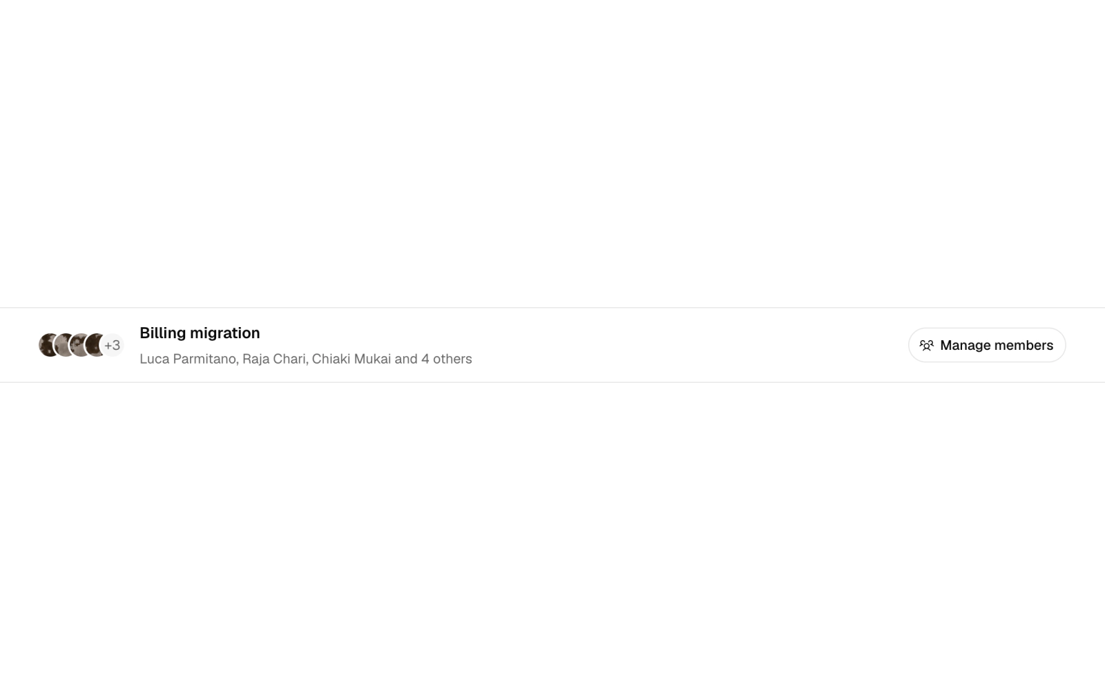

Member management sheet: a side panel with a list of removable member rows with optional avatars, an add-by-name form and an empty state, announcing each addition and removal in a live status line.
Team Member
team-member
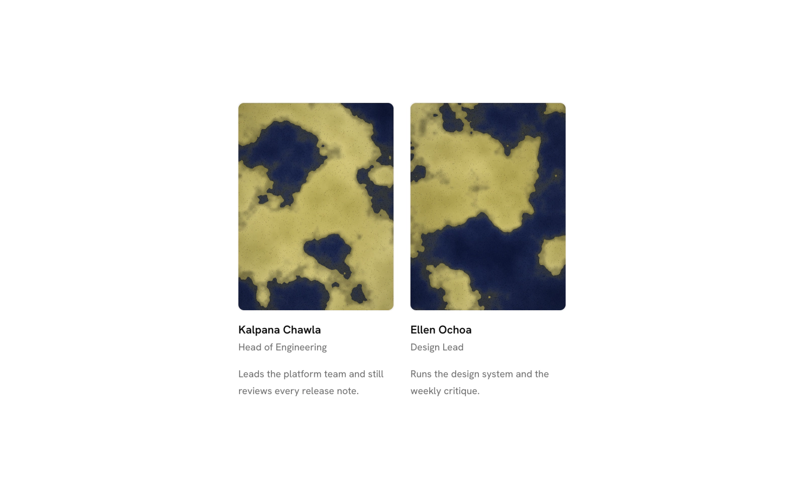
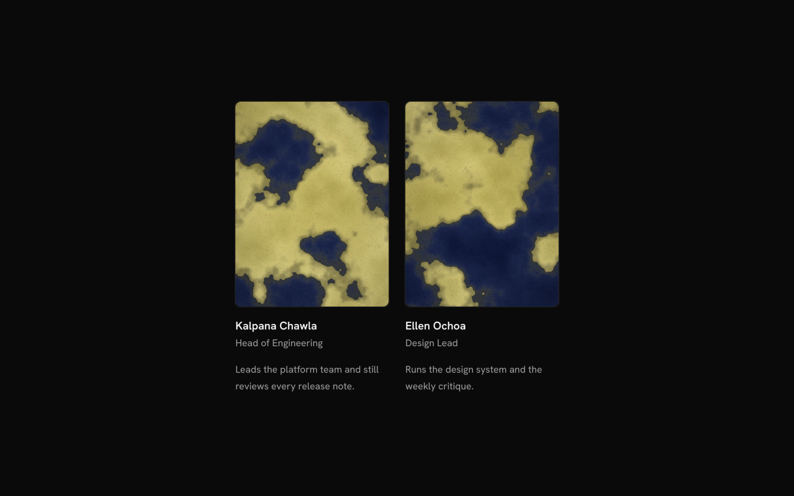
Team member card: one person on a team page with a full-width portrait and hairline outline, then the name and role as a byline, then an optional bio. Everything comes from props.
Team Member List
team-member-list
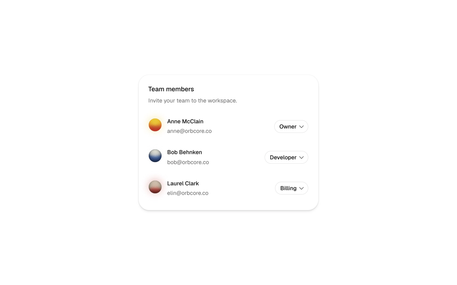
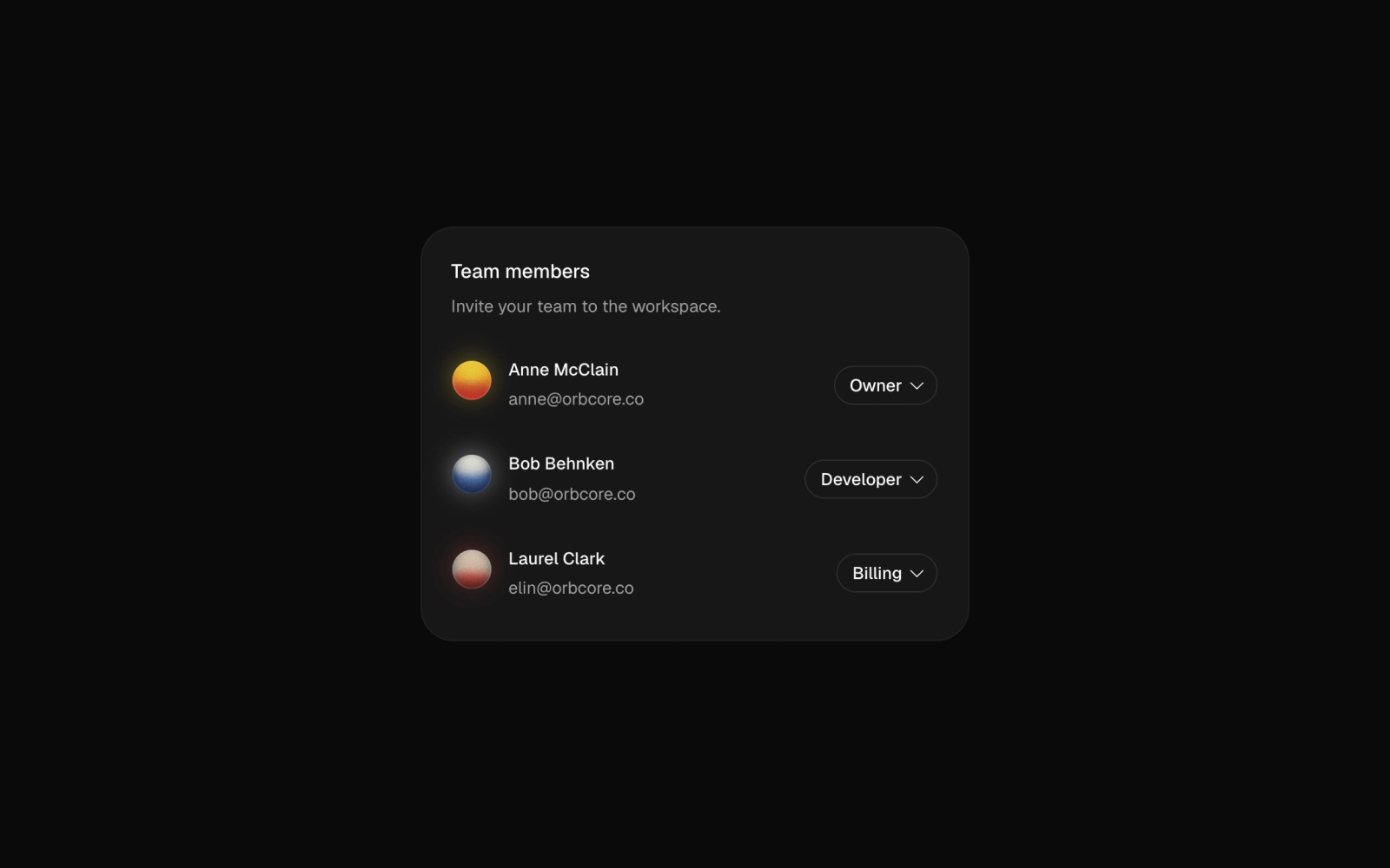
Team member list card: each person with avatar and description, plus a role button that opens a searchable Command popover of roles with descriptions. Controlled through a role change callback.
Team Switcher
team-switcher
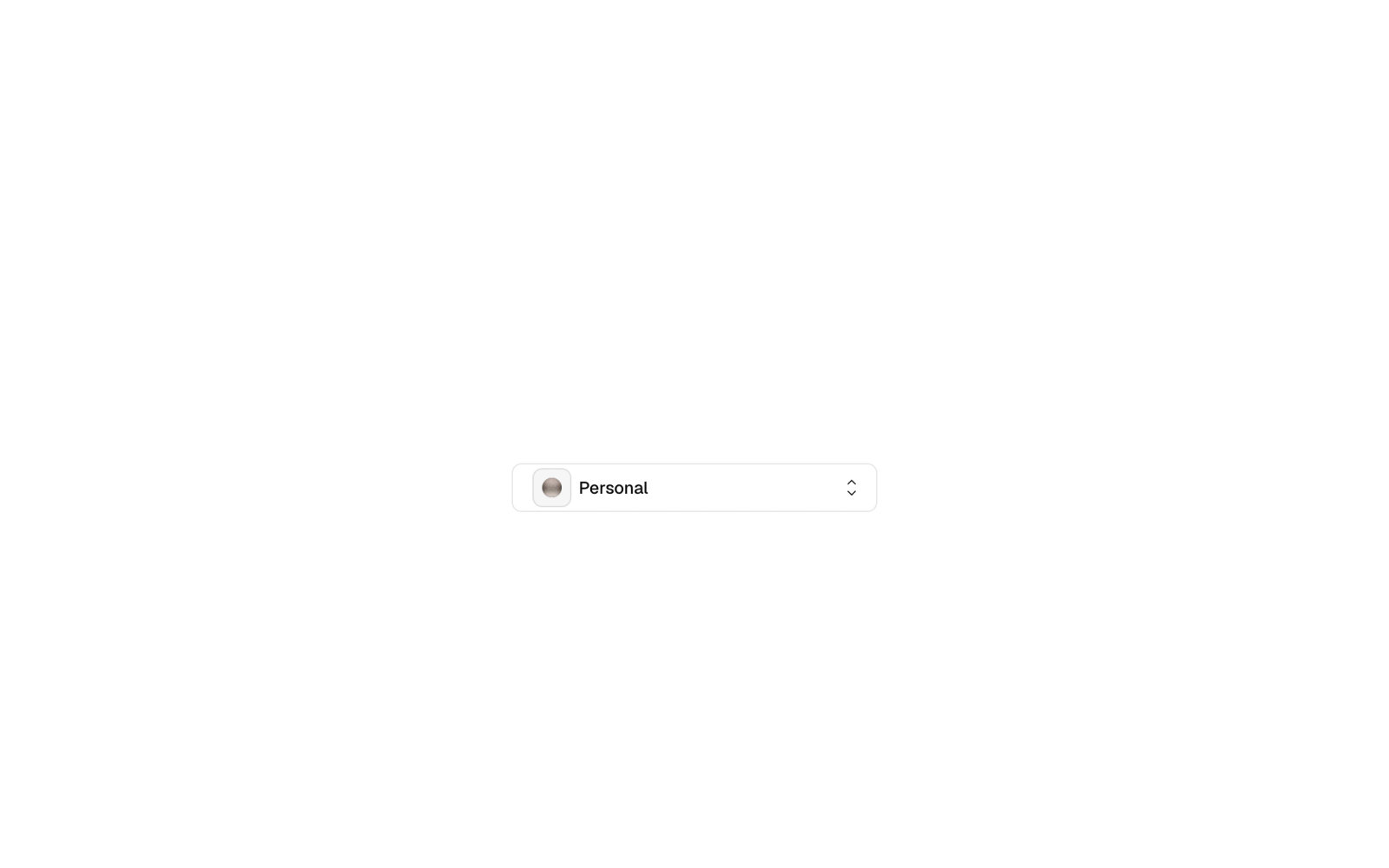
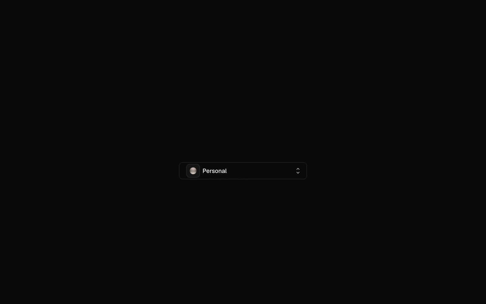
Team switcher dropdown: an outline button showing the current team with avatar and badge opens a menu of grouped radio items with descriptions and an optional create item. Controlled or uncontrolled.