All Hero components
Every Hero component side by side, with a picture and description of each. Open one for its preview, API and install.
5 components, A to Z.
Centered Hero
centered-hero
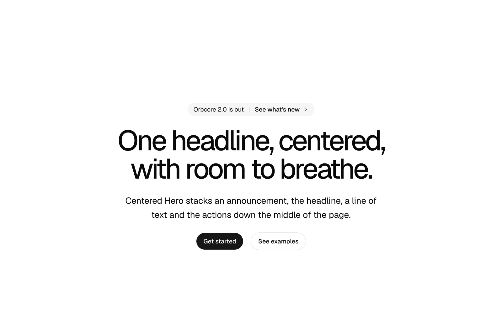
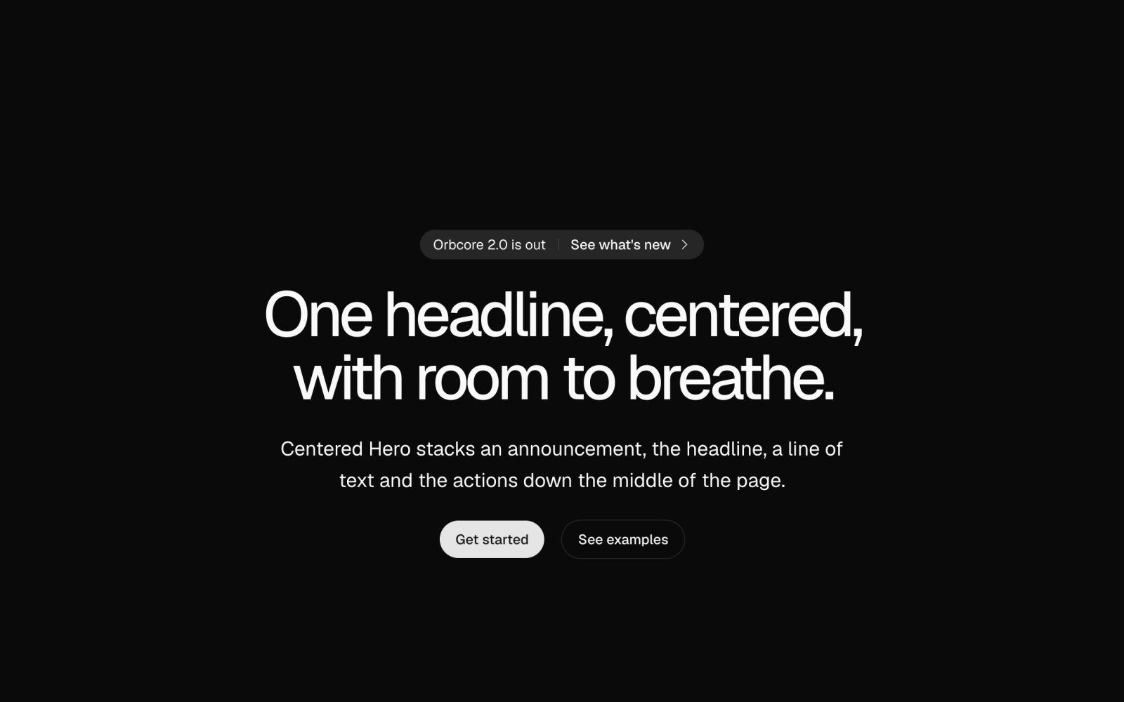
Centered hero section composition for landing pages: an optional Announcement pill, headline, description and link buttons, the first filled and the rest outline. Takes an optional background and an h1 or h2 level.
Hero
hero
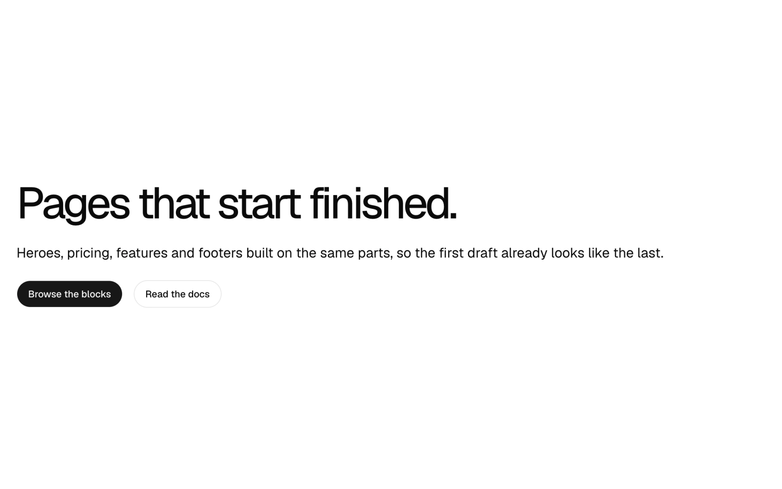
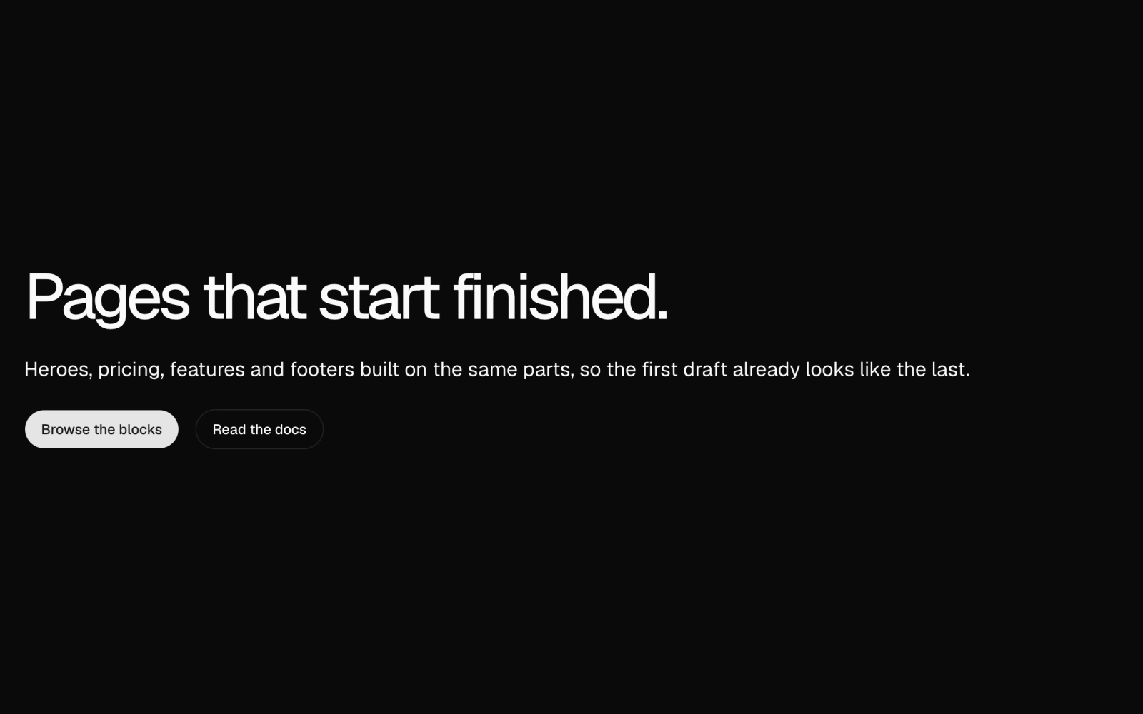
Hero section components for landing pages: a full-height hero container, background layer for images, scenes or gradients, centered or split layouts, and slots for headline, subtitle, CTA buttons and media.
Magazine Cover
magazine-cover
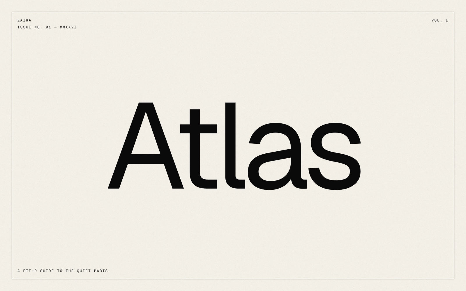
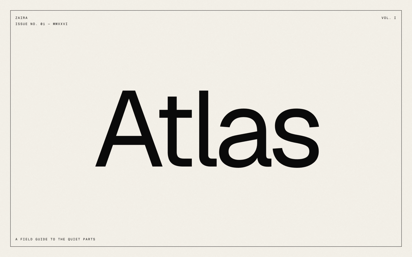
Magazine cover hero: a full-screen cover on cream paper with grain, an inset hairline frame, monospace corner text for masthead, issue and tagline, and an oversized centered title. Art goes underneath.
Poster Hero
poster-hero
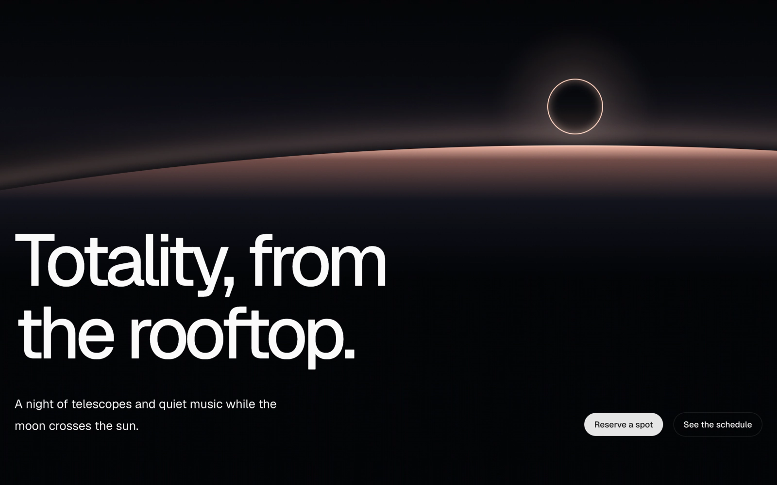
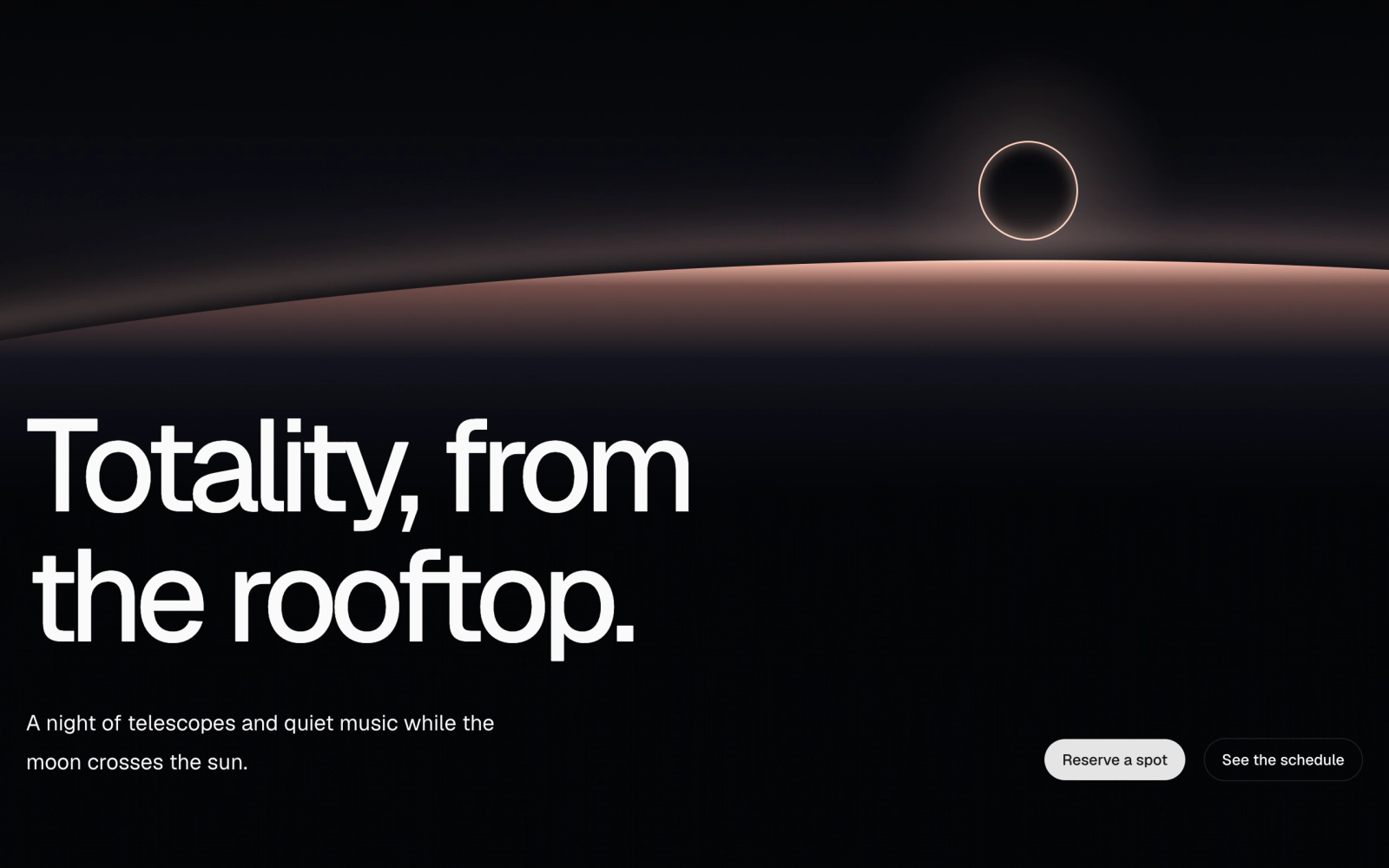
Poster hero with a bottom-anchored layout: a large headline above a footer row that holds the description on one side and link buttons on the other. Pass any background behind it.
Split Hero
split-hero
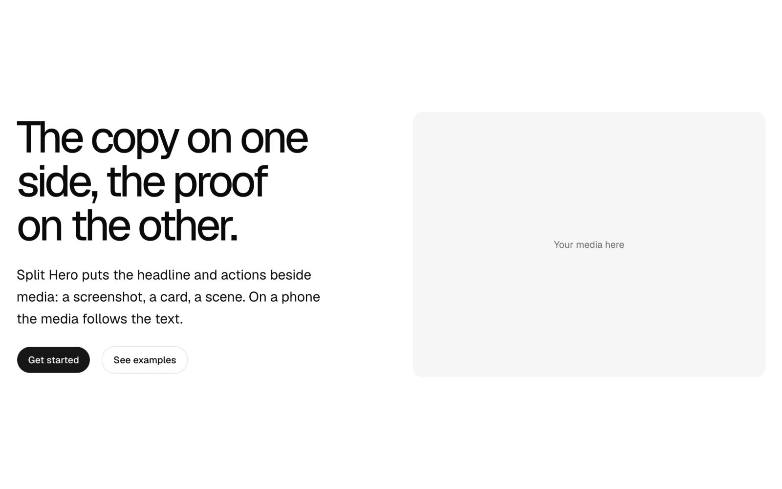
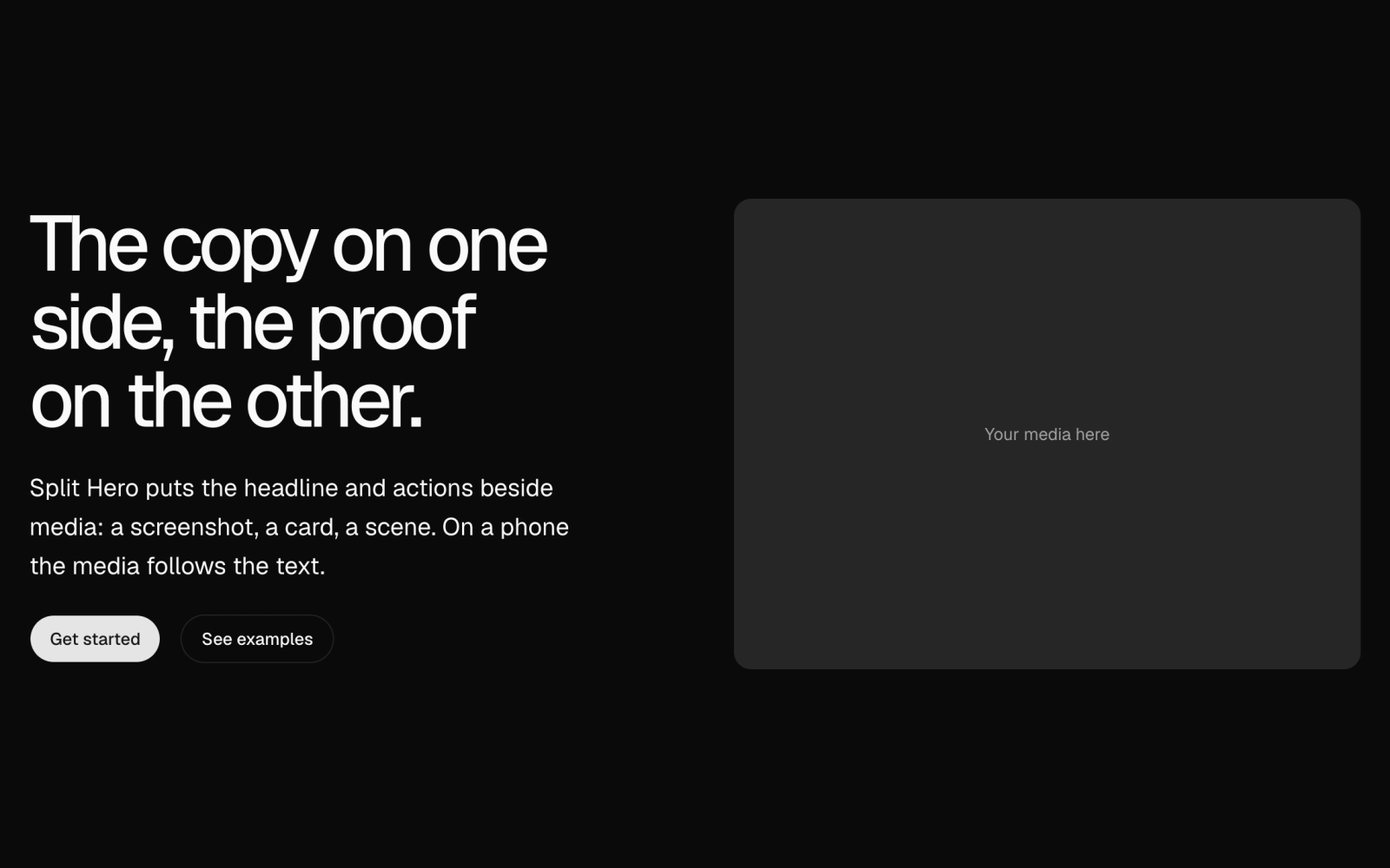
Split hero section: a two-column Hero with announcement, headline, description and buttons beside a media slot. A flip option puts the media first on wide screens; optional background.