Editorial
Editorial components: compare
Every Editorial component side by side: whether it follows the theme or stays dark, how many parts and custom props it has, and whether it is free. Open one for its preview, API and install.
Compare
| Component | Theme | Parts | Custom props | Access |
|---|---|---|---|---|
| Announcement | Light and dark | 3 | 0 | Free |
| App Timeline | Light and dark | 7 | 0 | Free |
| Eyebrow | Light and dark | 1 | 1 | Free |
| Faq List | Light and dark | 4 | 2 | Free |
| Features | Light and dark | 4 | 4 | Free |
| Heading | Light and dark | 1 | 1 | Free |
| Logo | Light and dark | 2 | 5 | Free |
| Milestones | Light and dark | 9 | 4 | Free |
| Person | Light and dark | 7 | 5 | Licensed |
| Post | Light and dark | 10 | 4 | Free |
| Pricing | Light and dark | 16 | 7 | Free |
| Pricing Toggle | Light and dark | 2 | 3 | Free |
| Quote | Light and dark | 8 | 4 | Free |
| Section | Light and dark | 8 | 12 | Free |
| Stats | Light and dark | 4 | 3 | Free |
All Editorial components
15 components, A to Z.
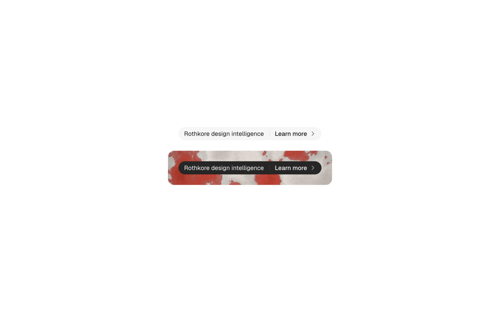
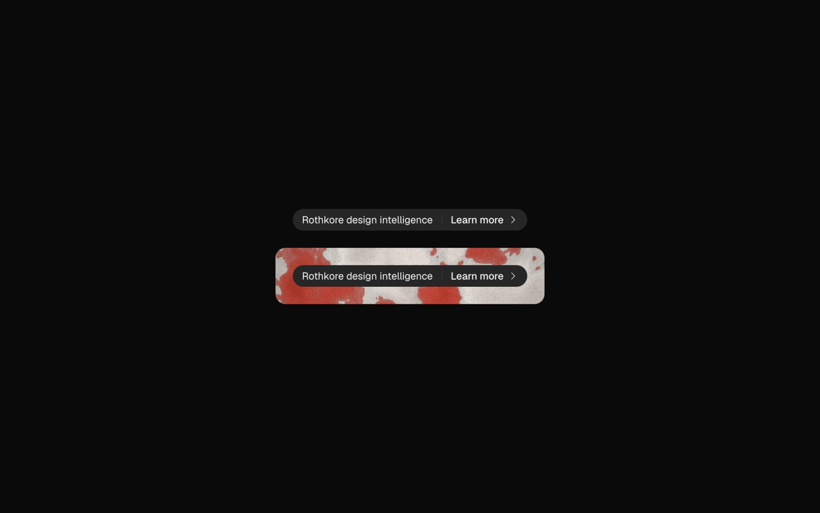 AnnouncementFreeNews pill link built on the secondary Badge, with a headline that truncates first and a Learn more action set off by a short vertical Separator. Renders an anchor through Base UI useRender.
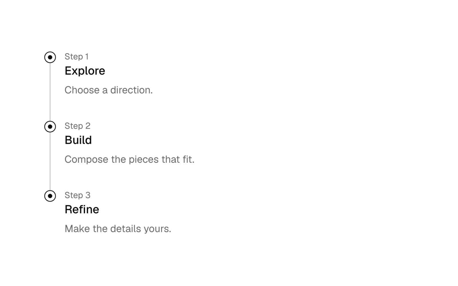
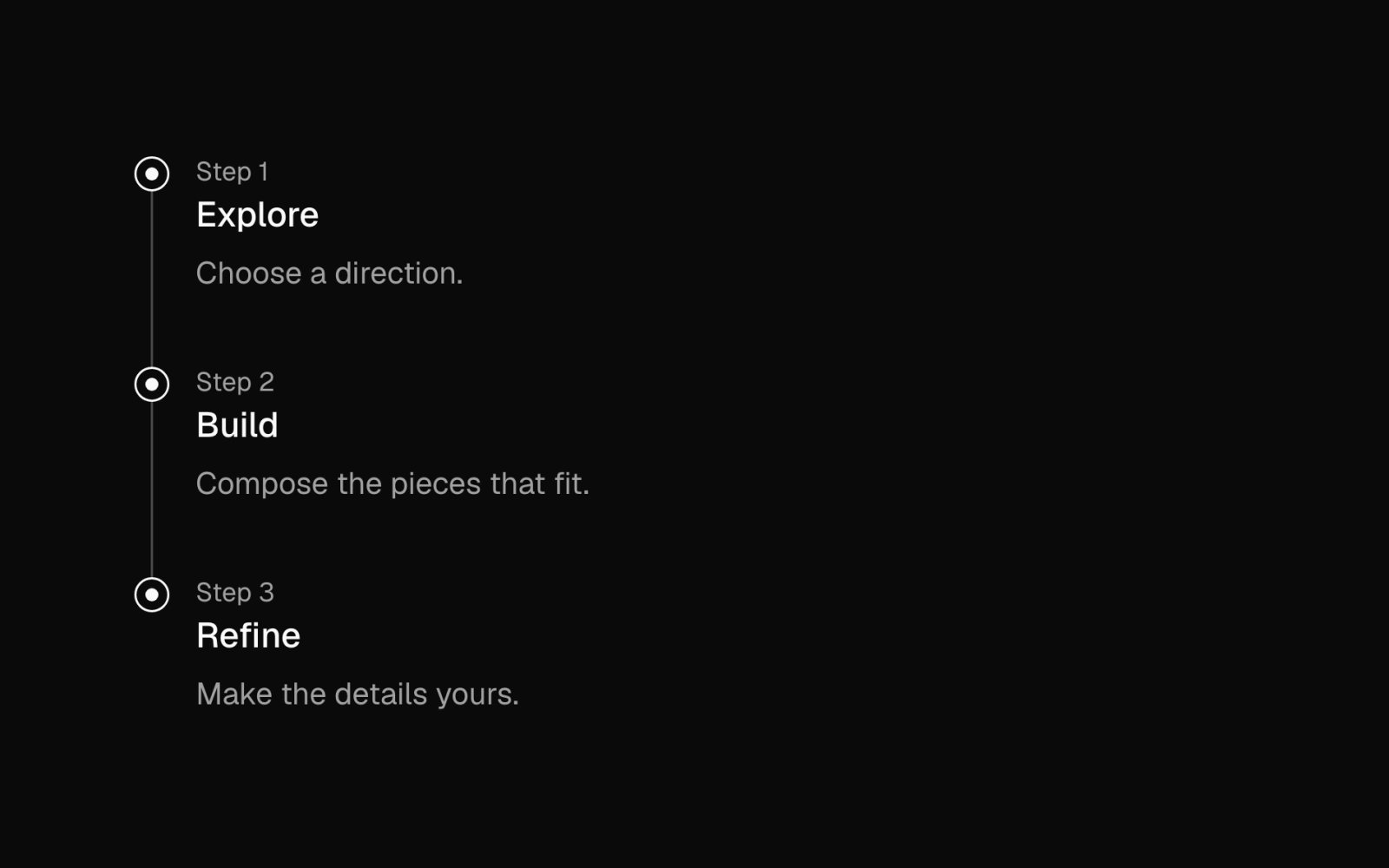 App TimelineFreeVertical timeline as an ordered list: a ring-and-dot indicator or custom mark per item, a 1px rail joining them, title, description and small label. CSS variables tune dot size and alignment.
 EyebrowFreeShort label set above a heading. Default is 12px uppercase Geist Mono with wide tracking in muted ink; sans is a 14px semibold line in sentence case. Pulls in the Geist Mono font item.
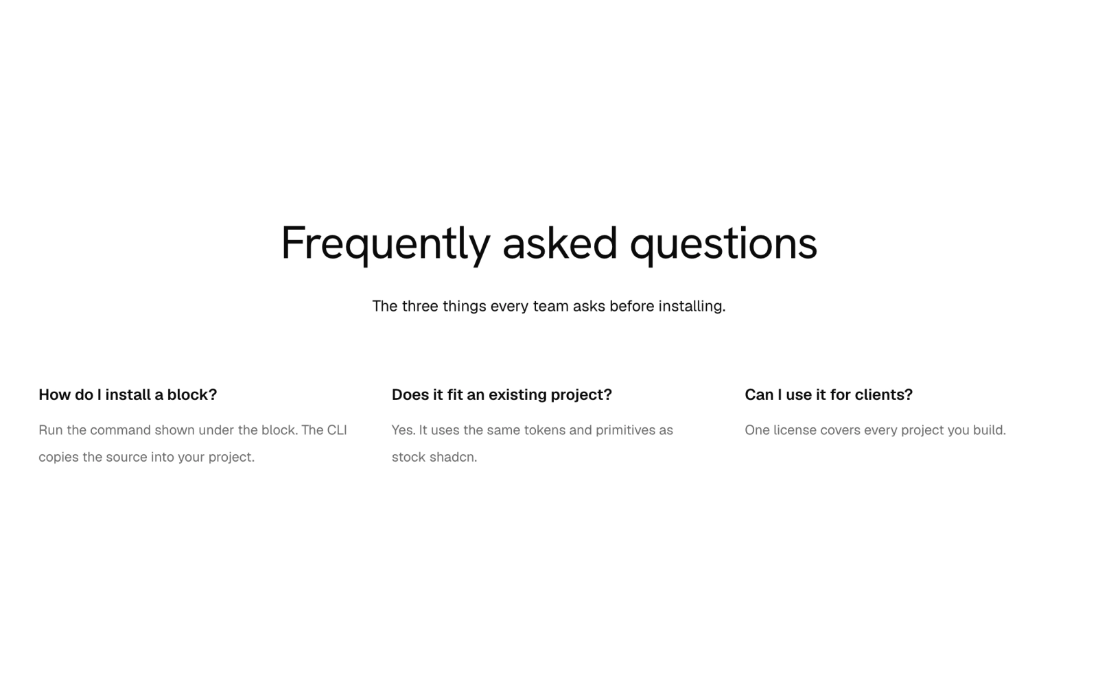
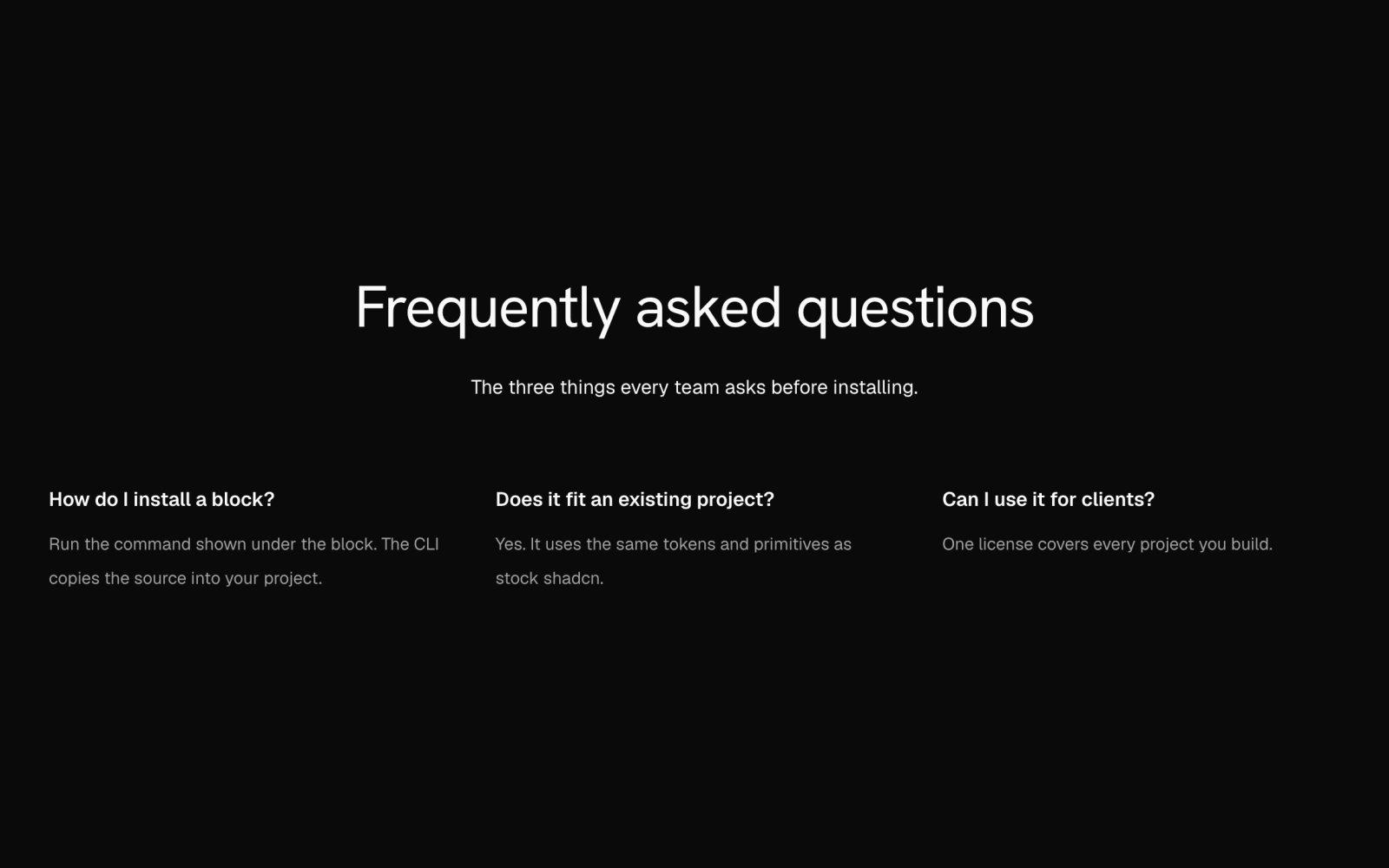 Faq ListFreeAlways-open FAQ as a description list on Grid. Stack sets question and answer pairs in up to three columns; split rules the pairs apart and sets each question beside its answer when wide.
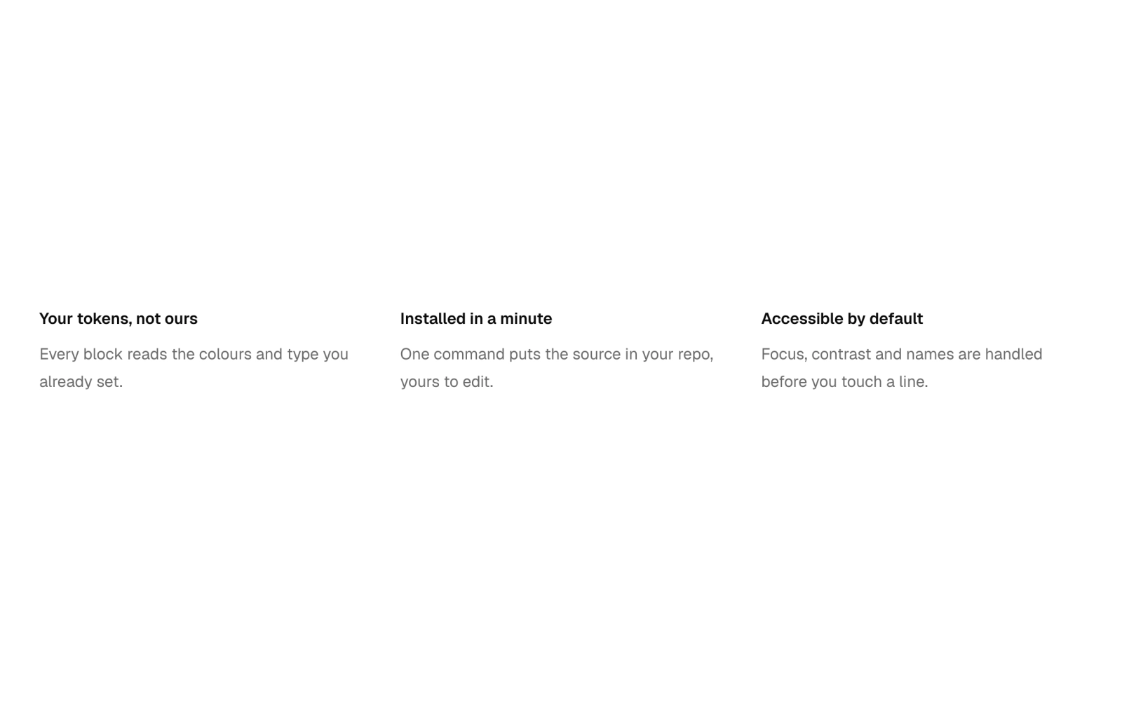
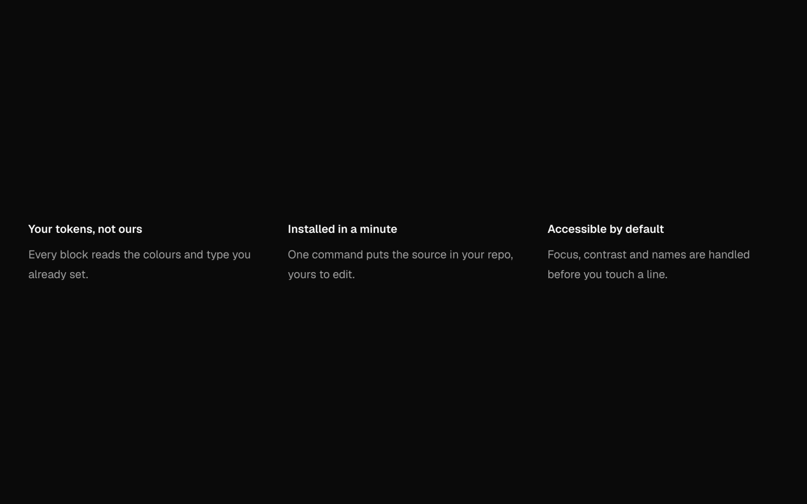 FeaturesFreeFeature list parts: a Grid rendered as a list in one to four columns or a divided single column, with feature, title and description parts and an outline item that rules its left edge.
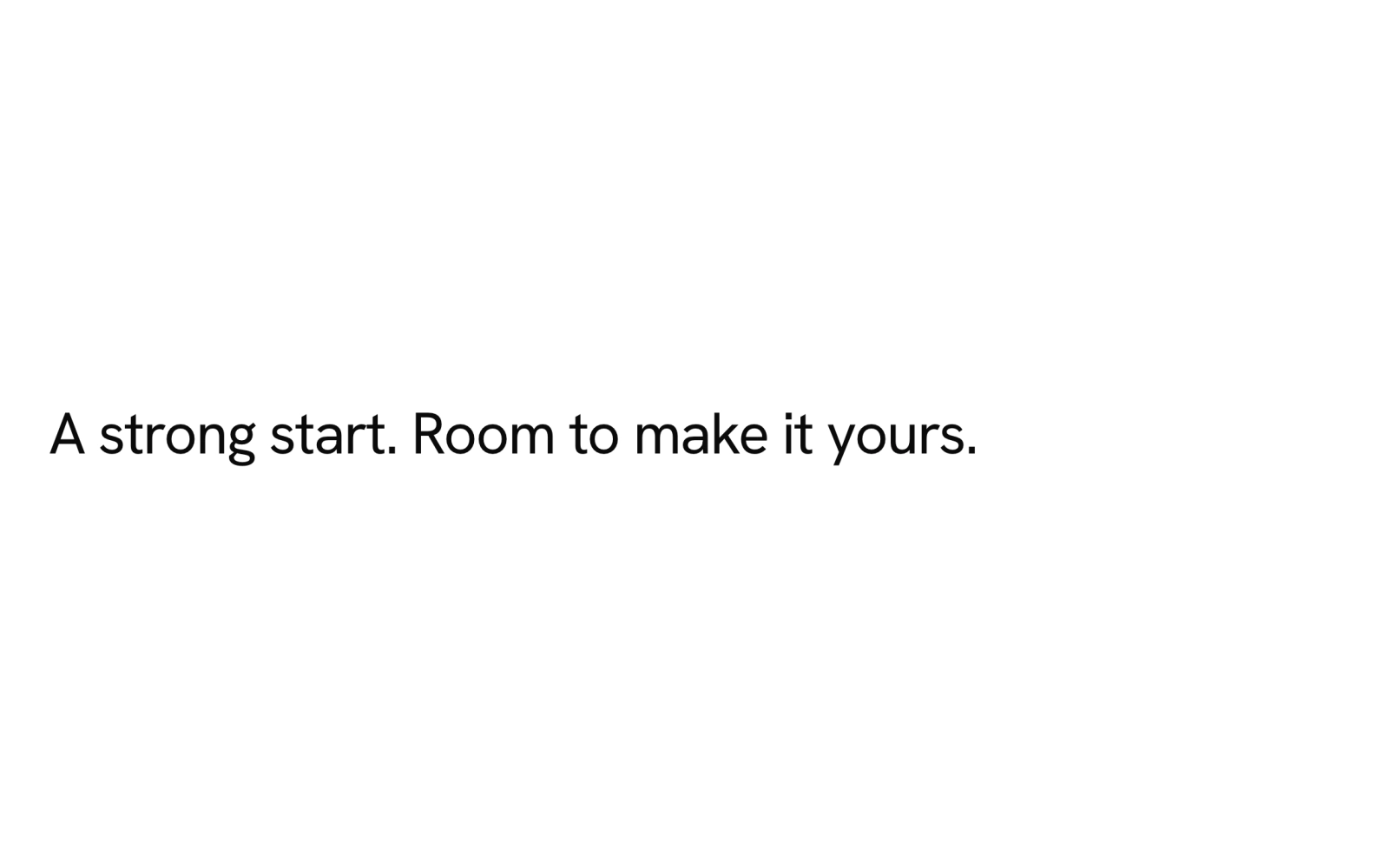
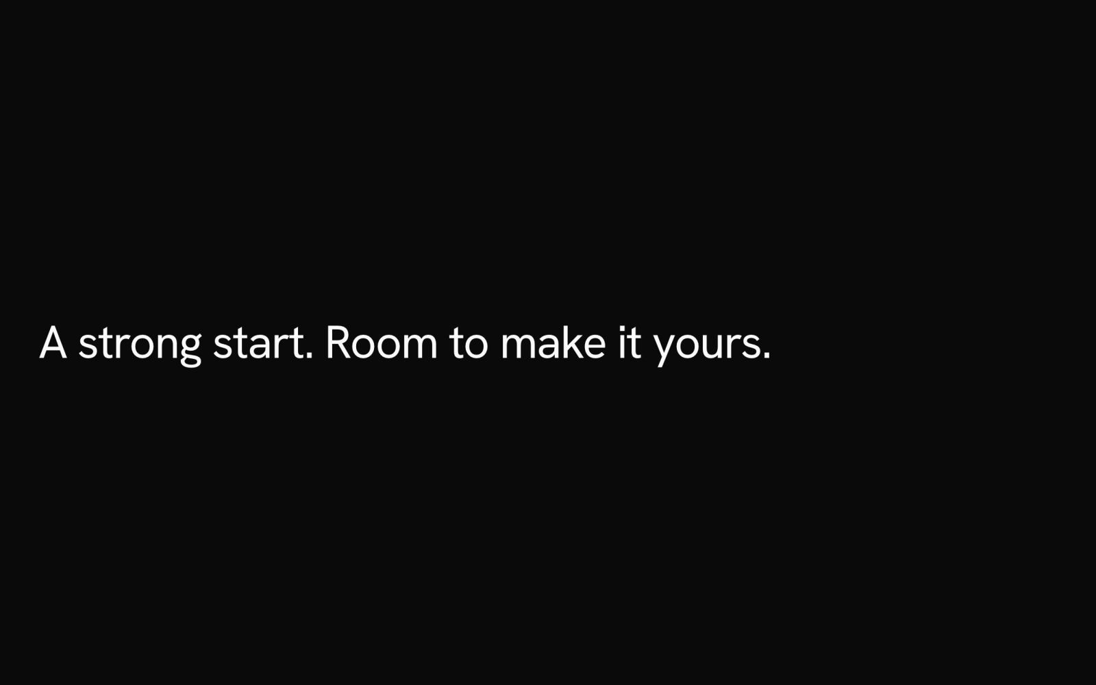 HeadingFreeSection heading in the display face, Hanken Grotesk through the --font-display variable, at four sizes that step up with the Section container. Renders an h2 by default; the tag can be swapped.
 LogoFreeLogo cloud parts: a labelled list laid out as a centred grid, a single wrapping baseline, two columns or muted tiles. Each logo takes an img, svg or text wordmark at three sizes, with a greyscale muted variant.
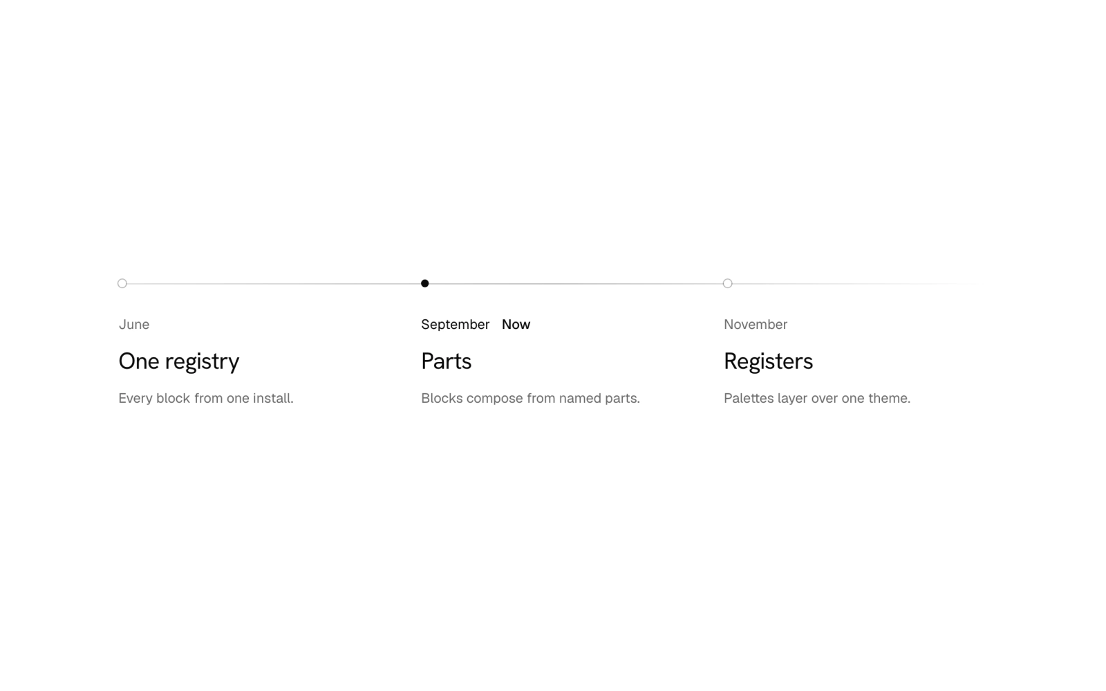
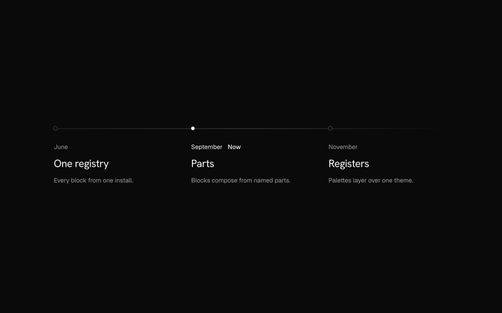 MilestonesFreeRoadmap or company history as an ordered list on Grid, in grid or rows layout. Rules can be off, a top border per item, or one fading horizon line with dots; the current milestone's dot is filled.
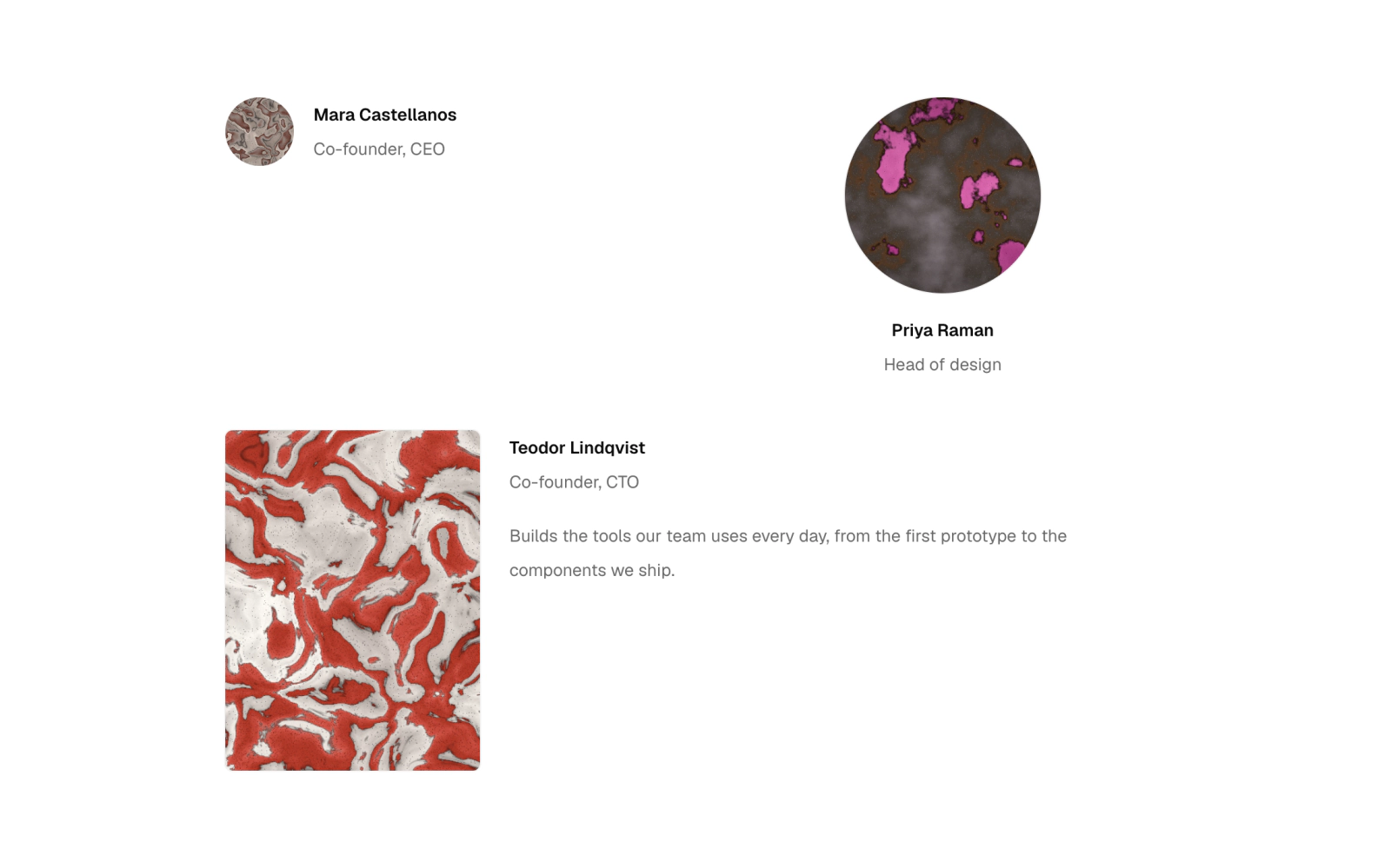
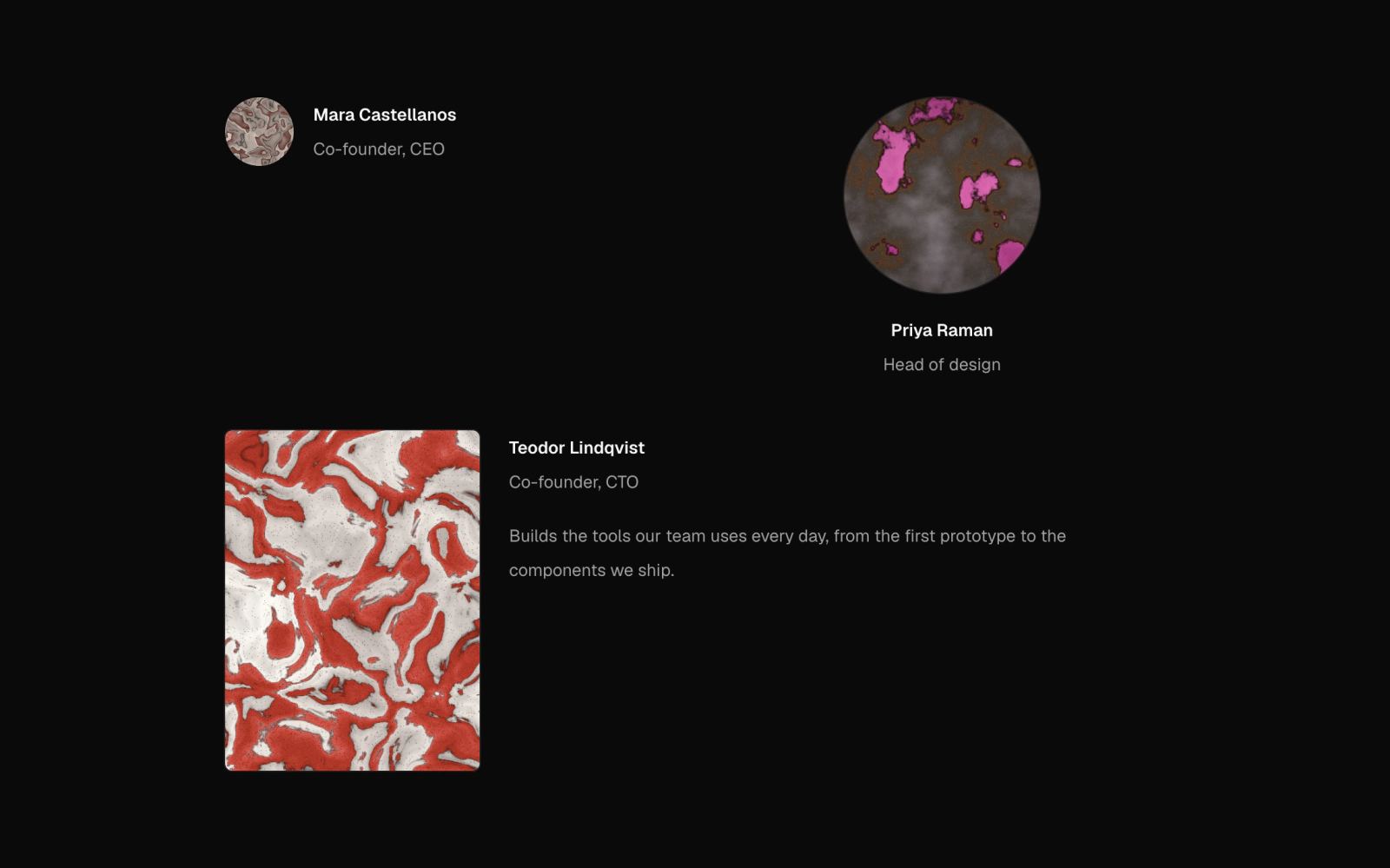 PersonLicensedCredit for a person built on Item, Avatar and Media: row, stack or profile layouts with an avatar or portrait, name, role and bio. Byline density credits one person; dense suits member lists.
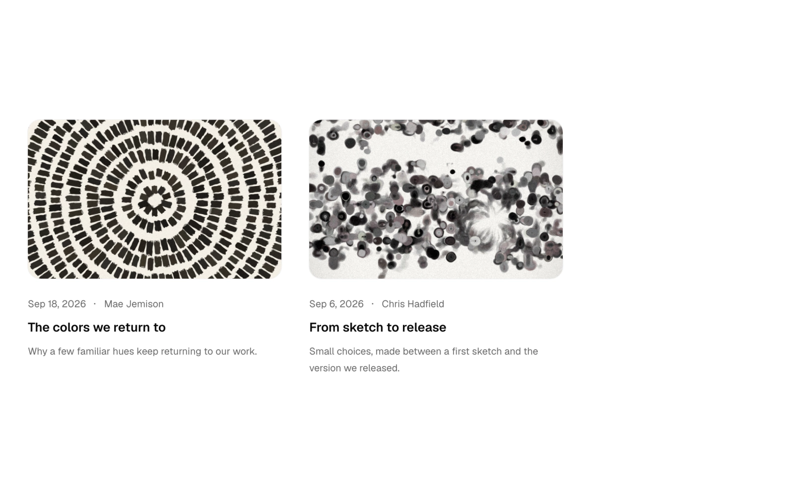
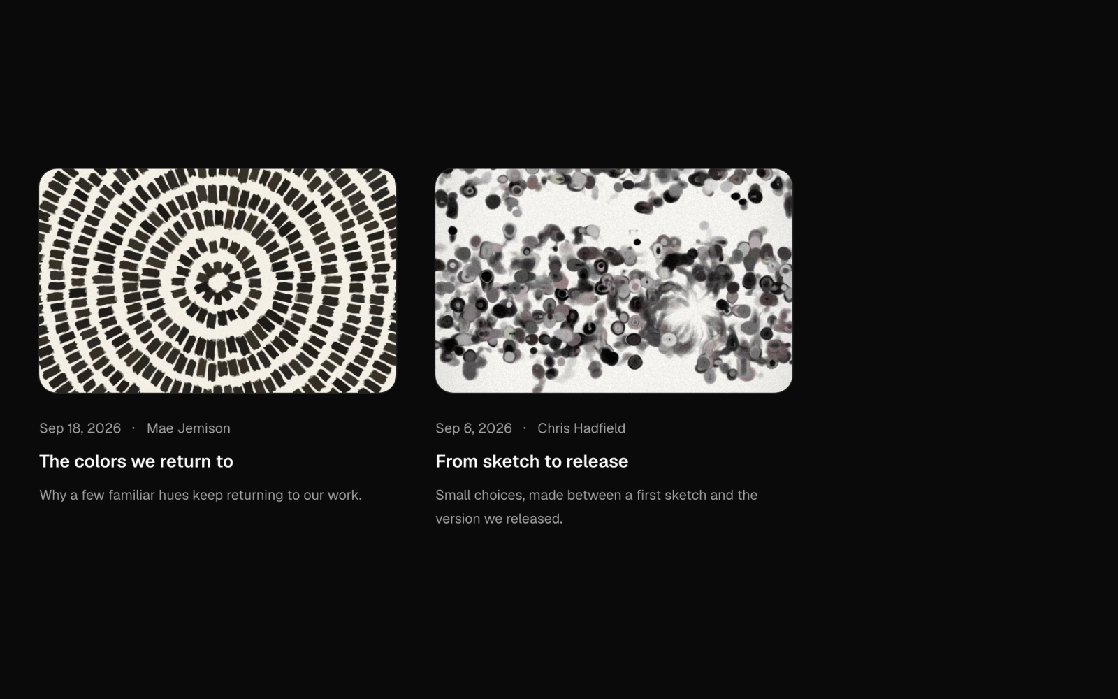 PostFreeBlog post listing parts: a Grid list or divided column of posts, each made fully clickable by its title link, with cover media, dotted meta for date, category and author, title and clamped excerpt.
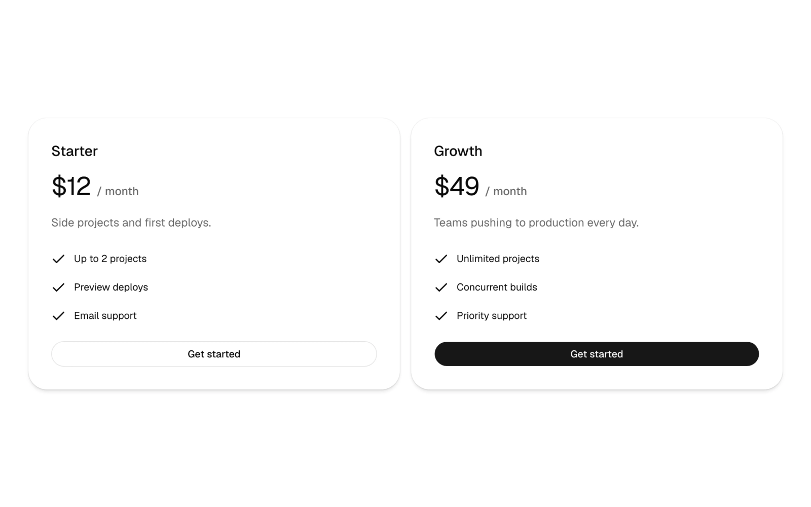
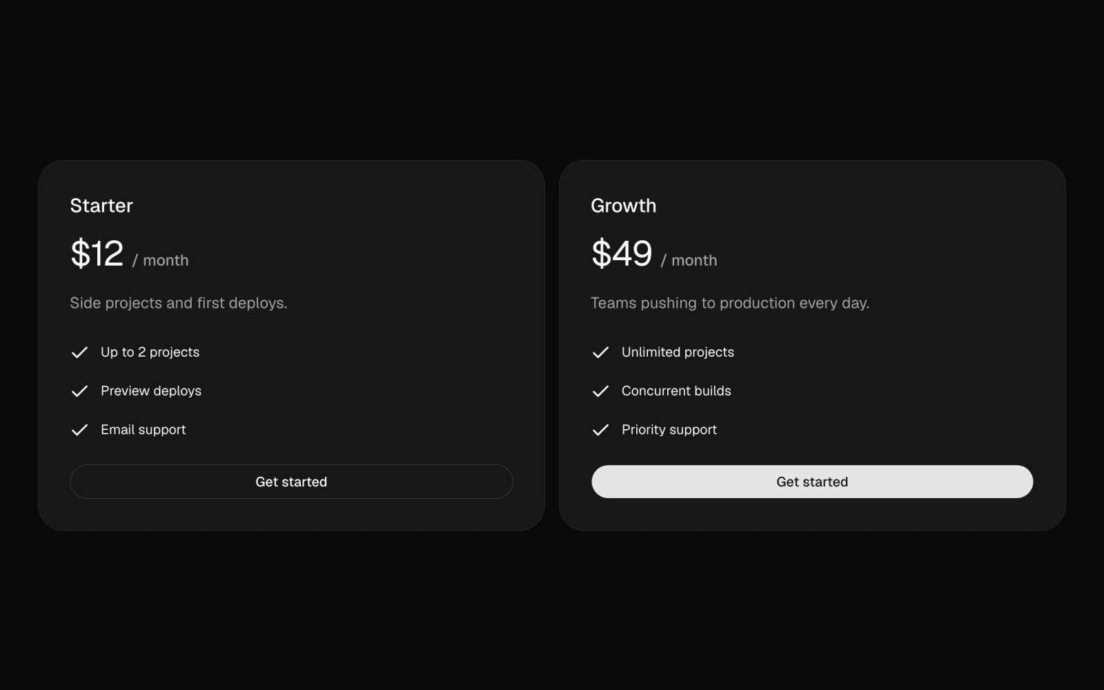 PricingFreePricing card grid on the stock Card, using subgrid rows so titles, prices, descriptions and features align across plans. Gapped cards or a cells plate with hairline gaps; featured is a styling hook.
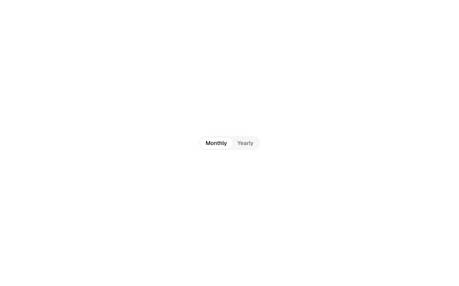
 Pricing ToggleFreeBilling period switch, such as monthly and yearly, built on the stock Tabs list. A controlled client component that takes a typed value and a change handler.
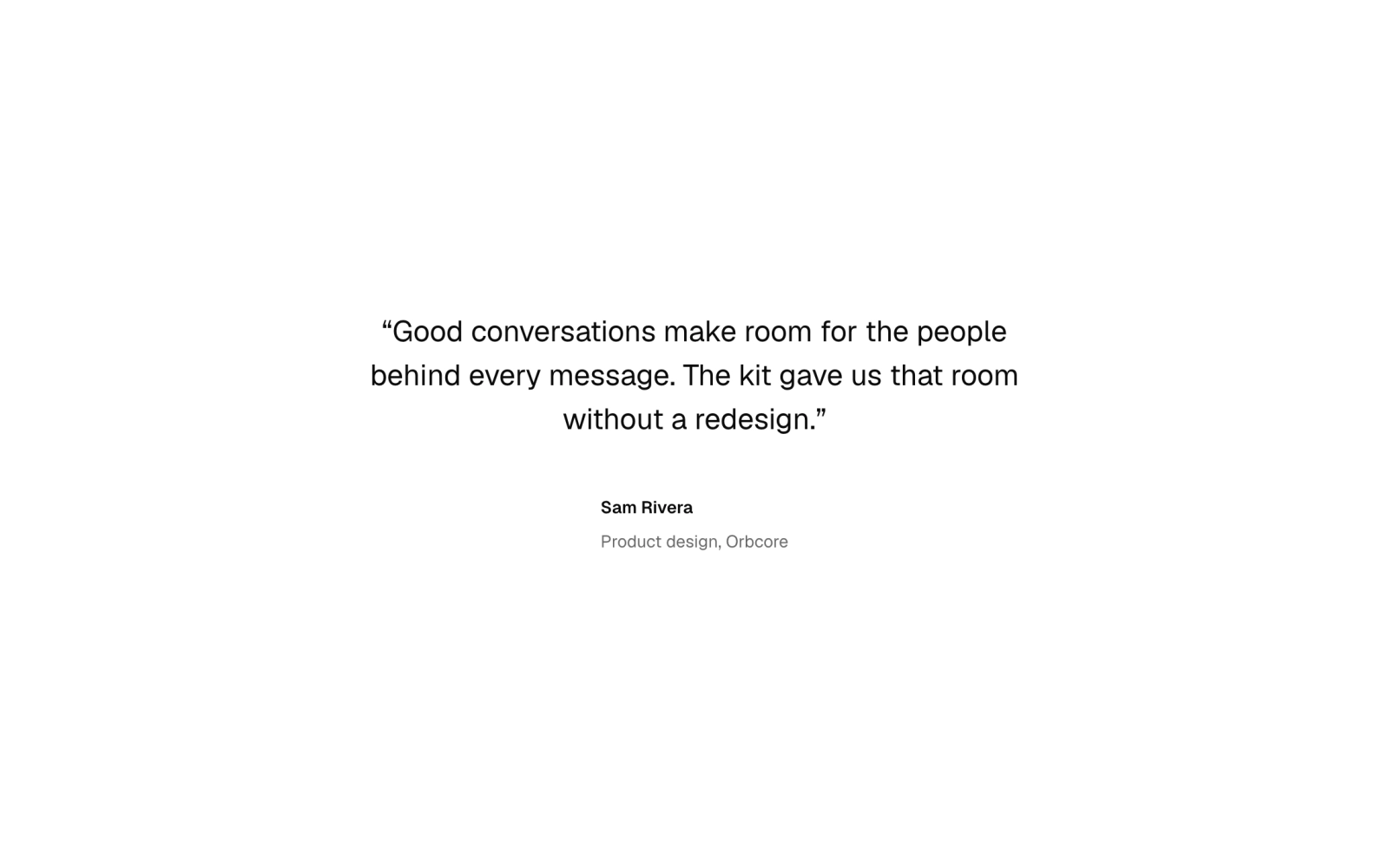
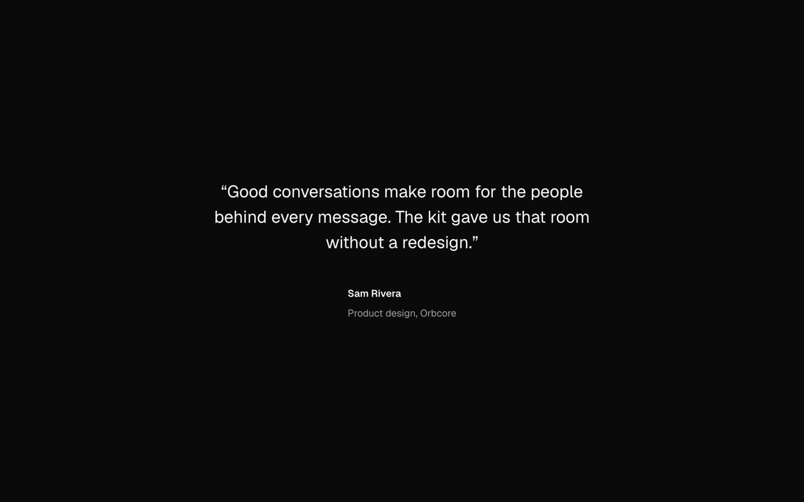 QuoteFreeTestimonial parts: a grid, divided or masonry group whose one to four columns step on a parent Section; figures in default, centred or muted tile style; quotes in four sizes with a byline.
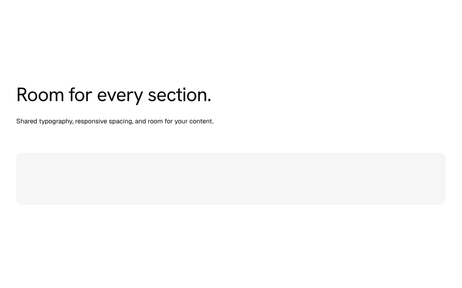
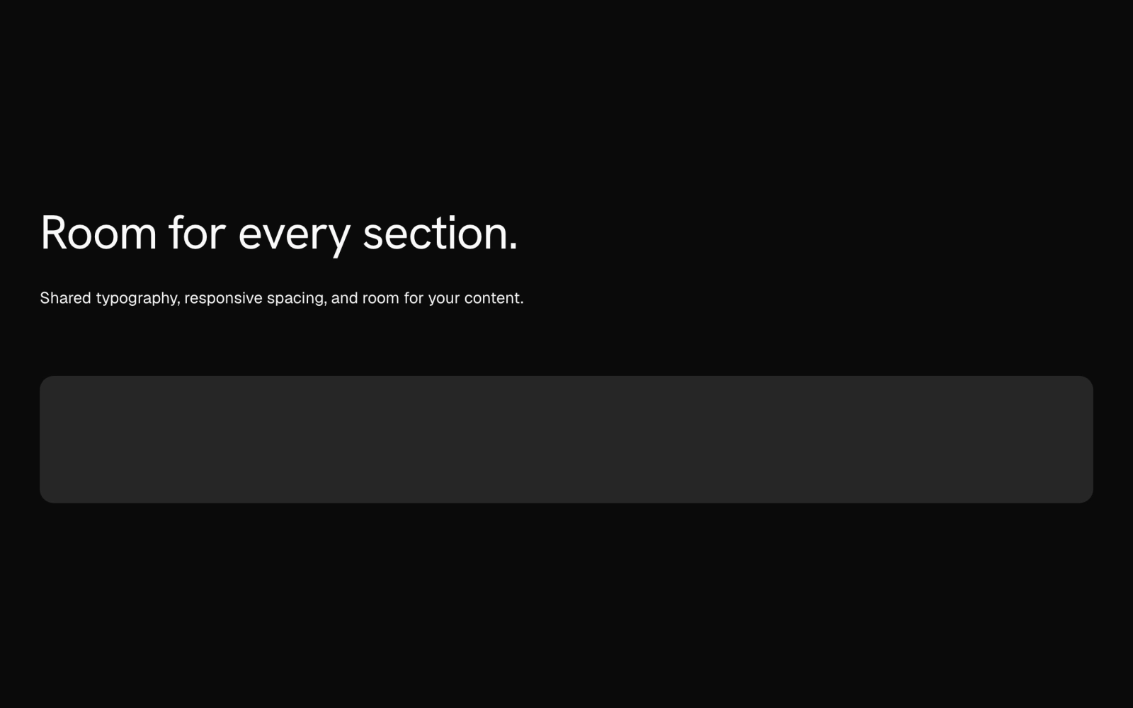 SectionFreePage section frame: a container-query band at three paddings around a centred 80rem column, with background, stack or split header, title group, description, width-capped content, columns and actions.
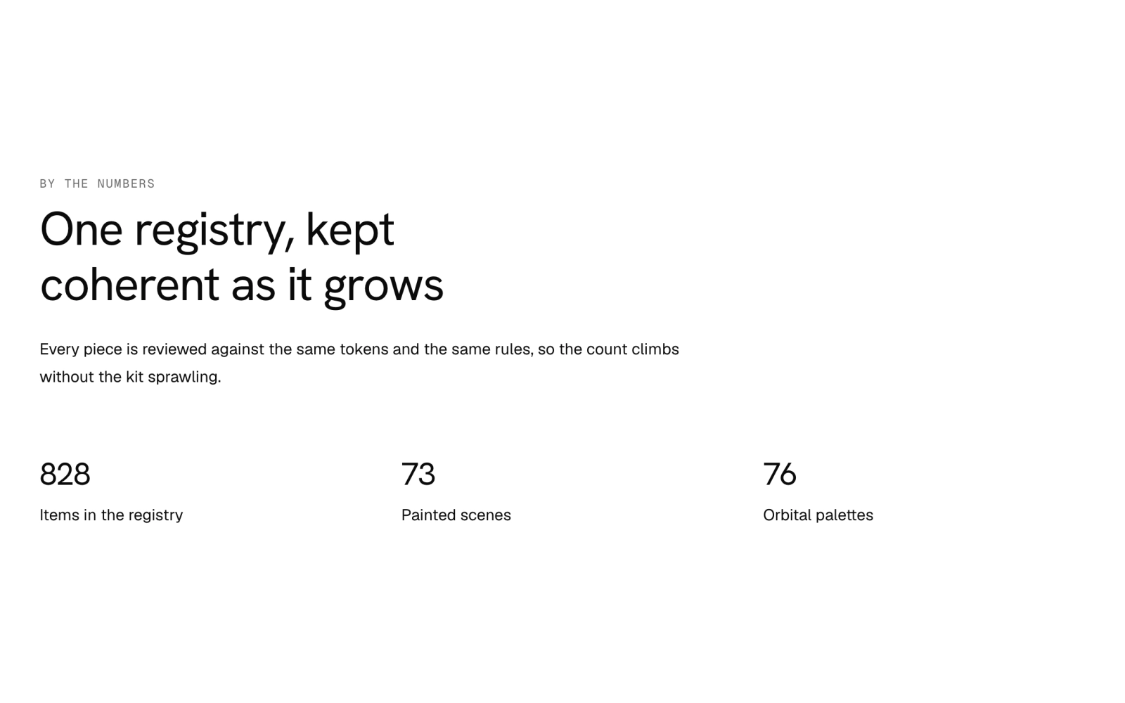
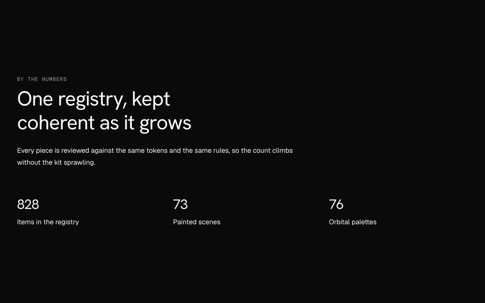 StatsFreeStatistic list on Grid: each stat pairs a large value in the Hanken Grotesk display face with a label, shown plain, on a filled card panel, or with a rule down its left side.
Celestograph Plate
A Celestograph plate that fills a sized container, in emulsion or amber chemistry or your own color anchors. Fresh, developed and ruined presets set its age and opacity, so the ground behind shows through.
Announcement
News pill link built on the secondary Badge, with a headline that truncates first and a Learn more action set off by a short vertical Separator. Renders an anchor through Base UI useRender.