Button
Button components: compare
Every Button component side by side: whether it follows the theme or stays dark, how many parts and custom props it has, and whether it is free. Open one for its preview, API and install.
Compare
| Component | Theme | Parts | Custom props | Access |
|---|---|---|---|---|
| Cloud Dancer Switch | Light and dark | 1 | 1 | Free |
| Frosted Button | Dark only | 1 | 2 | Free |
| Menu Button | Light and dark | 1 | 4 | Free |
| Sphere Button | Light and dark | 1 | 4 | Licensed |
| Thermal Button | Dark only | 1 | 2 | Licensed |
All Button components
5 components, A to Z.
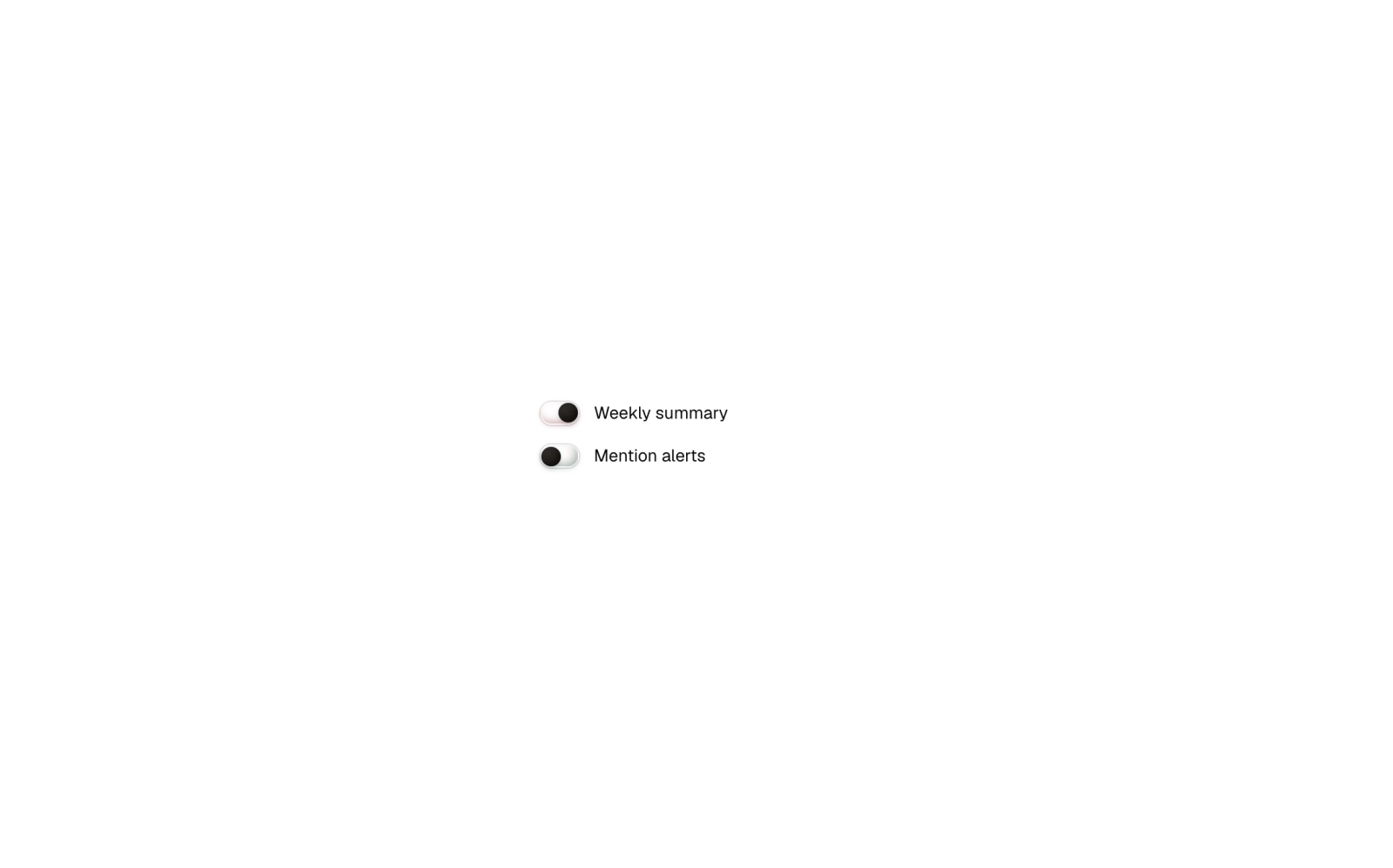
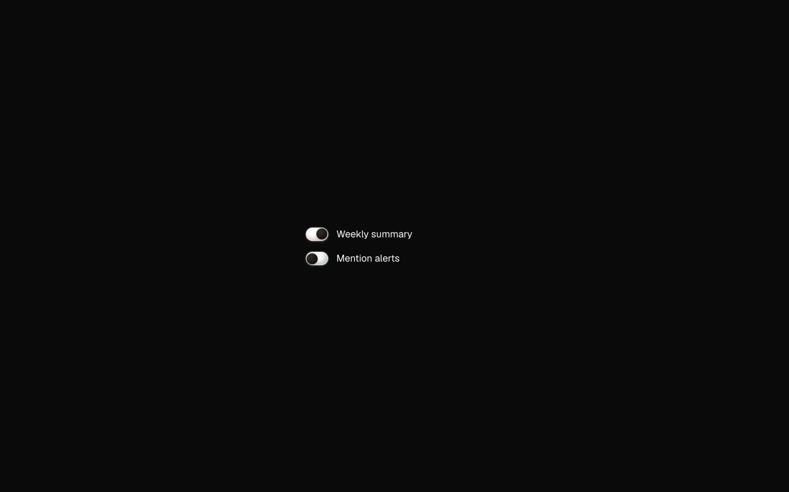 Cloud Dancer SwitchFreeA Base UI switch with a cream pill groove shaded teal that warms to rose when checked, and a dark void orb for a thumb. Default and small sizes, client component.
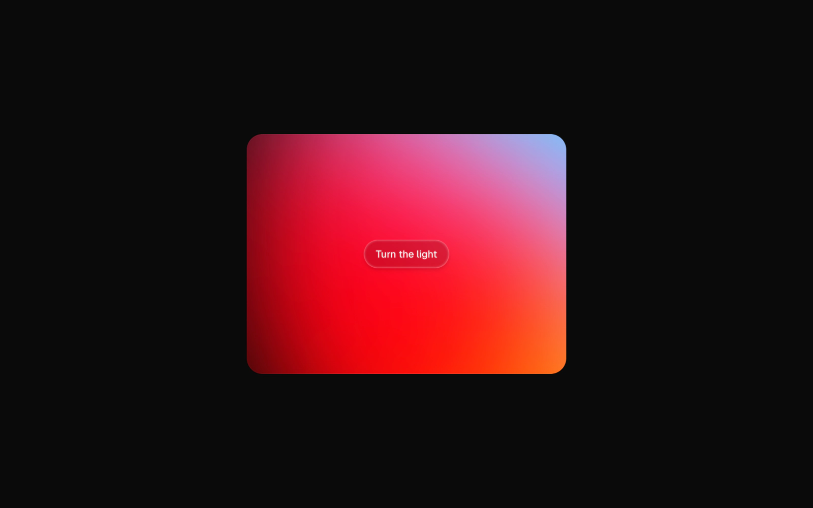
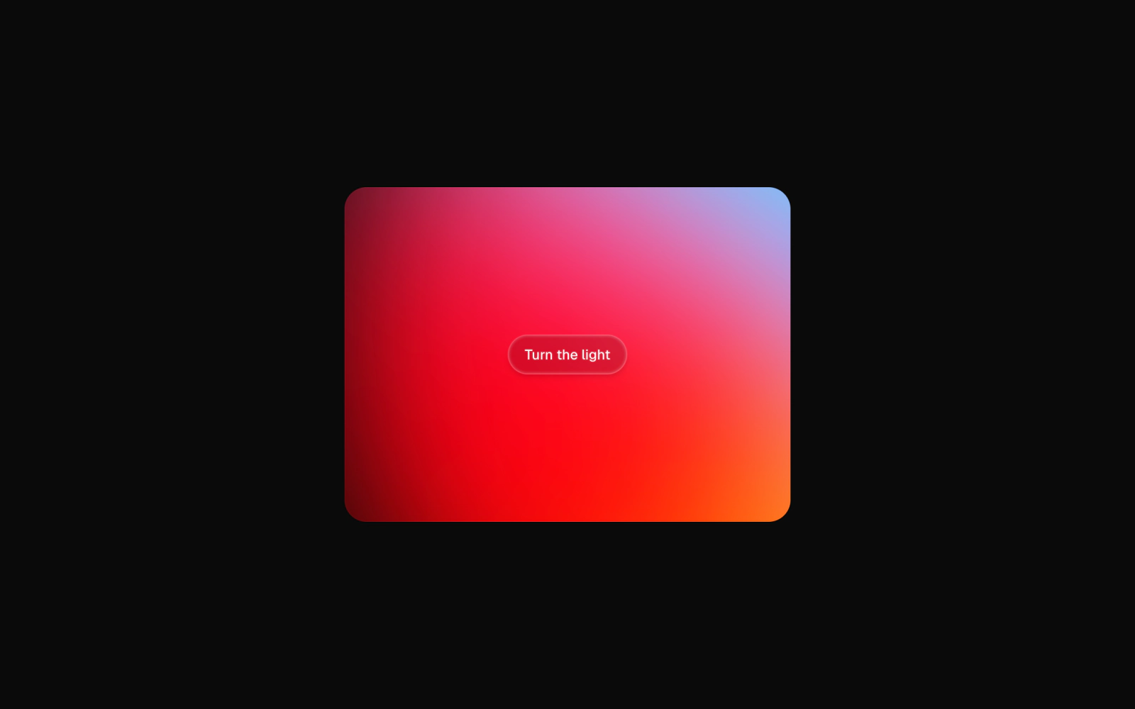 Frosted ButtonFreeA translucent Button for use over art: a blurred, faint background-tinted fill with a border and inner glow that follow currentColor. Needs a backdrop behind it for the blur to read.
 Menu ButtonFreeA hamburger icon Button that morphs into a close cross. The animation is driven entirely by aria-expanded, so the visual state and the screen-reader state stay in sync.
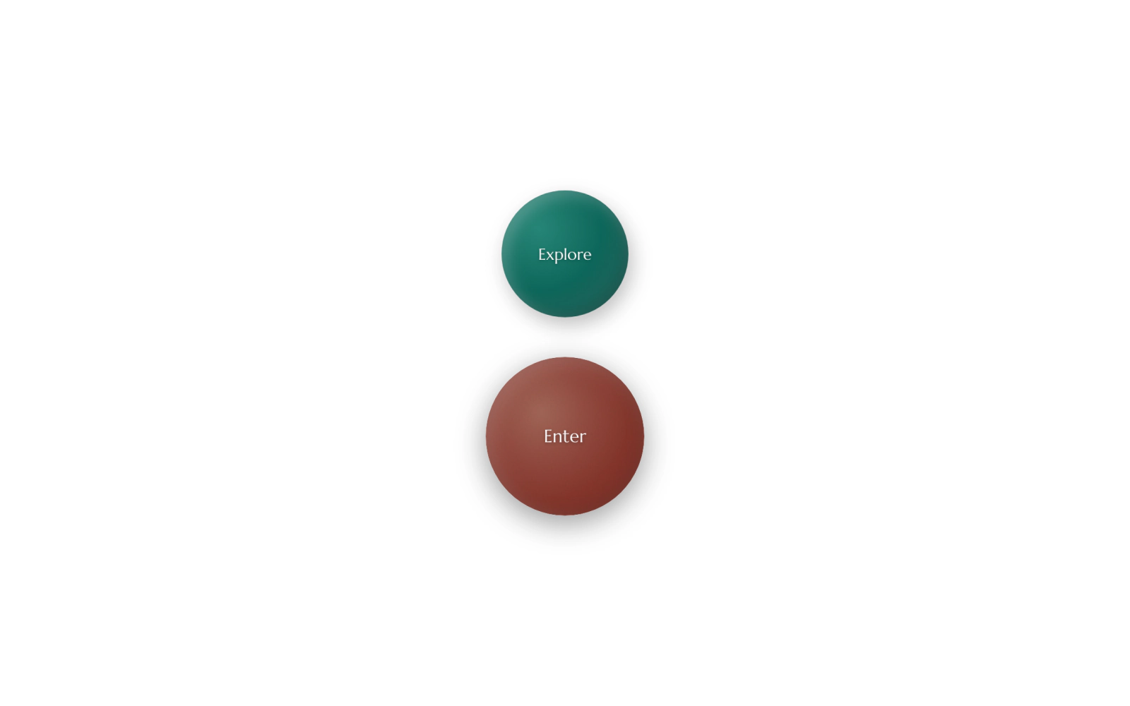
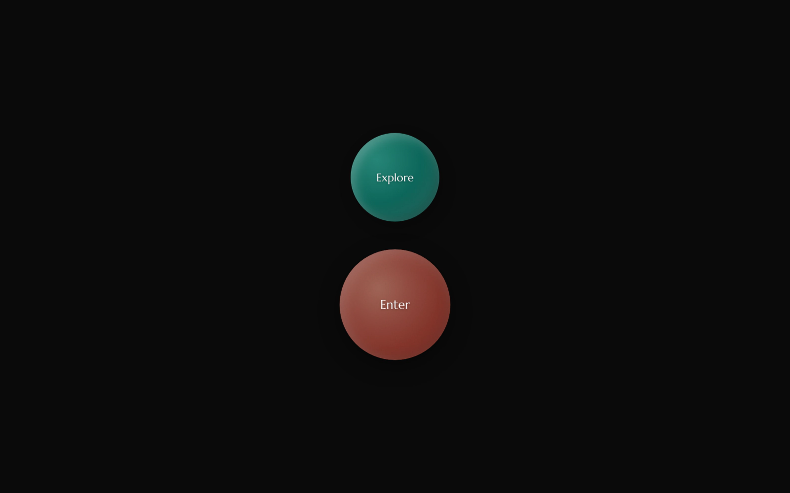 Sphere ButtonLicensedA round planetary button lit by a radial highlight and crescent inset shadows, in teal, blue and coral. A void variant opens a dark centre on hover; labels set in Marcellus.
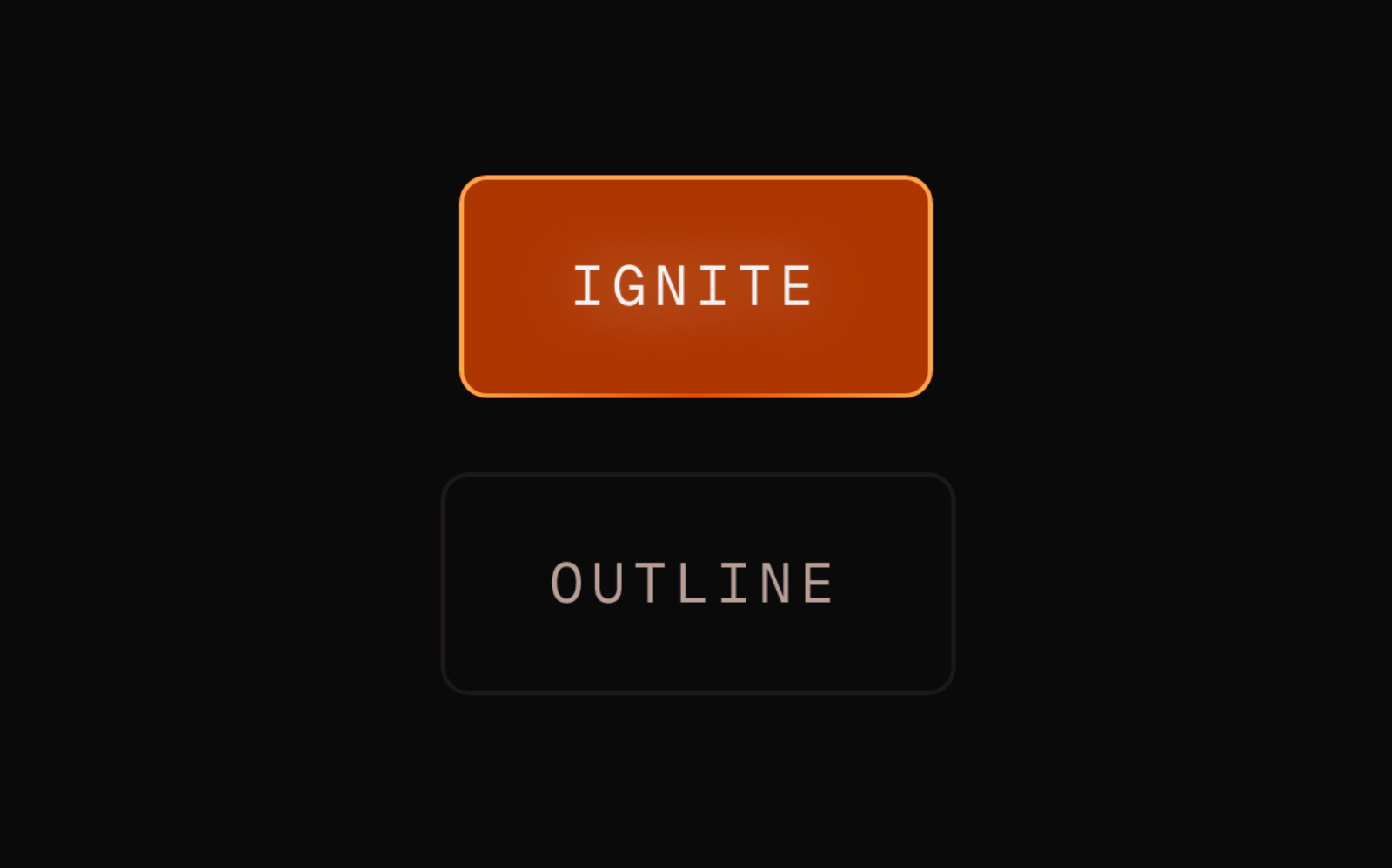
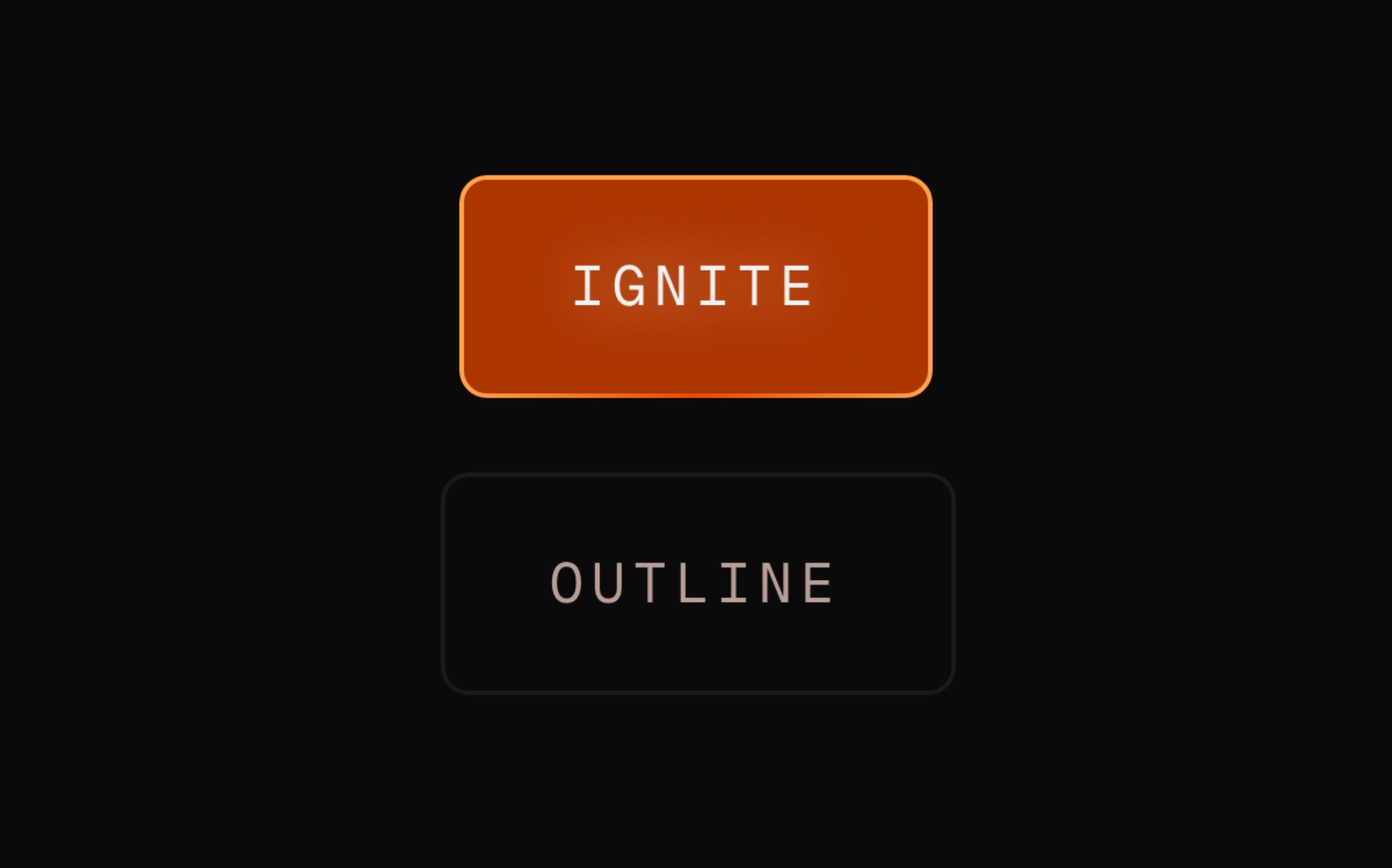 Thermal ButtonLicensedA dark mono-label button built on motion that heats on hover, flashes to ember on press and greys to ash when a Thermal Provider reports depletion. Pulse respects reduced motion.
Split Card
Rounded two-column card with copy on one side and a picture or scene on the other, stacking until the Section is 48rem wide. Flip swaps the sides and the hairline divider beside the media is optional.
Cloud Dancer Switch
A Base UI switch with a cream pill groove shaded teal that warms to rose when checked, and a dark void orb for a thumb. Default and small sizes, client component.