Tables blocks: compare
Every Tables block side by side, with a picture and description of each. Open one for its preview, props and install.
All Tables blocks
5 blocks, A to Z.
data-table
data-table
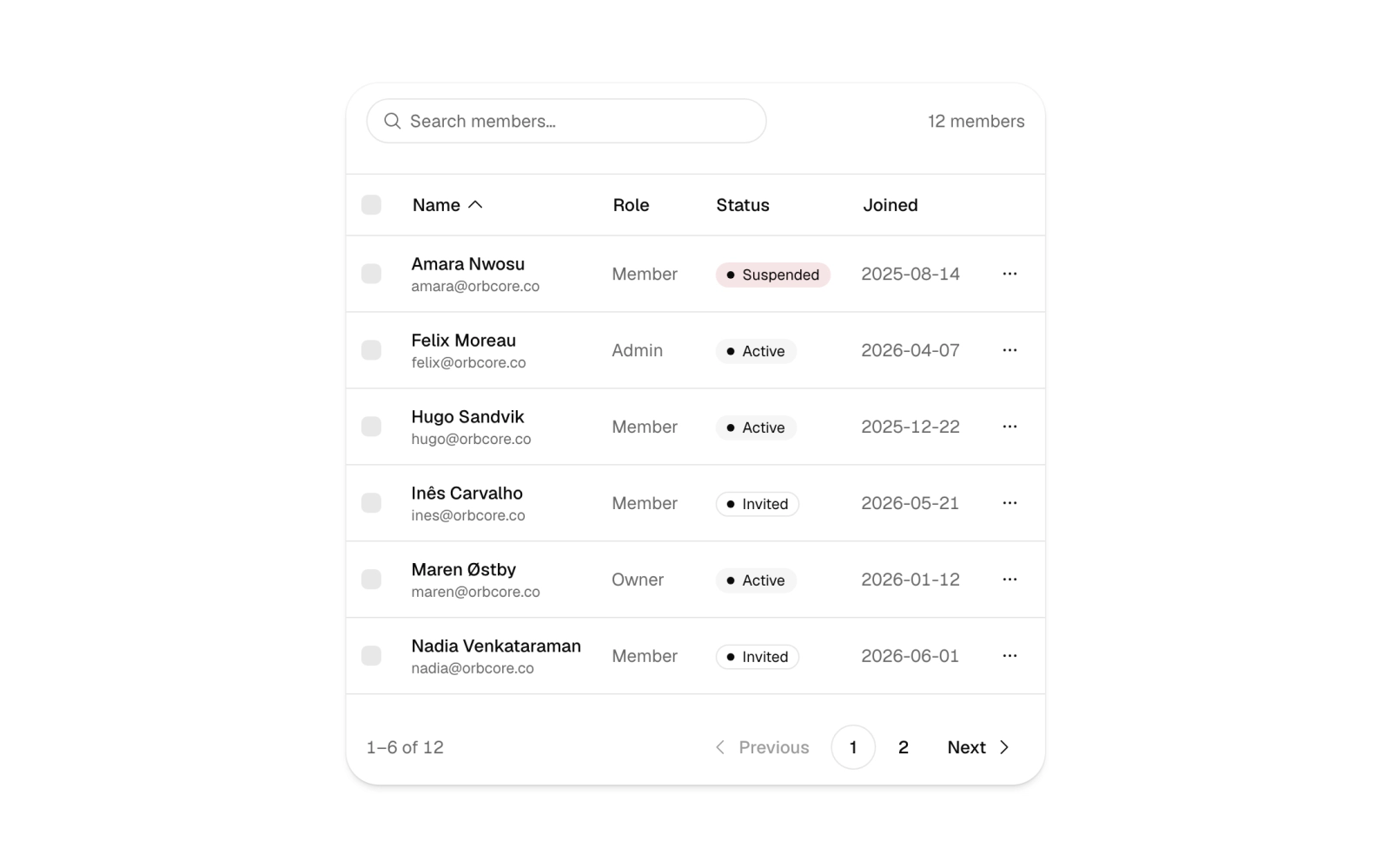
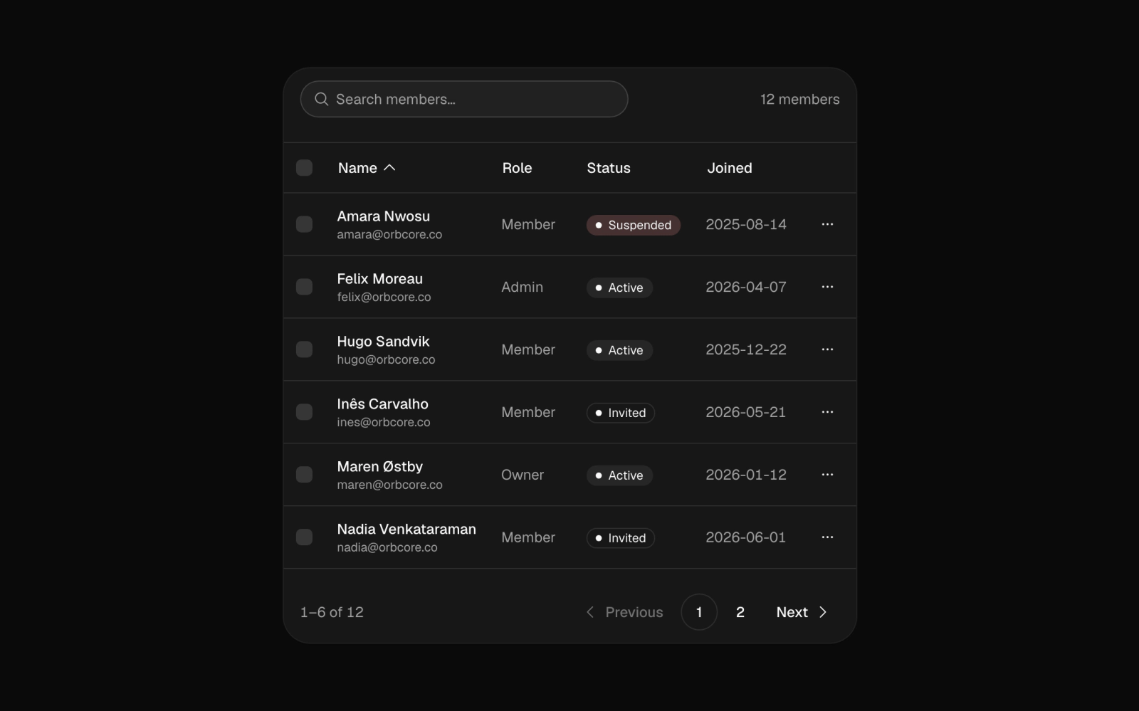
Members data table for admin panels with search, sortable name, role and joined columns, row and page checkboxes for bulk select, status badges, per-row action menus and pagination at six rows a page. Columns hide on narrow screens.
top-editorials
top-editorials
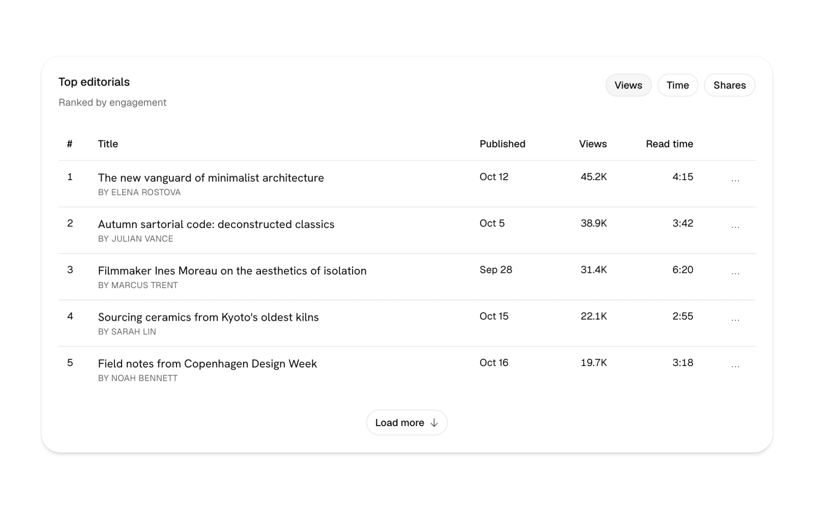
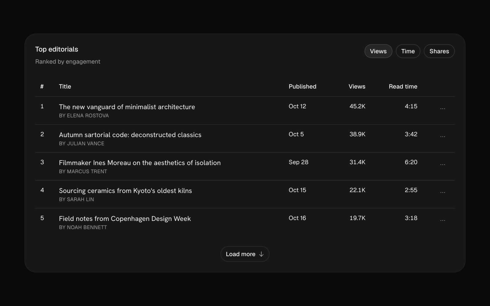
Top posts leaderboard table card for blog and content analytics: a views, time or shares toggle, display-face titles, row menus to edit in a dialog, publish now or confirm delete, and a load more button.
tutor-capacity-01
tutor-capacity-01
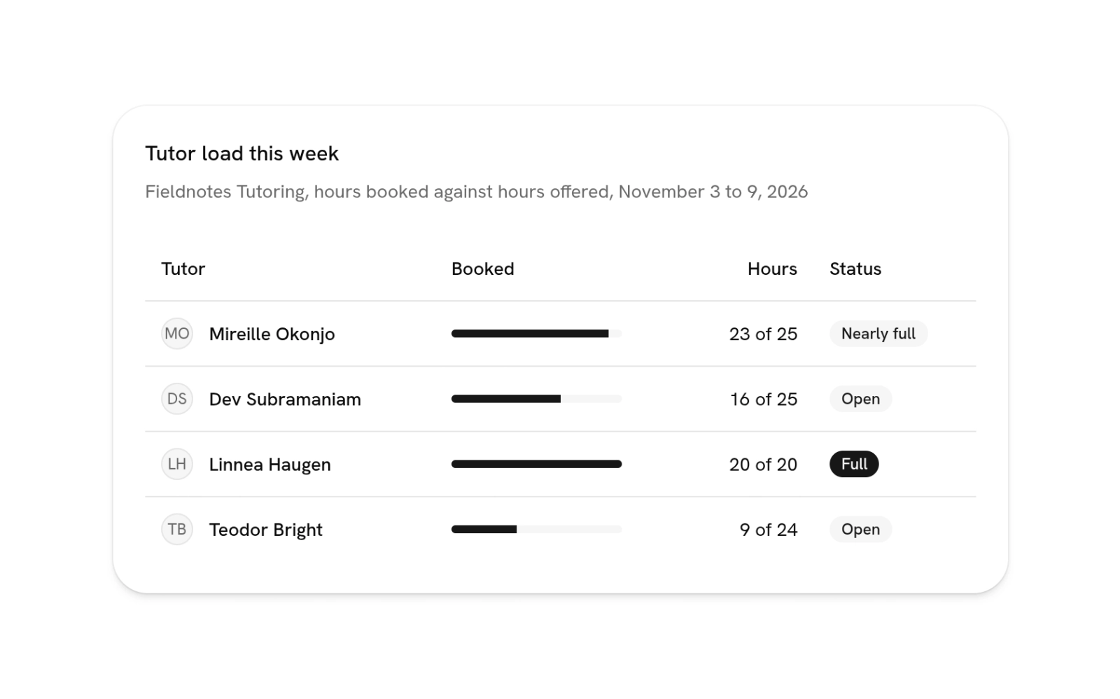
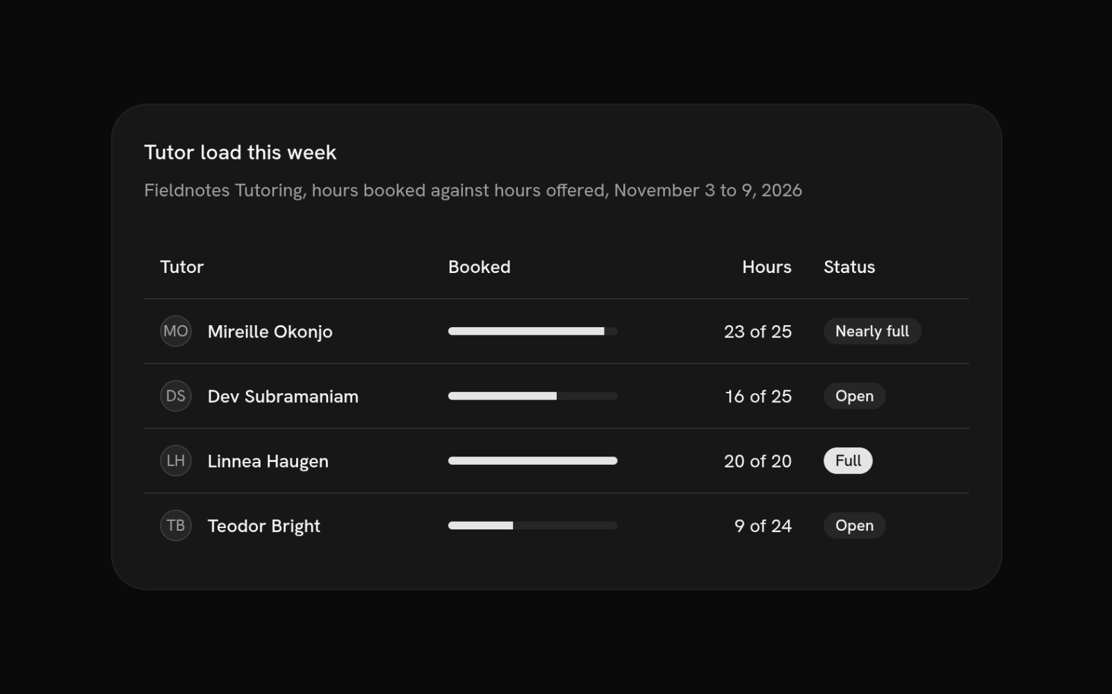
Capacity table for a team that takes bookings: each row pairs a person and avatar with a booked-versus-offered progress bar, exact hours and a status badge, so a coordinator sees who has room.
usage-table-01
usage-table-01
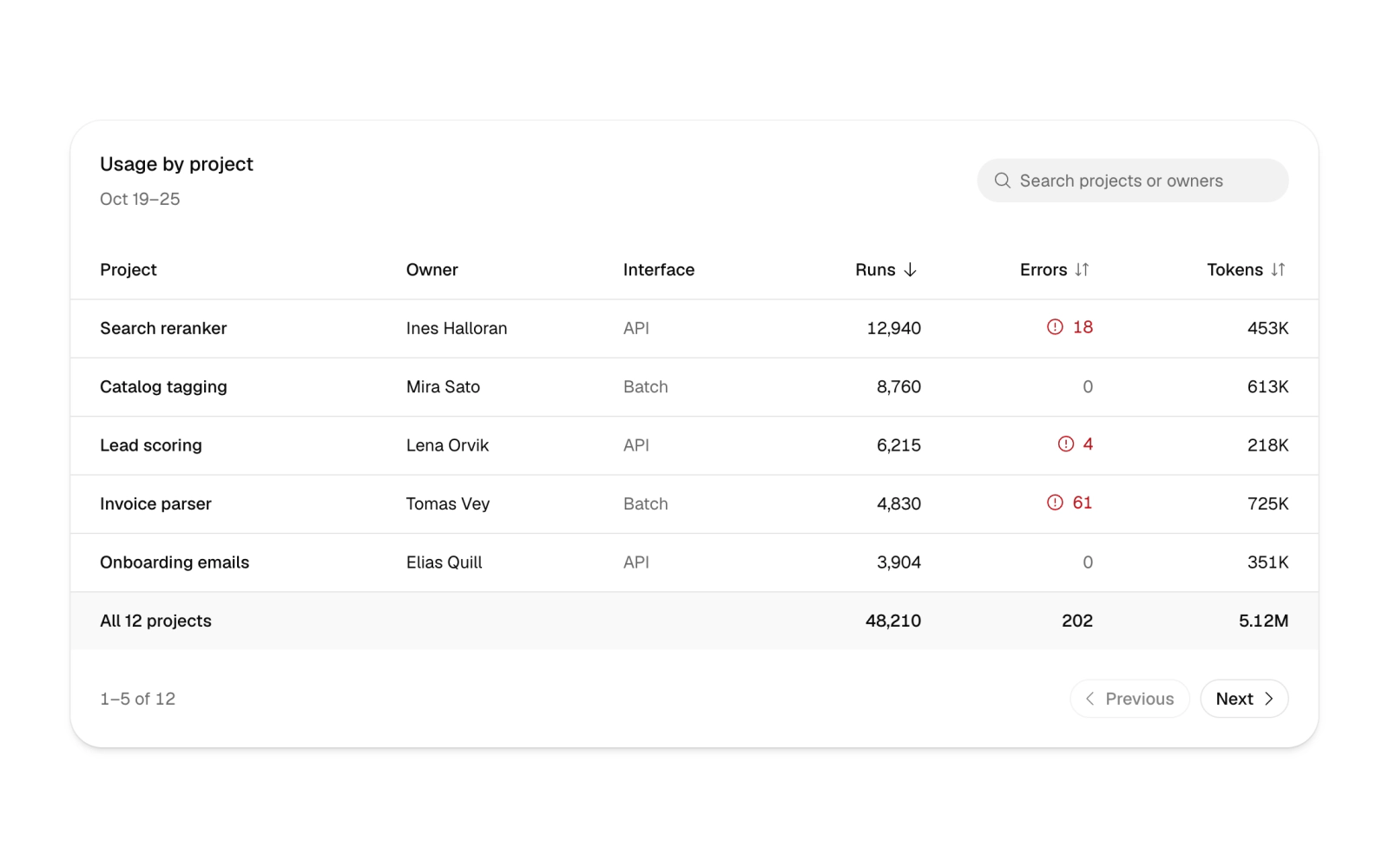
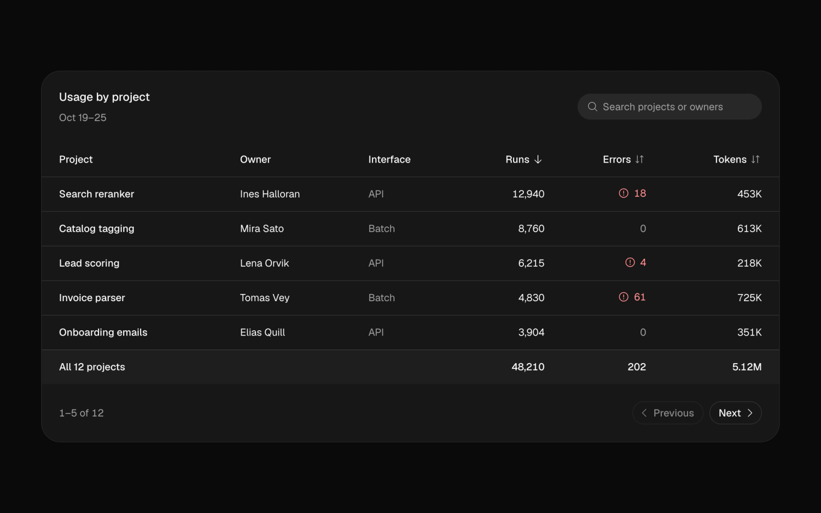
Usage table card: project search, sortable runs, errors and tokens columns, a totals footer, five-row pagination and screen reader status announcements. A client usage dashboard for SaaS billing and analytics.
wholesale-orders-01
wholesale-orders-01
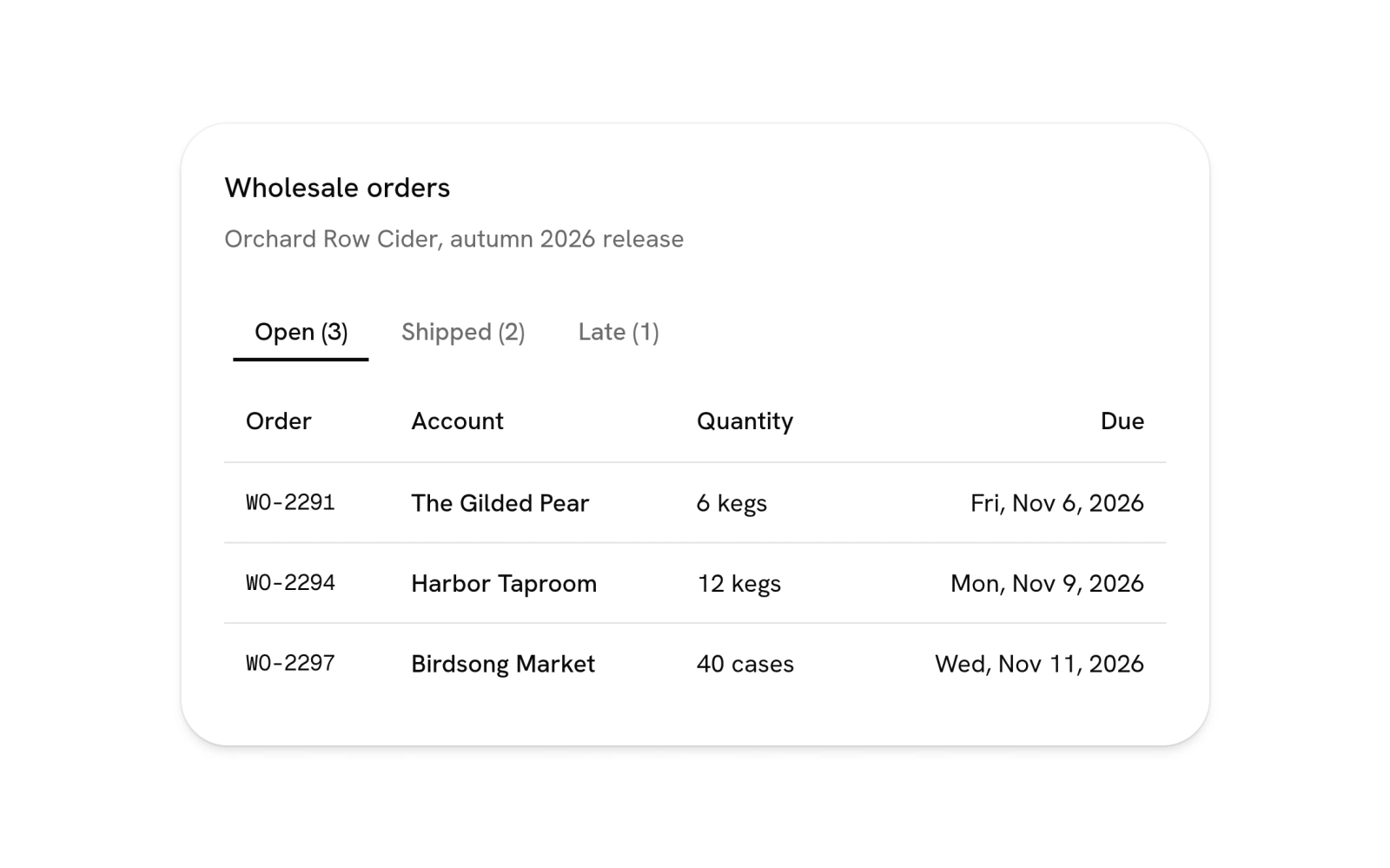
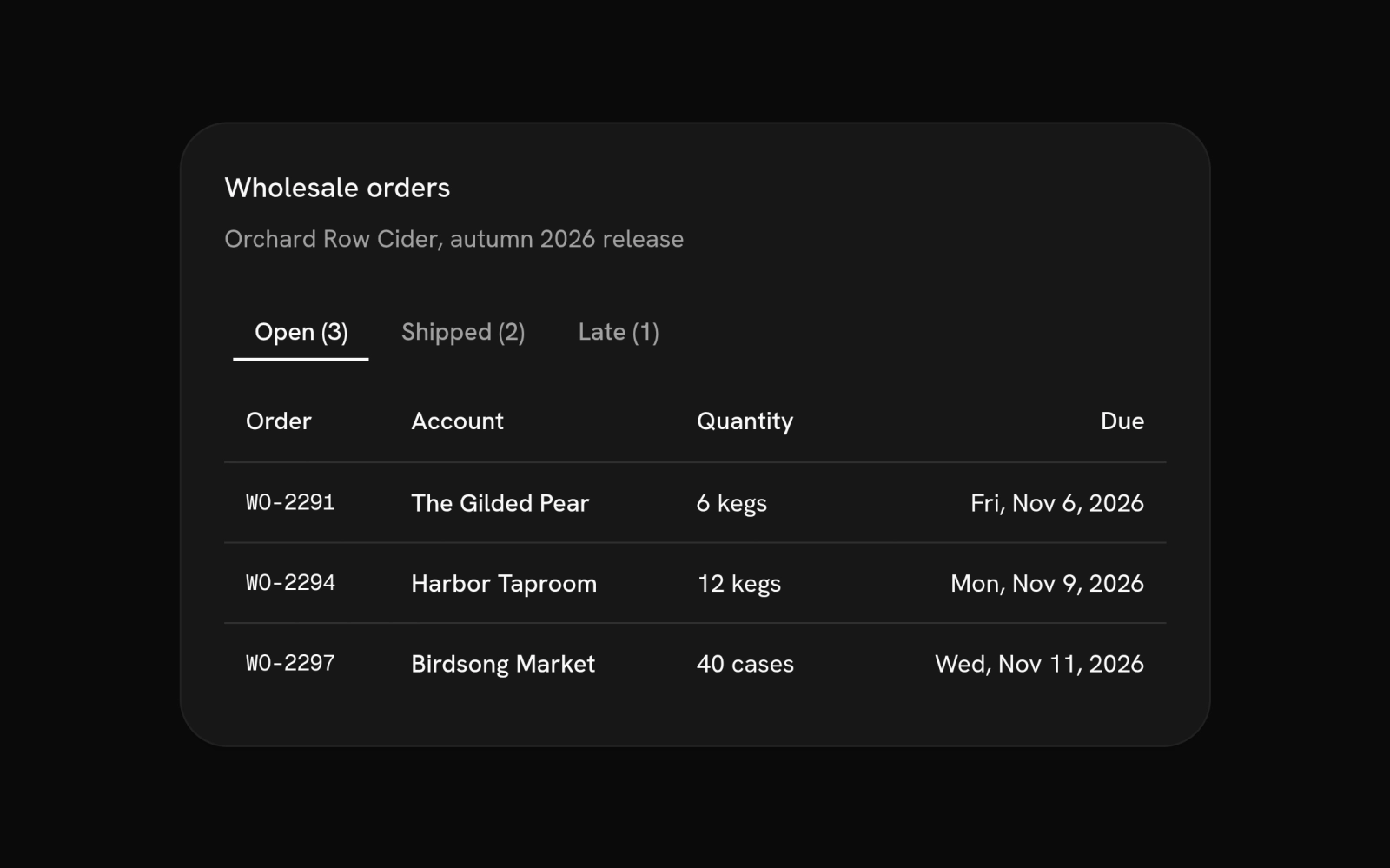
Orders table with status tabs for an operations or fulfillment dashboard: Open, Shipped and Late tabs carry their counts and switch the rows, with order number, account, quantity and due or sent date.