Login
Login blocks: compare
Every Login block side by side: whether it follows the theme or stays dark, the stock parts it is built on, and whether it is free. Open one for its preview, props and install.
Compare
| Block | Theme | Uses | Access |
|---|---|---|---|
| Minimal Login Card | Light and dark | Button, Card, Field, … | Free |
| Split Login Card with OAuth | Light and dark | Button, Card, Field, … | Licensed |
| Split Sign Up with Orbital Limb | Light and dark | Button, Field, Input | Licensed |
| Two-Column Login Page | Light and dark | Button, Field, Input | Licensed |
All Login blocks
4 blocks, A to Z.
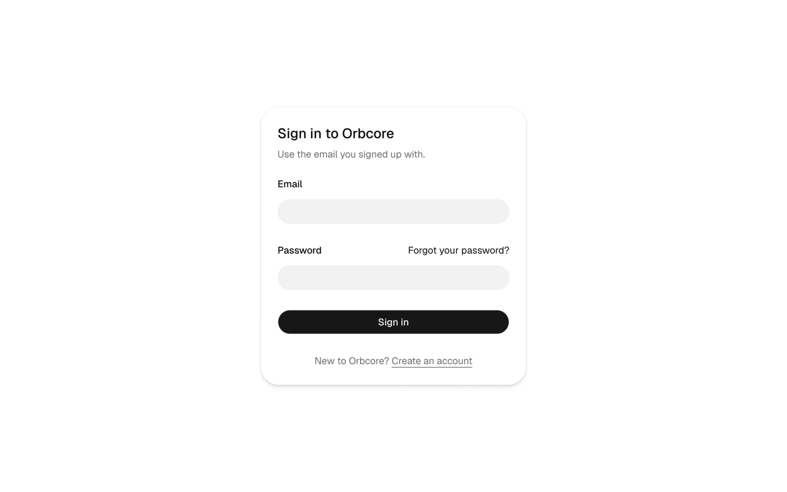
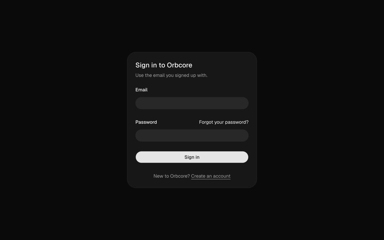 Minimal Login CardFreePlain sign-in card: a title, email and password fields with a forgot-password link, a sign-in button and a link to create an account, validated with React Hook Form and Zod. Theme tokens only, light and dark.
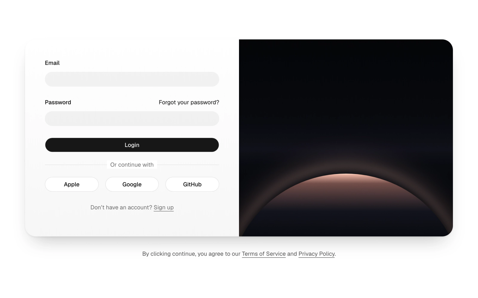
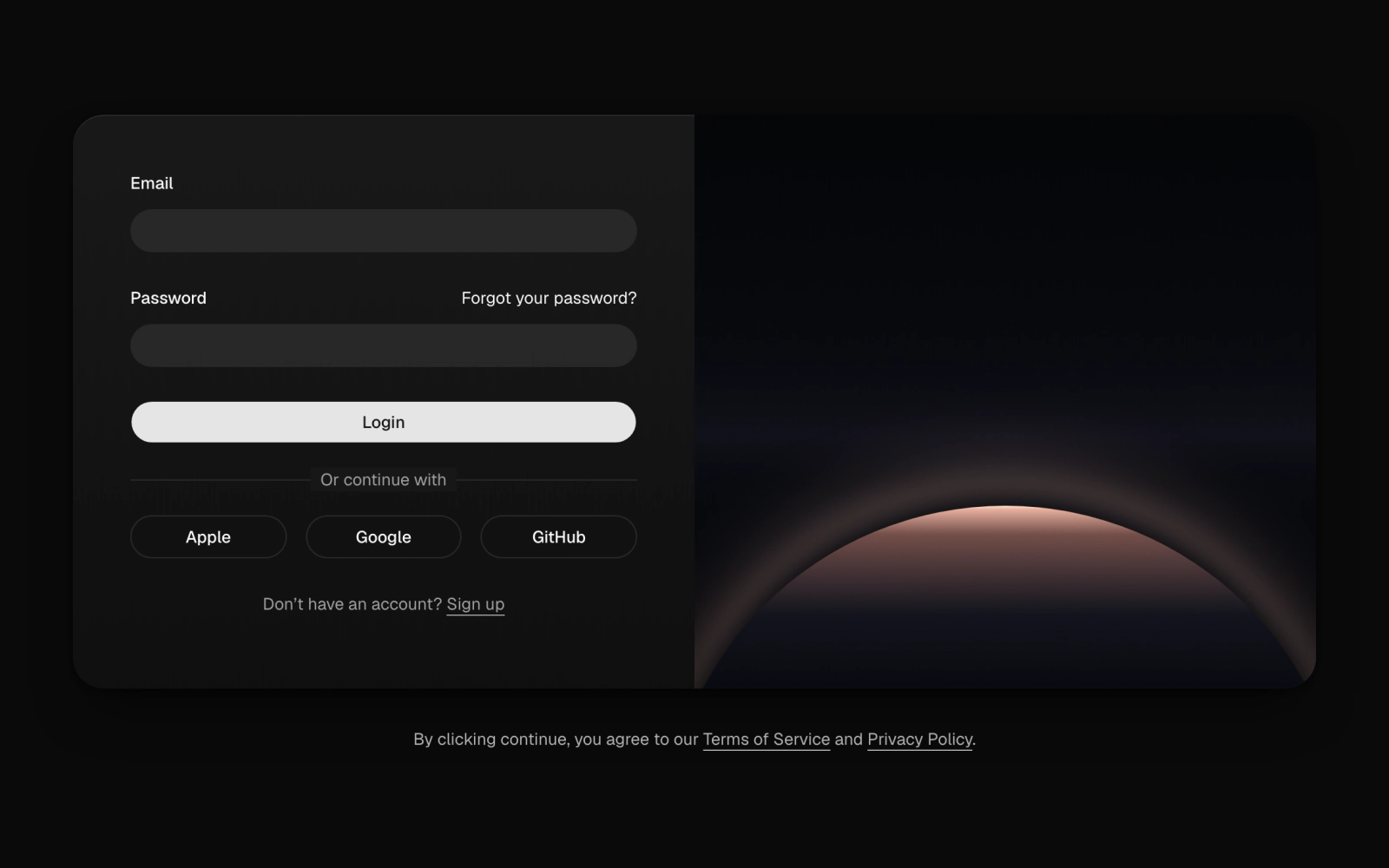 Split Login Card with OAuthLicensedLogin card split in two: an email and password form with a forgot link, Apple, Google and GitHub buttons and a sign-up prompt, beside an OrbitalLimbScene panel. Validated with react-hook-form and zod.
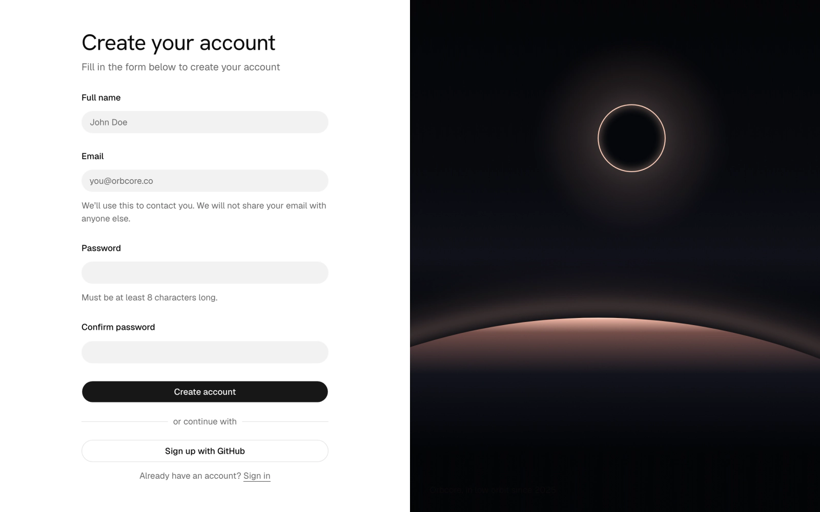
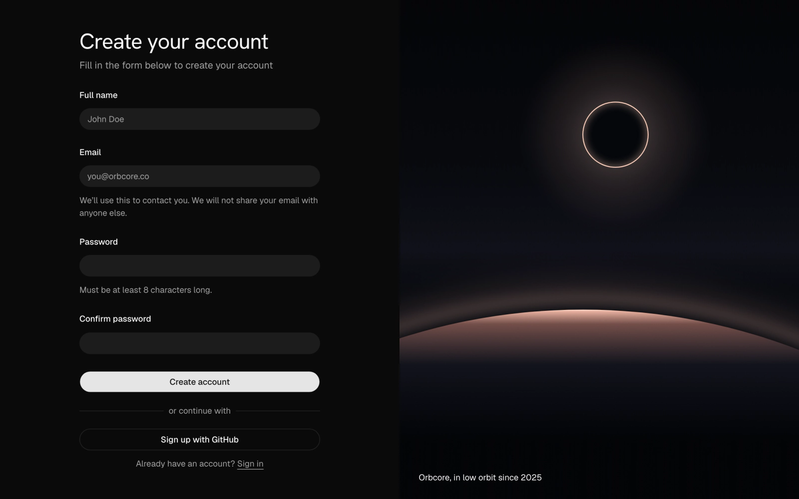 Split Sign Up with Orbital LimbLicensedFull-height sign-up page: name, email, password and confirm fields with hints, a GitHub option and sign-in link, beside a full-bleed dual-lit OrbitalLimbScene with the Orbcore tagline. Zod checks the passwords match.
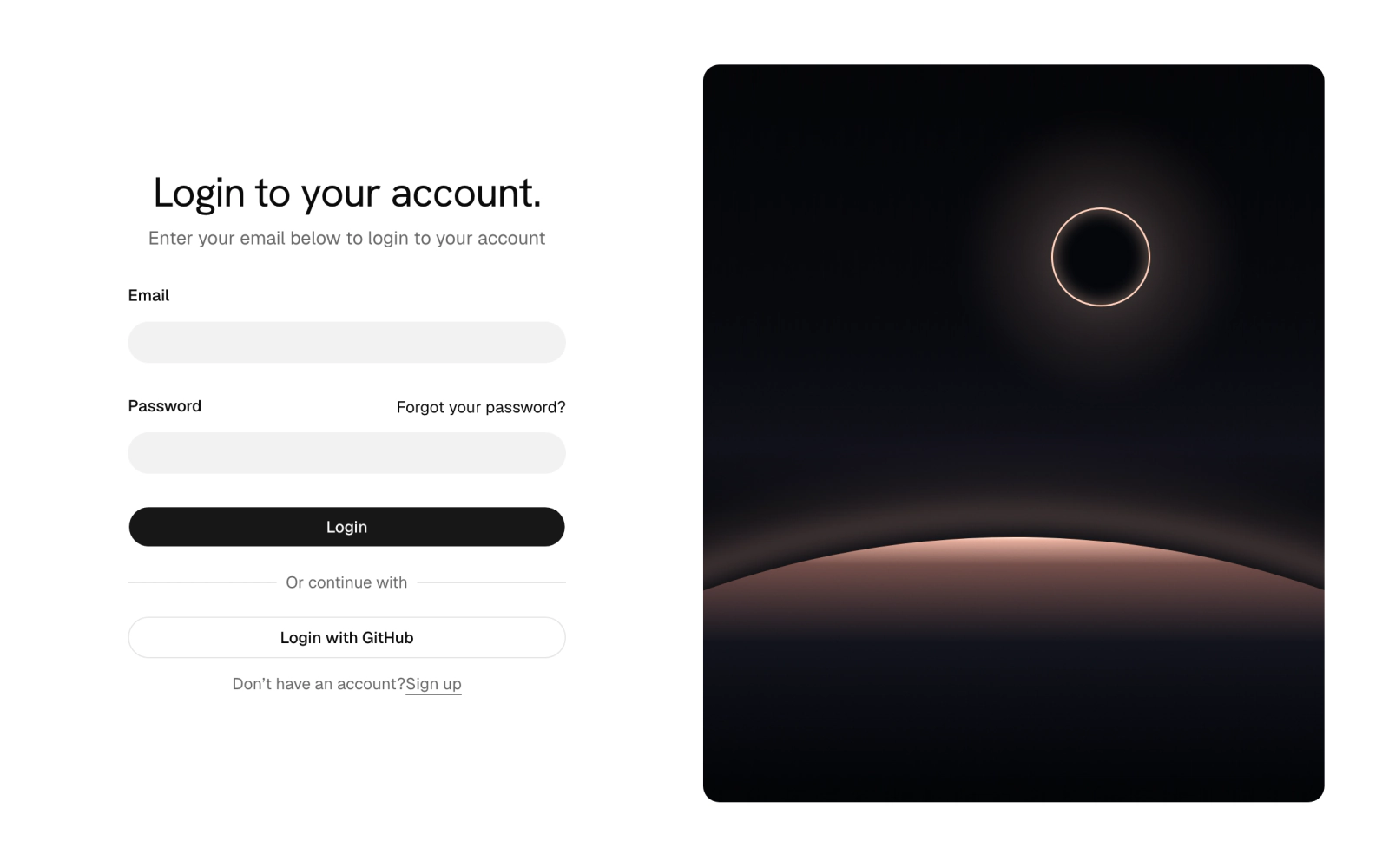
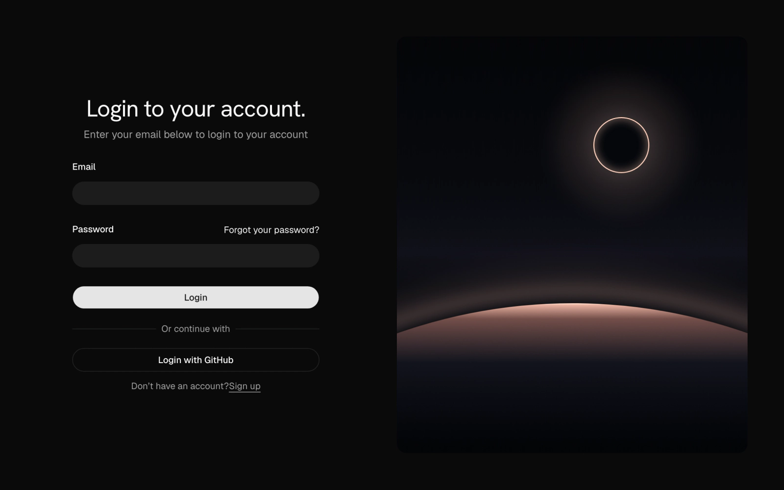 Two-Column Login PageLicensedTwo-column login page: a display-type heading, email and password fields, a GitHub button and sign-up link on one side, a rounded OrbitalLimbScene figure on the other. Validated with zod.
Spotlit Serif Not Found
Dark 404 lit from above by a GlowRig, with an oversized 404 and headline set in Marcellus, a dimmed body line and a home button. Pulls in Marcellus and Hanken Grotesk.
Minimal Login Card
Plain sign-in card: a title, email and password fields with a forgot-password link, a sign-in button and a link to create an account, validated with React Hook Form and Zod. Theme tokens only, light and dark.