Banner
Banner blocks: compare
Every Banner block side by side: whether it follows the theme or stays dark, the stock parts it is built on, and whether it is free. Open one for its preview, props and install.
Compare
| Block | Theme | Uses | Access |
|---|---|---|---|
| Archived Workspace Banner | Light and dark | Button | Licensed |
| Billing Warning Banner | Light and dark | Its own markup | Free |
| Blue Glow Line Banner | Dark only | Its own markup | Licensed |
| Corner Sheen Banner | Light and dark | Its own markup | Licensed |
| Dark Glow Seam Banner | Dark only | Its own markup | Licensed |
| Dark Paper Texture Banner | Dark only | Its own markup | Licensed |
| Gradient Live Event Banner | Light and dark | Its own markup | Licensed |
| Maintenance Notice Banner | Light and dark | Its own markup | Free |
| Muted Release Banner | Light and dark | Its own markup | Free |
| Neoconstruct Event Banner | Light and dark | Its own markup | Free |
| New Feature Badge Banner | Light and dark | Badge | Licensed |
| Primary Color Banner | Light and dark | Its own markup | Free |
| Raised Referral Banner | Light and dark | Its own markup | Licensed |
| Shaded URL Change Banner | Light and dark | Its own markup | Licensed |
All Banner blocks
14 blocks, A to Z.
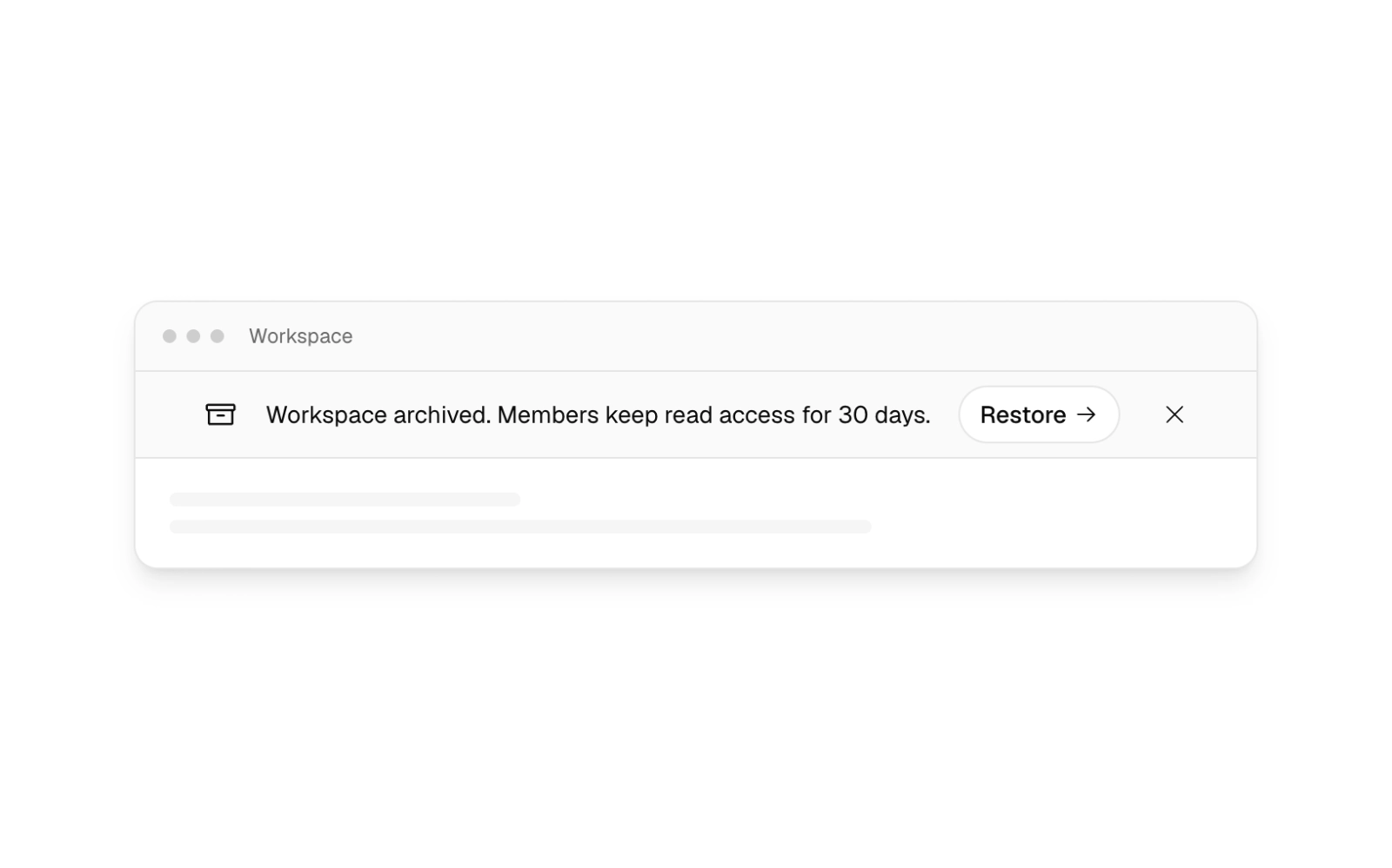
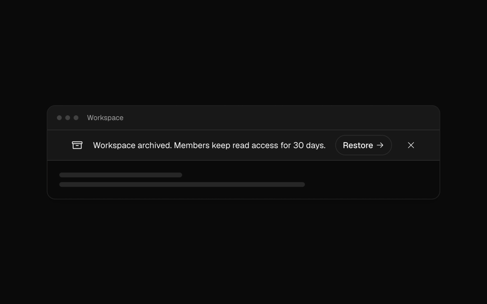 Archived Workspace BannerLicensedSidebar-toned status bar with an archive icon, a message that wraps beside an outline button link to restore, and a dismiss control. Sits above an app shell.
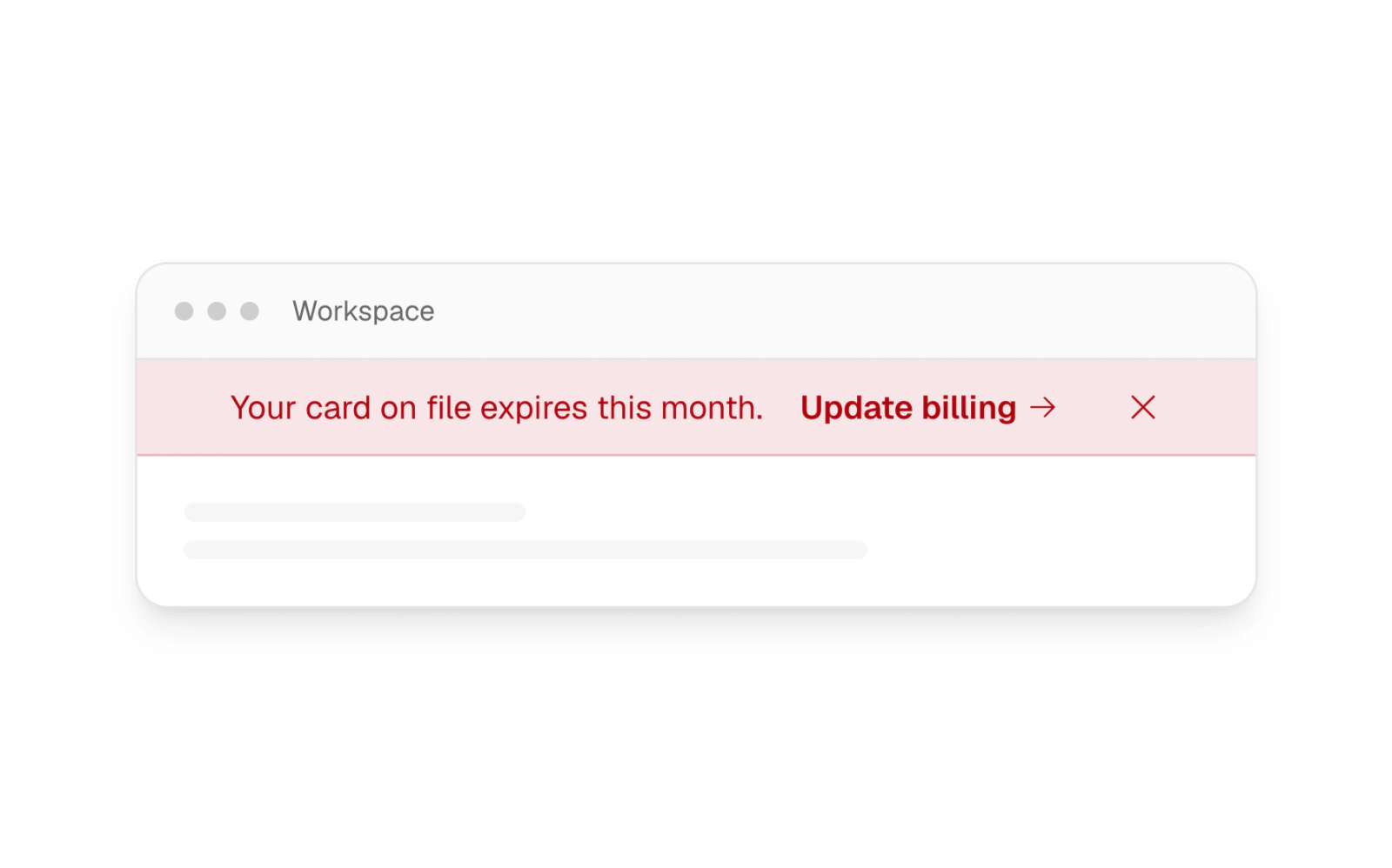
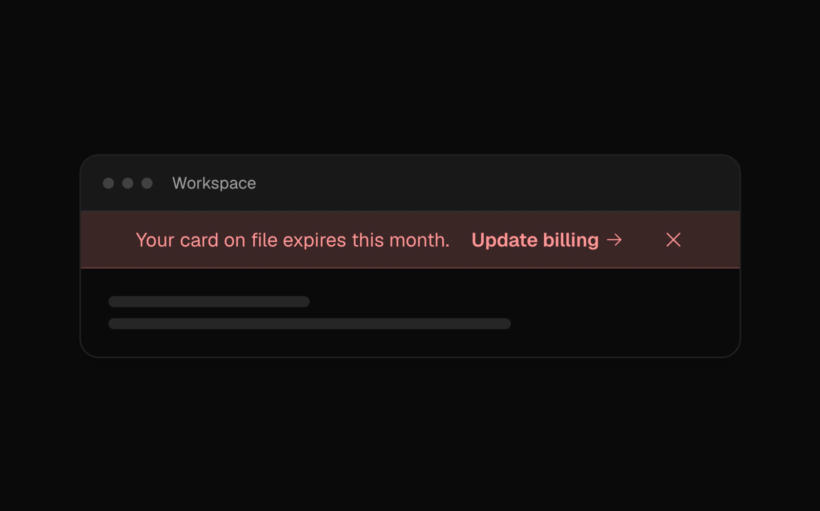 Billing Warning BannerFreeDestructive-tinted alert bar with a faint red ground, red text and a bottom border, carrying a billing warning, an update link and dismiss. The tint deepens in dark mode.
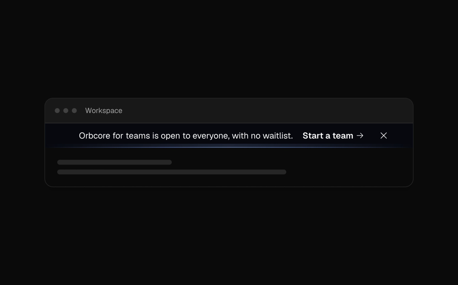
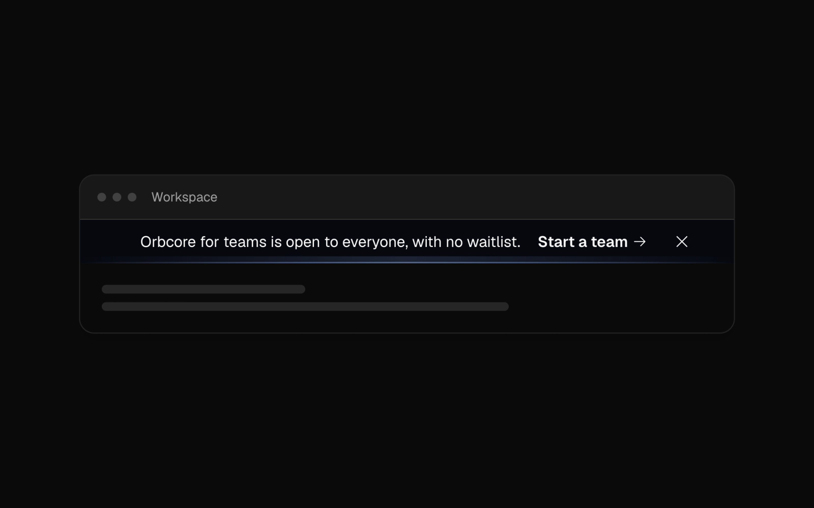 Blue Glow Line BannerLicensedDark centered launch banner on a cool near-black ground with a blue GlowLine lighting its bottom edge, an arrow link and dismiss button. Shorter copy on phones.
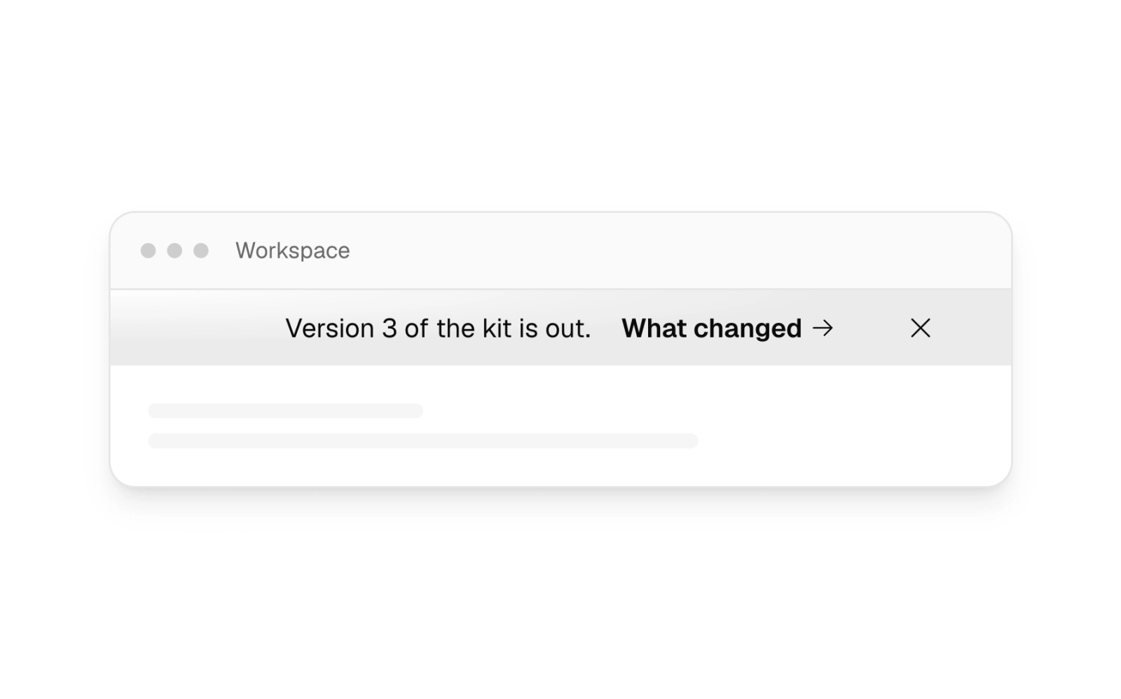
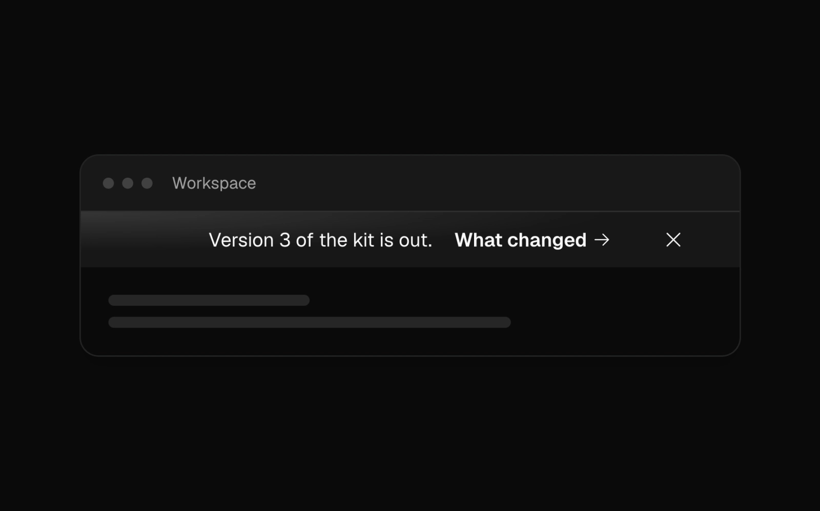 Corner Sheen BannerLicensedCentered card-colored banner with a sheen of light spilling in from the top-left corner, one short line of release news, a what-changed link and dismiss.
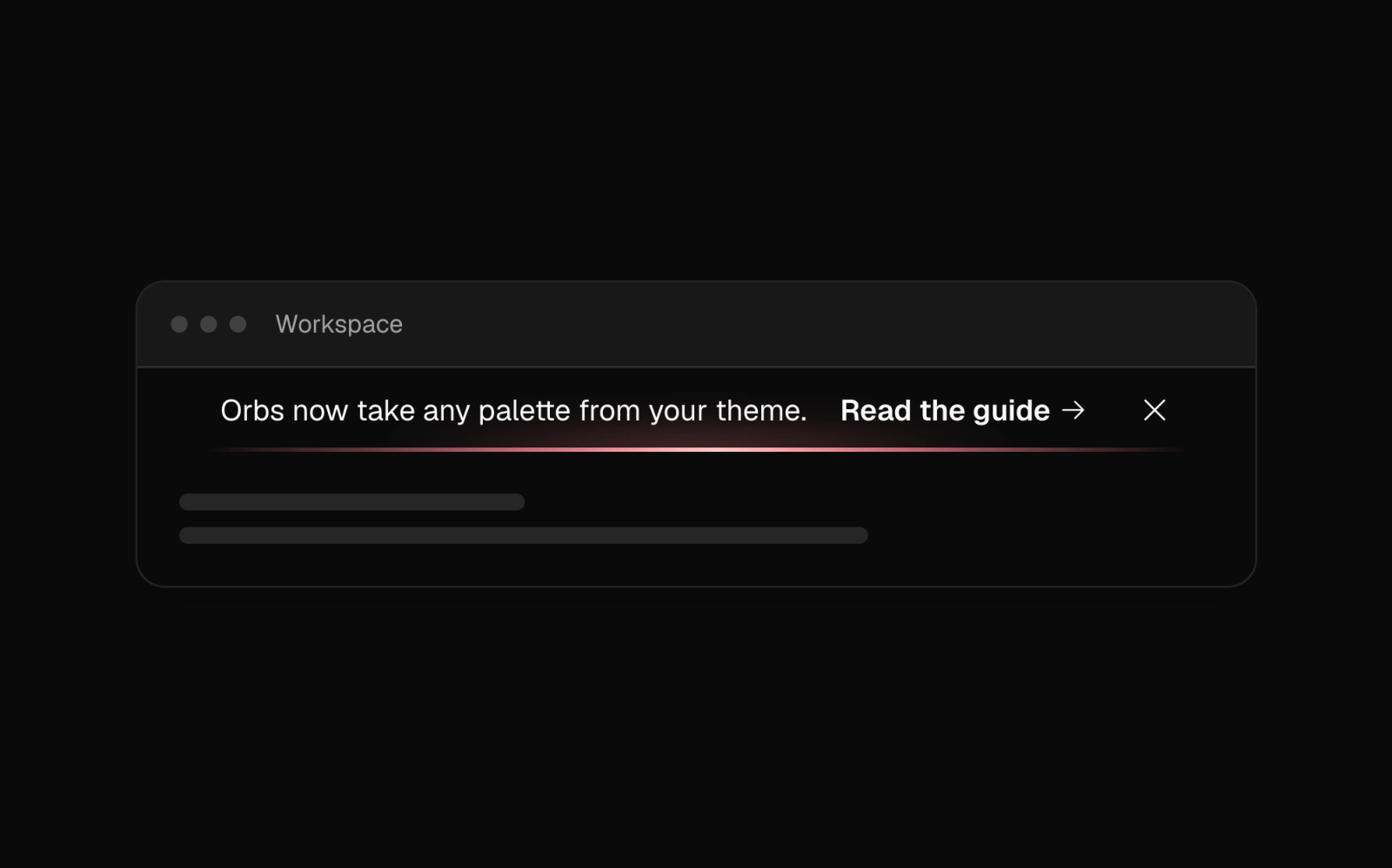
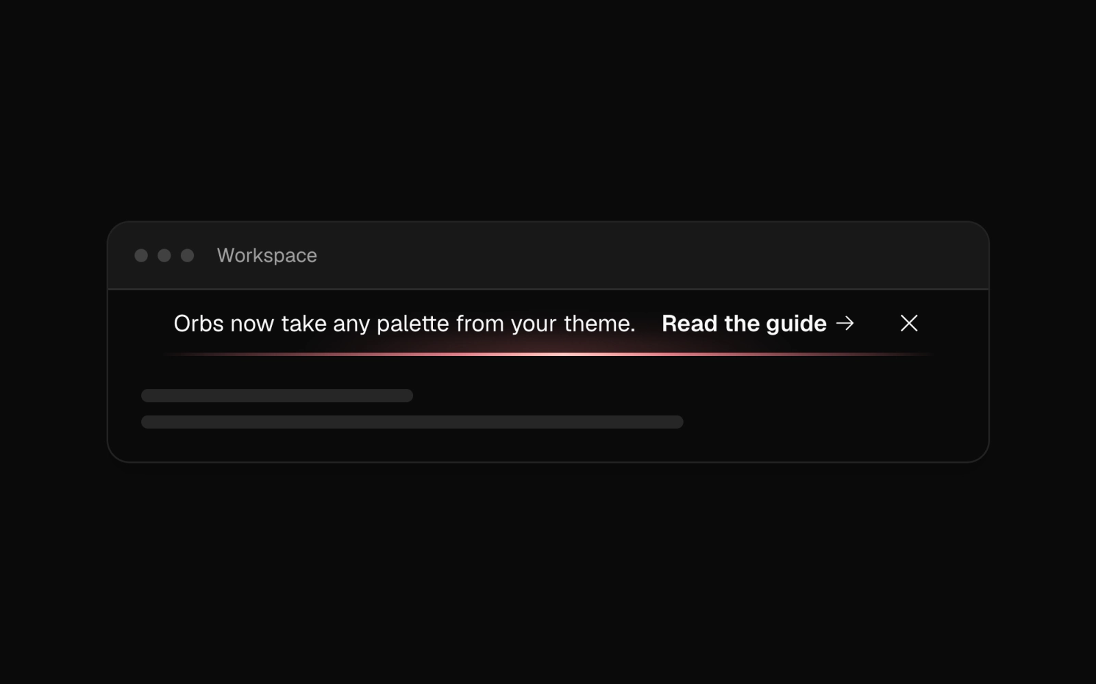 Dark Glow Seam BannerLicensedDark banner on the scene color with a GlowSeam light line along its bottom edge, a guide link and dismiss button; the dark class scopes tokens so it holds on any page.
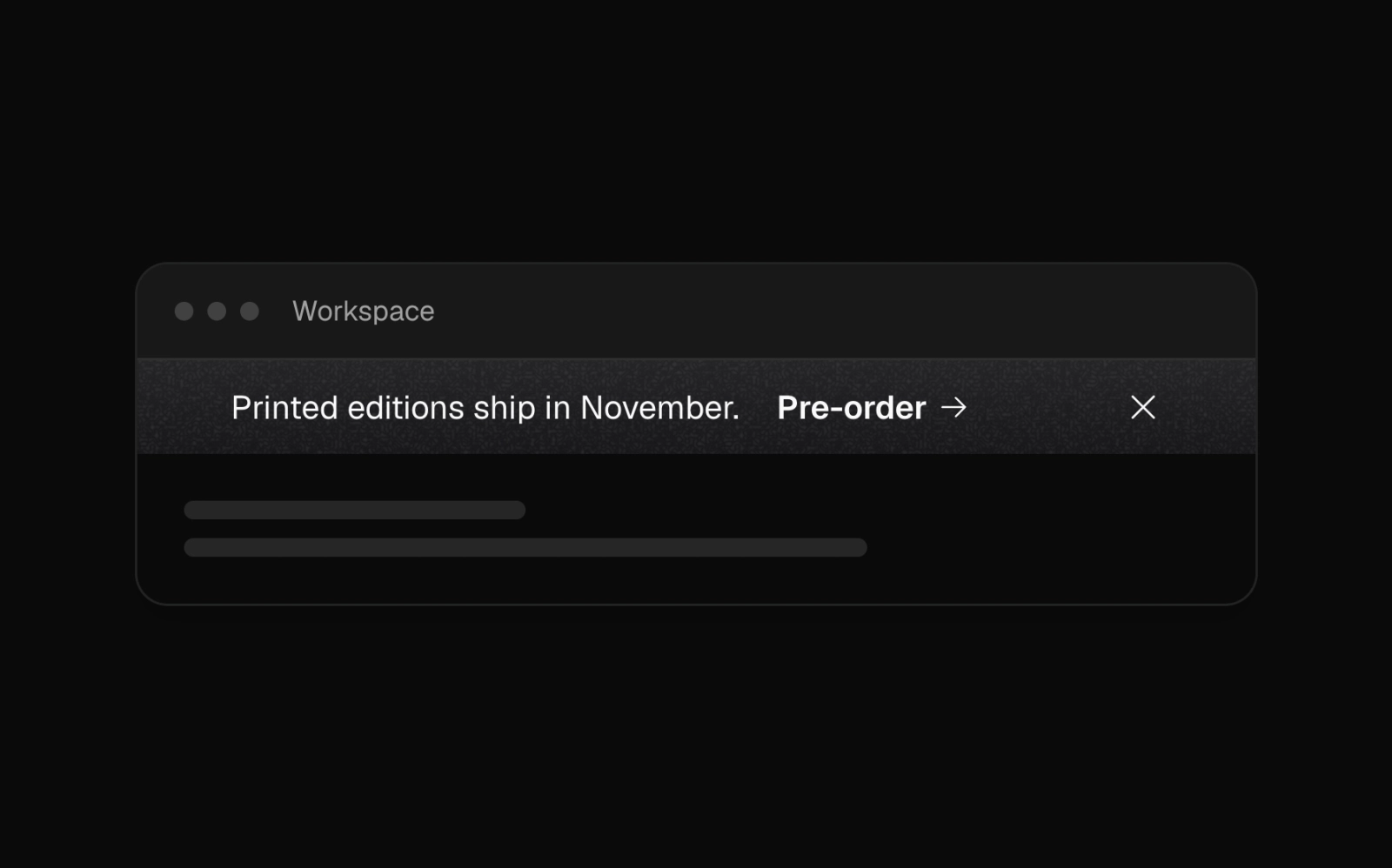
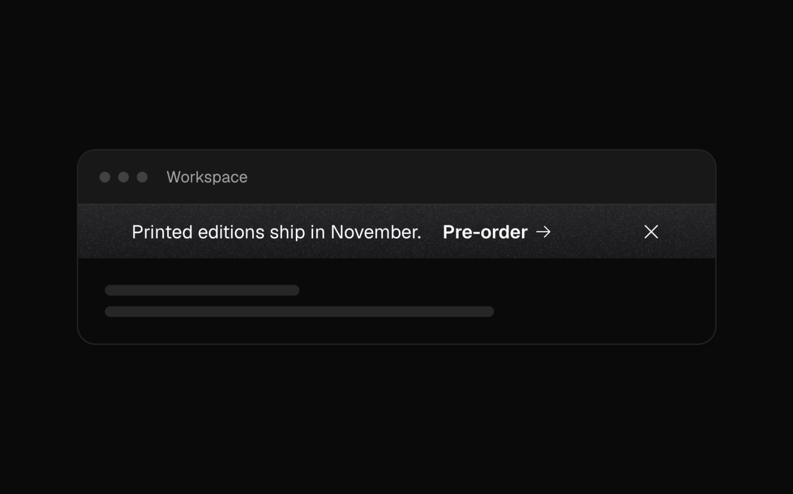 Dark Paper Texture BannerLicensedDark banner on the paper surface: a charcoal gradient with paper grain printed over the content, one line of copy and a pre-order link. Dark tokens are scoped to it.
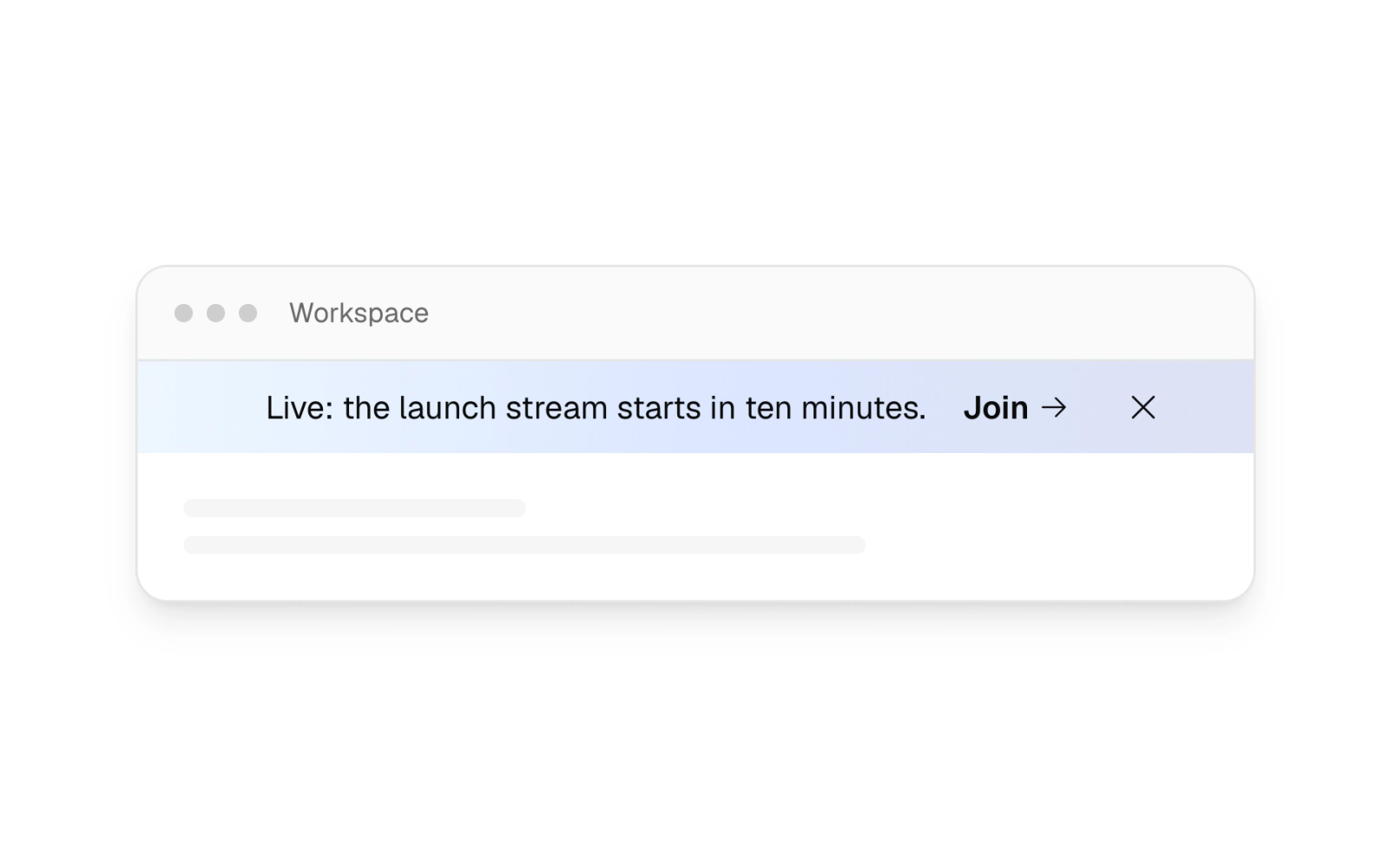
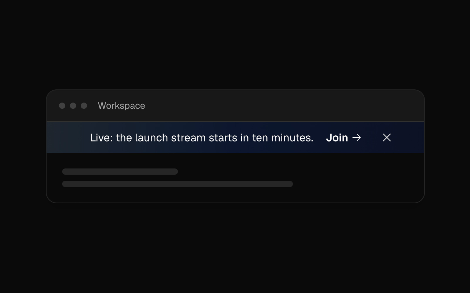 Gradient Live Event BannerLicensedCentered live-event banner on the page background washed with a low-opacity gradient across chart colors 1, 3 and 5, with a join link and dismiss button.
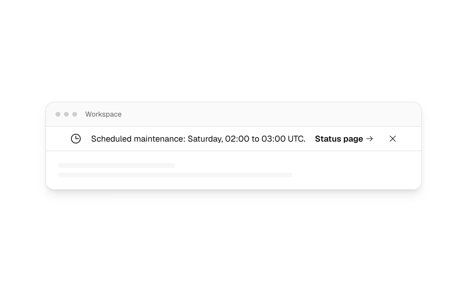
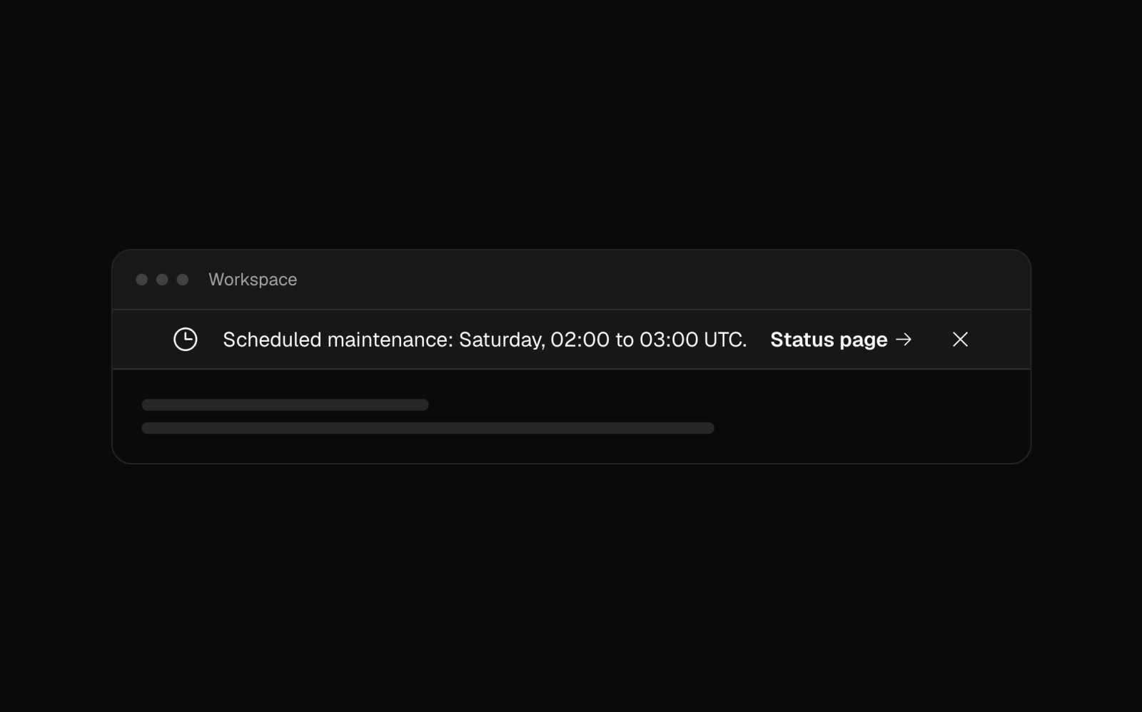 Maintenance Notice BannerFreeStart-aligned maintenance notice on the card surface with a bottom border, a clock icon that hides on phones, a status-page link and a dismiss button.
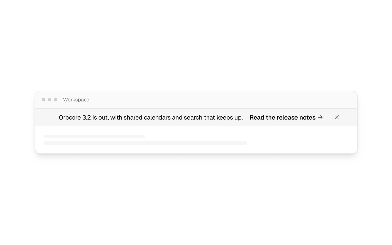
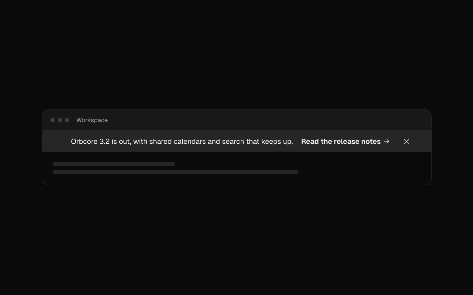 Muted Release BannerFreeCentered announcement bar on the muted ground with a release note, an arrow link and a dismiss button. A shorter line replaces the message below the md breakpoint.
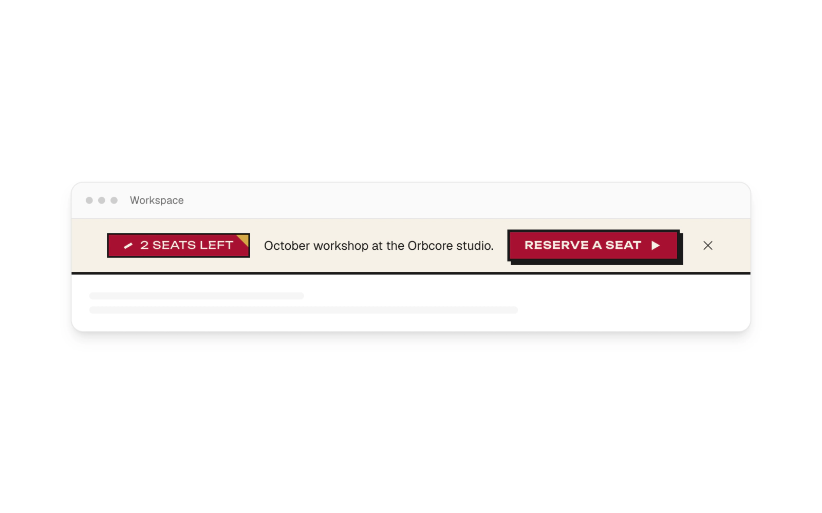
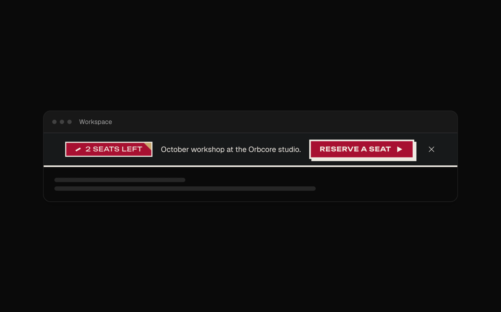 Neoconstruct Event BannerFreeNeoconstruct banner on cream paper with a hard ink rule below: a red Ribbon Badge for the seats left, the workshop notice, and a small Neoconstruct button with an arrow and an offset shadow that keeps its label on phones.
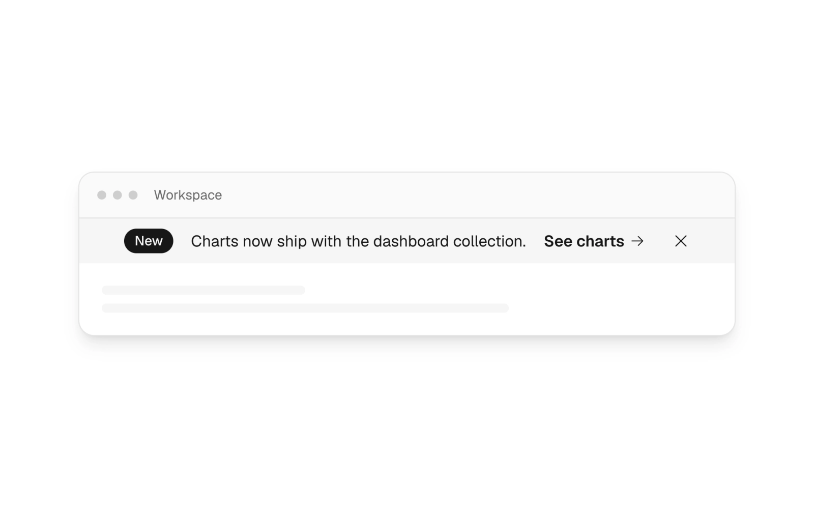
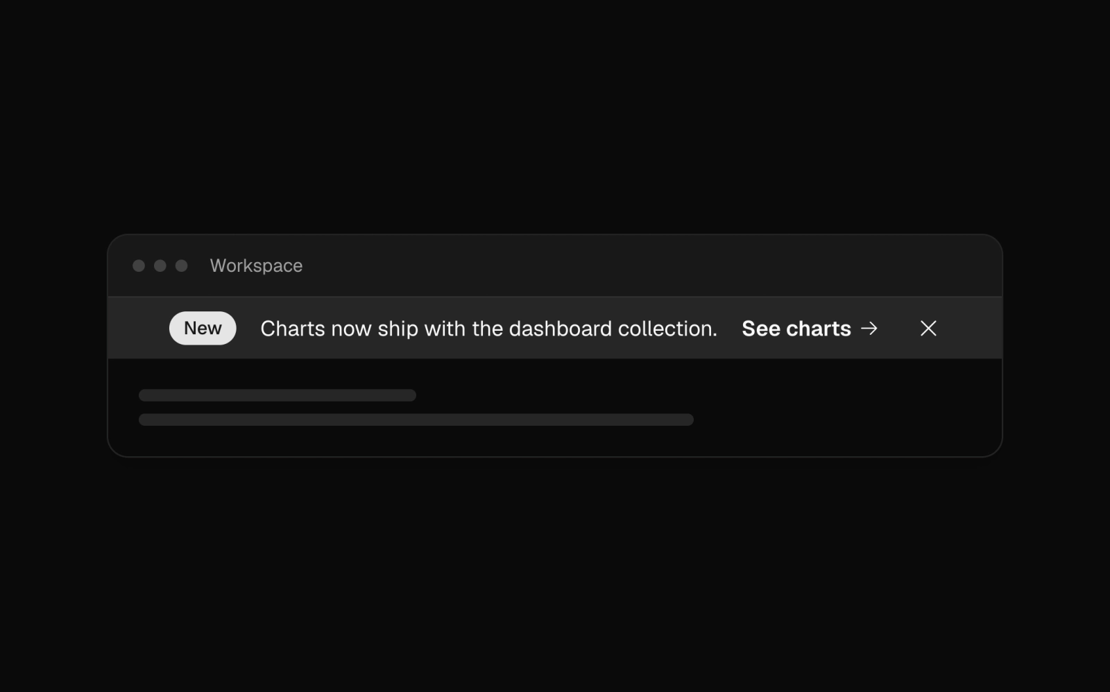 New Feature Badge BannerLicensedAccent-colored banner with a New badge before the message, an arrow link to the feature and a dismiss button. A shorter line swaps in on small screens.
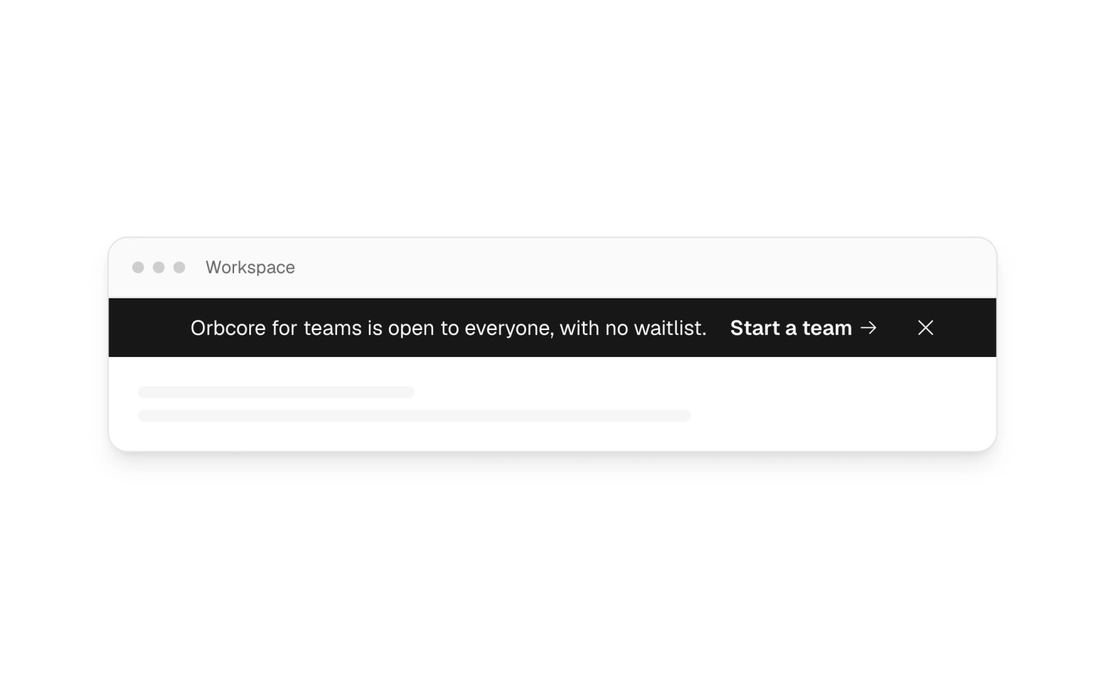
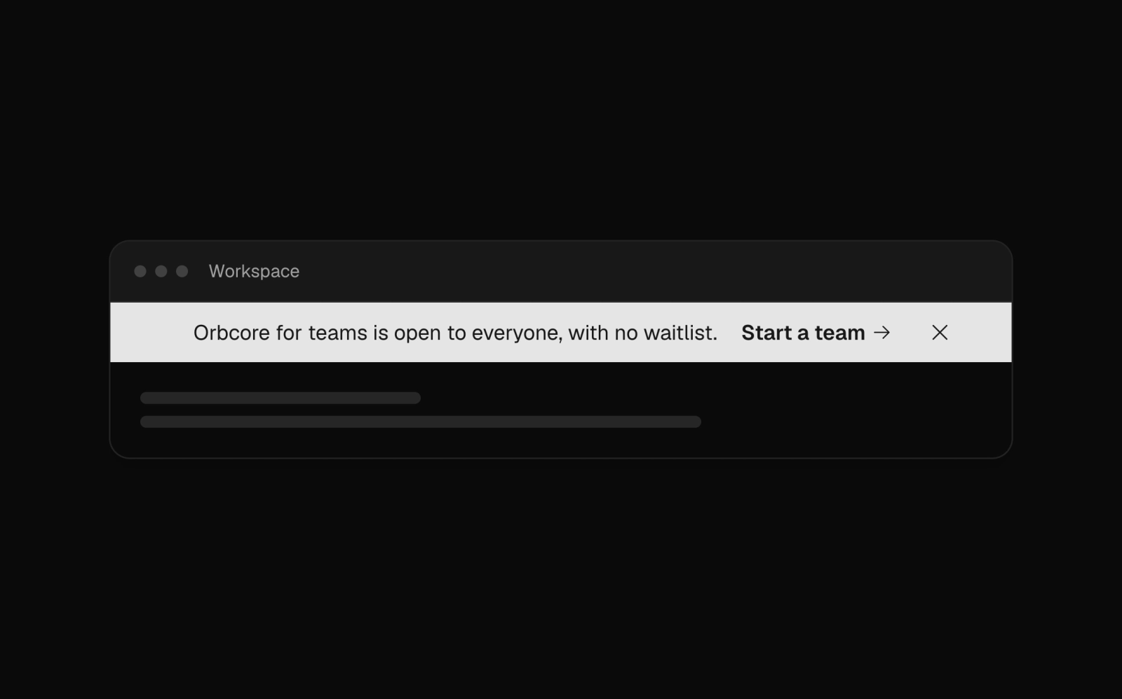 Primary Color BannerFreeCentered announcement bar filled with the primary color and primary-foreground text, an arrow link and a dismiss button; the message shortens below the sm breakpoint.
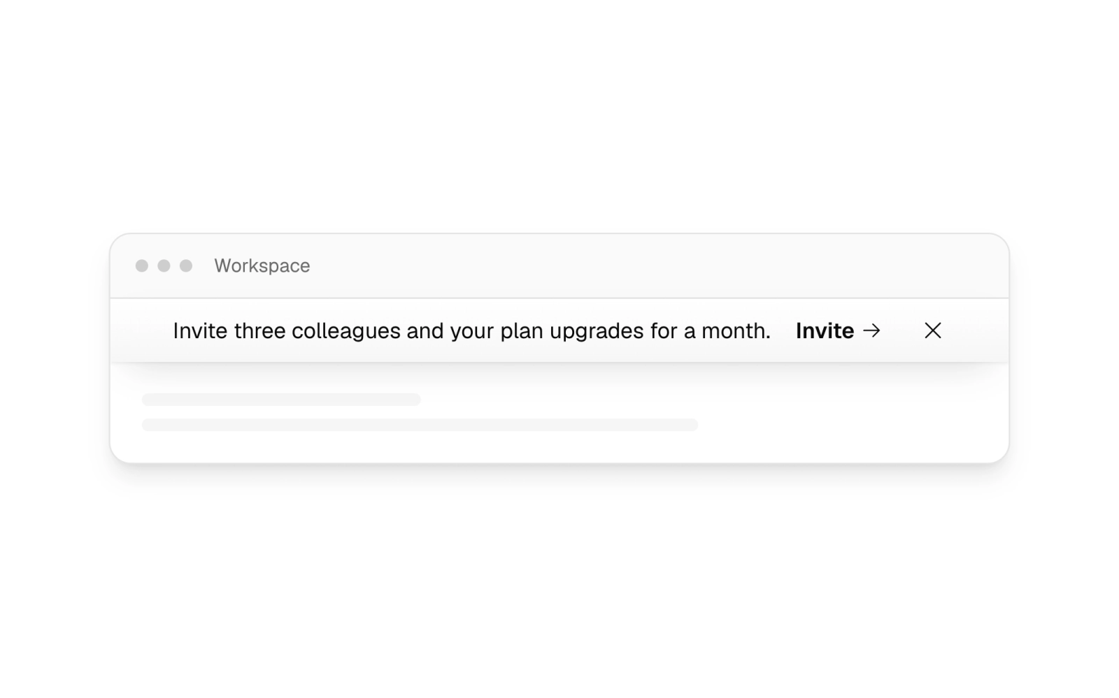
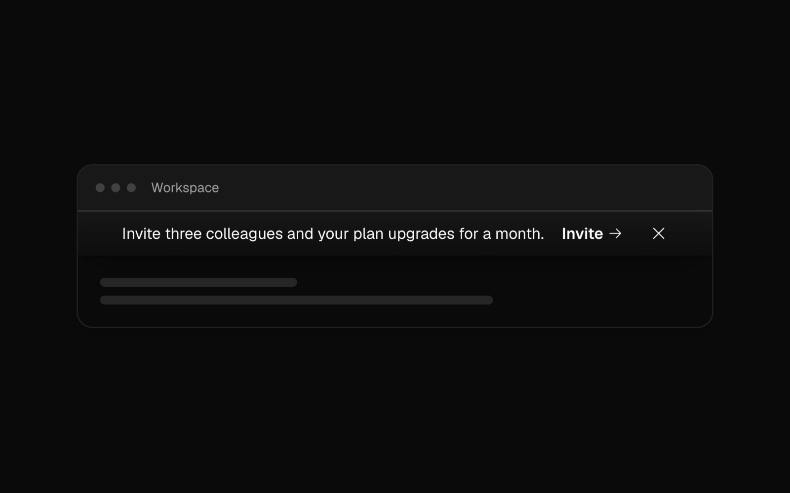 Raised Referral BannerLicensedStart-aligned referral banner on the raised surface, with a top highlight and soft drop shadow lifting it off the page, plus an invite link and dismiss button.
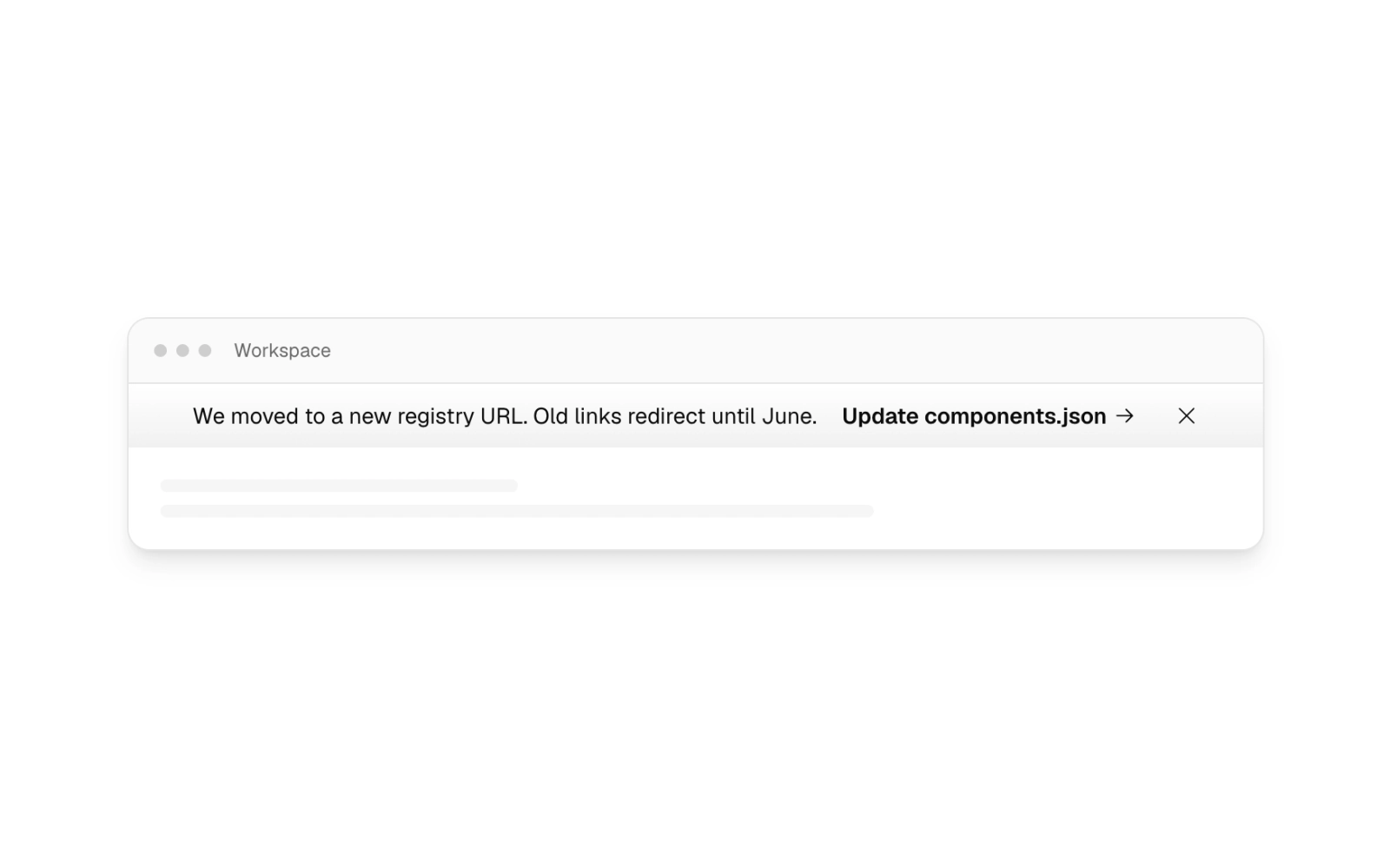
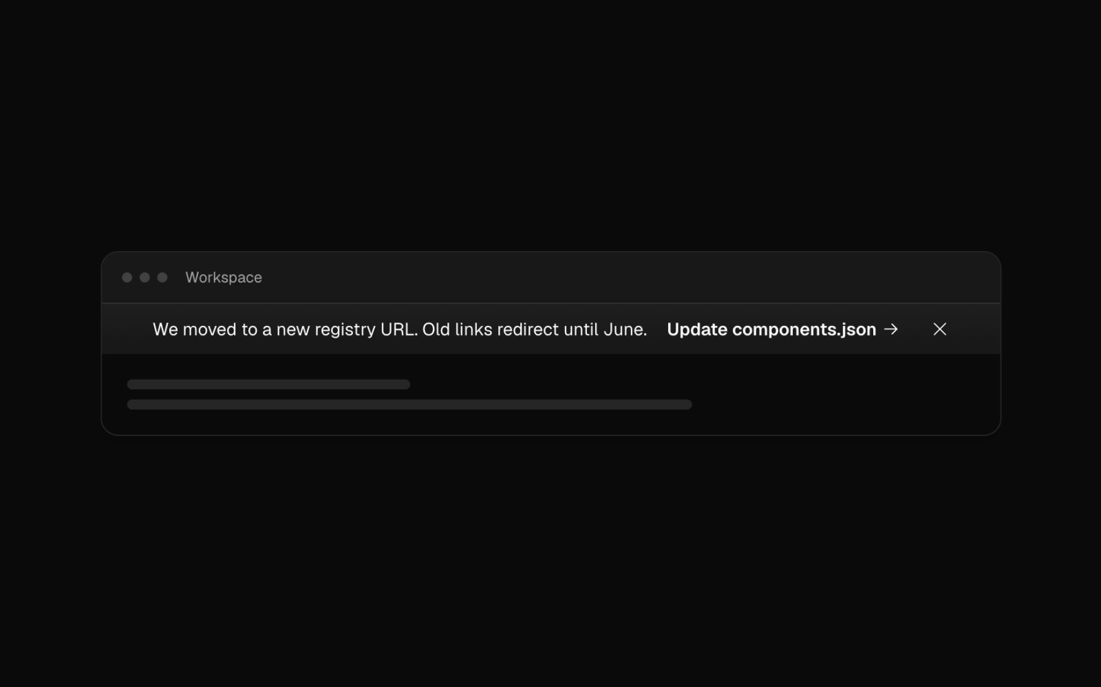 Shaded URL Change BannerLicensedStart-aligned notice on the depth surface, a card-colored panel that shades toward its foot, announcing a moved registry URL with a config link. Short copy below md.
Contact Sales Form
Contact sales form in one narrow column: first and last name, optional company, email, country select with phone, message and a privacy consent checkbox. Validated with react-hook-form and zod.
Archived Workspace Banner
Sidebar-toned status bar with an archive icon, a message that wraps beside an outline button link to restore, and a dismiss control. Sits above an app shell.