App
App blocks: compare
Every App block side by side: whether it follows the theme or stays dark, the stock parts it is built on, and whether it is free. Open one for its preview, props and install.
Compare
| Block | Theme | Uses | Access |
|---|---|---|---|
| Account Menu | Light and dark | Button, Drawer, Dropdown menu, … | Licensed |
| Accounts | Light and dark | Avatar, Badge, Button, … | Licensed |
| Activity Goal | Light and dark | Button | Free |
| Agent Workspace | Light and dark | Its own markup | Licensed |
| Command Palette | Light and dark | Card, Command, Kbd, … | Licensed |
| Contact List | Light and dark | Badge, Button, Card, … | Free |
| Contact List Card | Light and dark | Button, Card, Item | Free |
| Data Table | Light and dark | Badge, Button, Card, … | Licensed |
| Date Picker | Light and dark | Card | Free |
| Demographics | Light and dark | Its own markup | Licensed |
| File Tree | Light and dark | Button, Card, Collapsible | Free |
| No Results | Dark only | Button | Licensed |
| Orb Drawer | Light and dark | Its own markup | Licensed |
| Payment | Light and dark | Its own markup | Licensed |
| Report Issue | Light and dark | Its own markup | Free |
| Settings | Light and dark | Its own markup | Free |
| Share | Light and dark | Avatar | Licensed |
| Shortcuts | Light and dark | Item | Free |
| Team Members | Light and dark | Avatar | Licensed |
| Team Selector | Light and dark | Button, Dialog, Field, … | Licensed |
| Top Editorials | Light and dark | Alert dialog, Button, Card, … | Licensed |
| Weekly Installs Card | Light and dark | Card, Chart, Separator | Free |
All App blocks
22 blocks, A to Z.
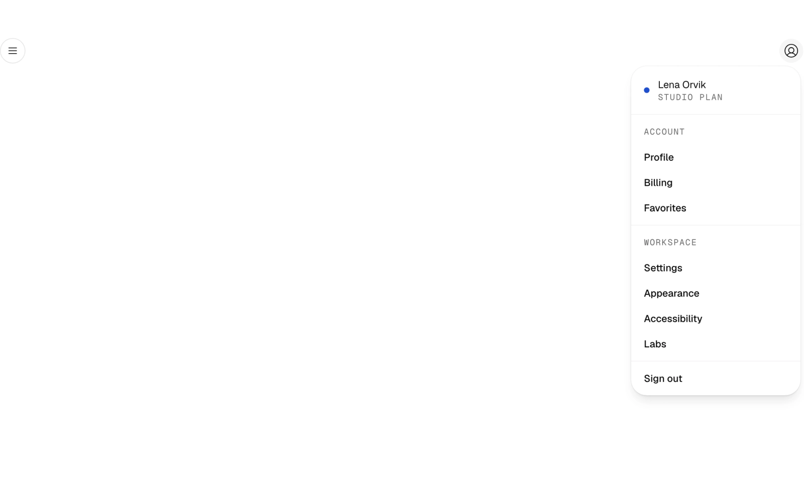
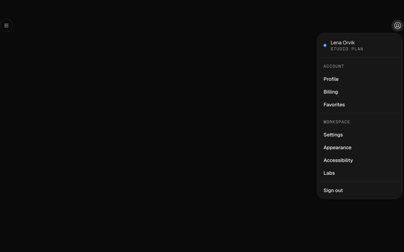 Account MenuLicensedAn app header with a left-swiping drawer of grouped navigation links and an account dropdown showing the signed-in user, plan and grouped settings. Group labels use Geist Mono; icons come from Phosphor.
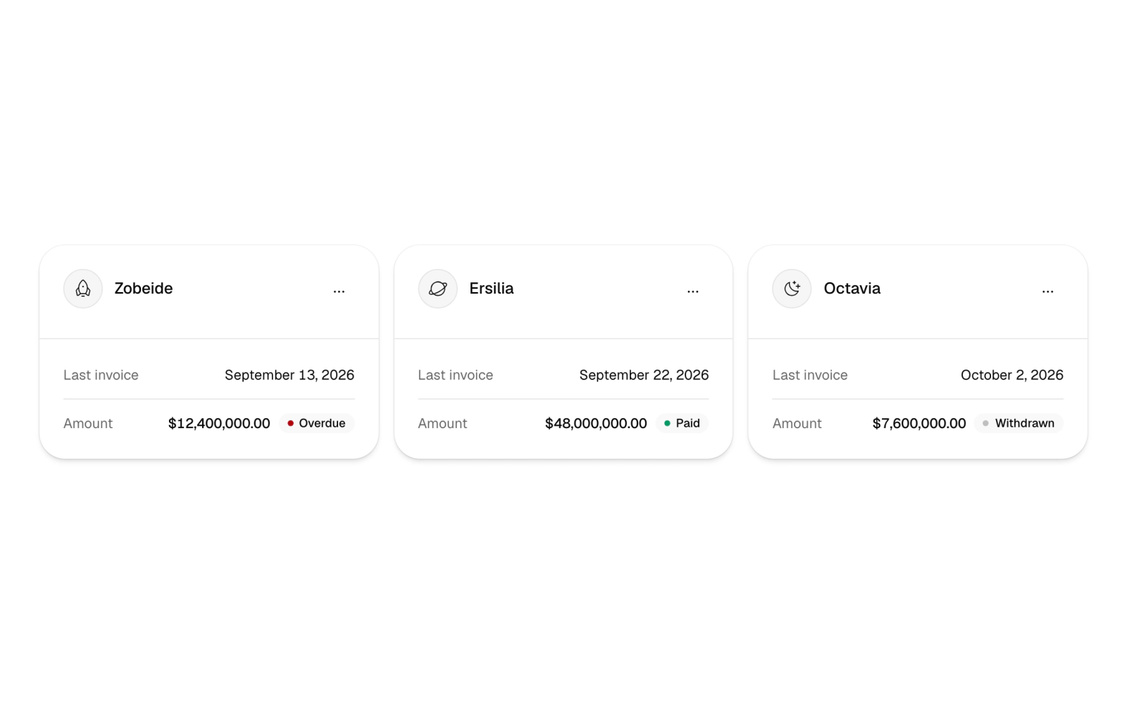
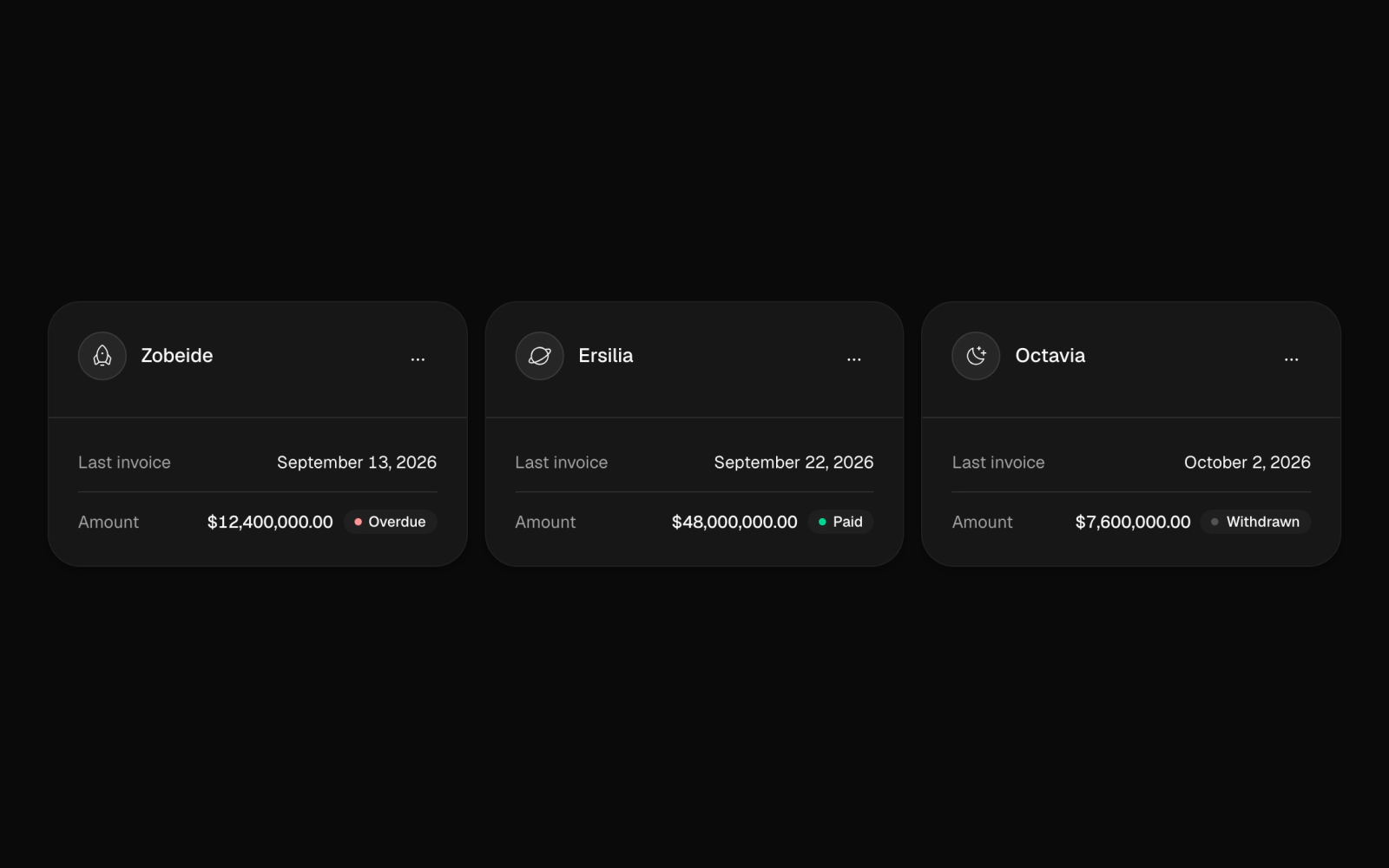 AccountsLicensedA responsive grid of client account cards, each with an icon avatar, an options menu and the last invoice's date, amount and status badge. Status pairs a word with a colored dot; columns step by container width.
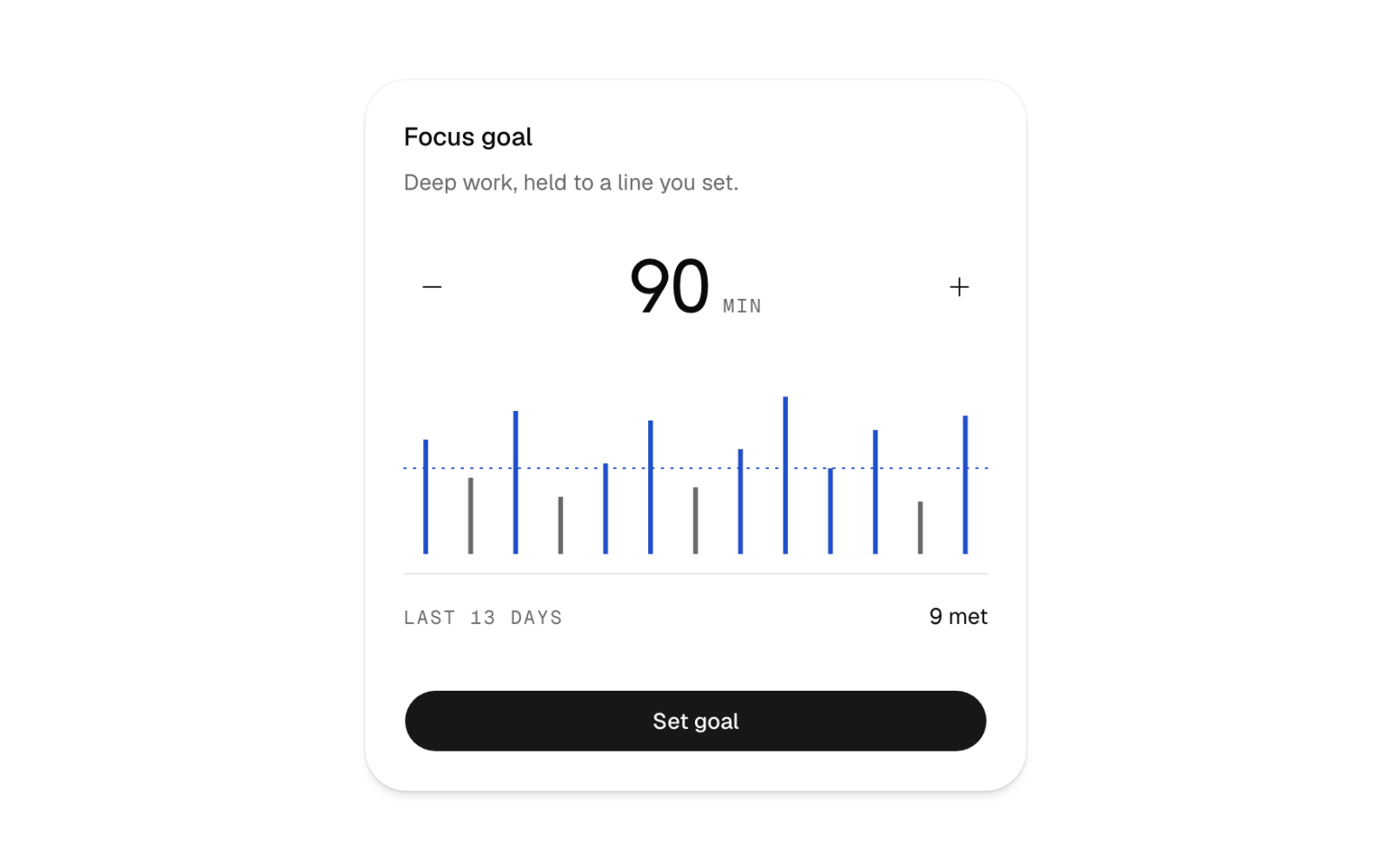
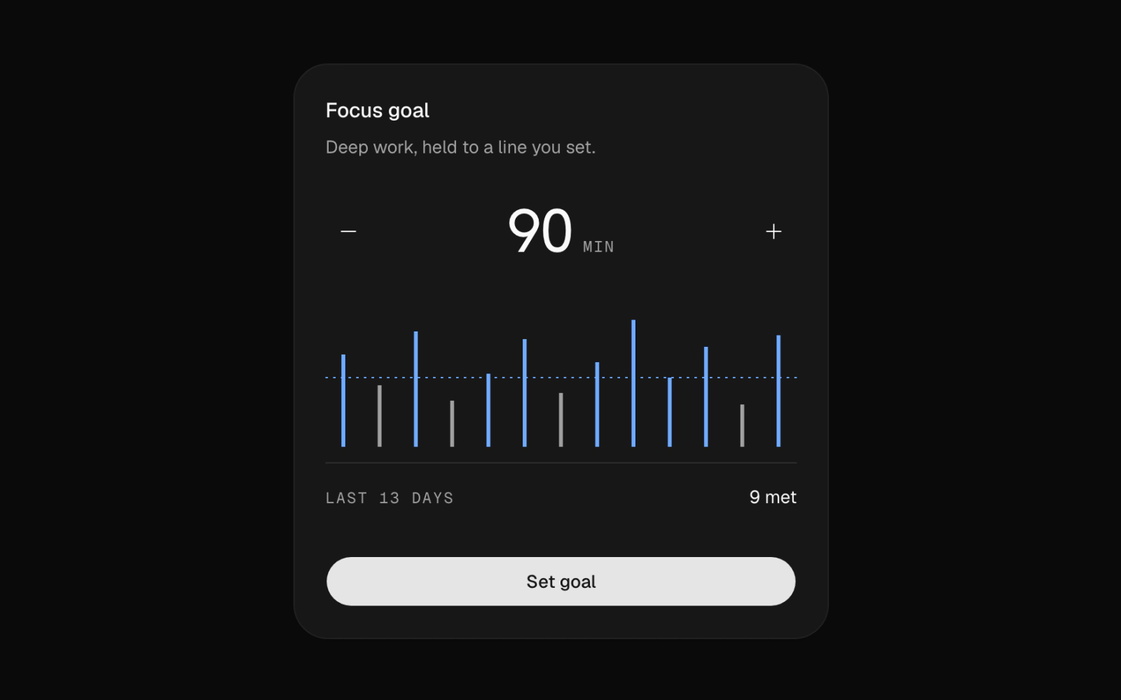 Activity GoalFreeA focus-goal card with a 13-day recharts bar chart of minutes against an adjustable goal line, stepper buttons, a met count and a Set goal button that announces the saved value.
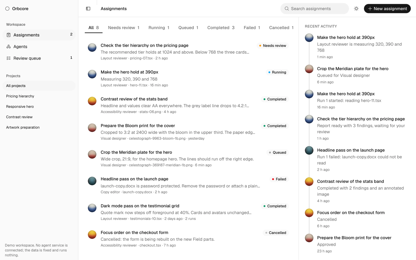
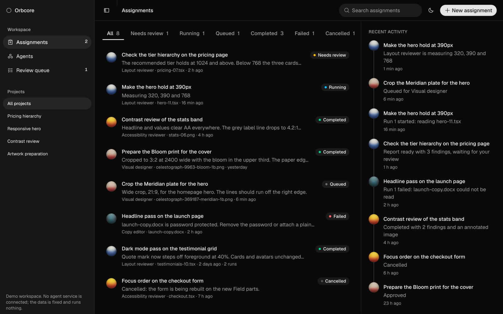 Agent WorkspaceLicensedA full agent workspace demo with assignments, agents and a review queue, search, status filters, recent activity, a detail sheet and a new-assignment dialog. It runs on fixed sample data with no agent service.
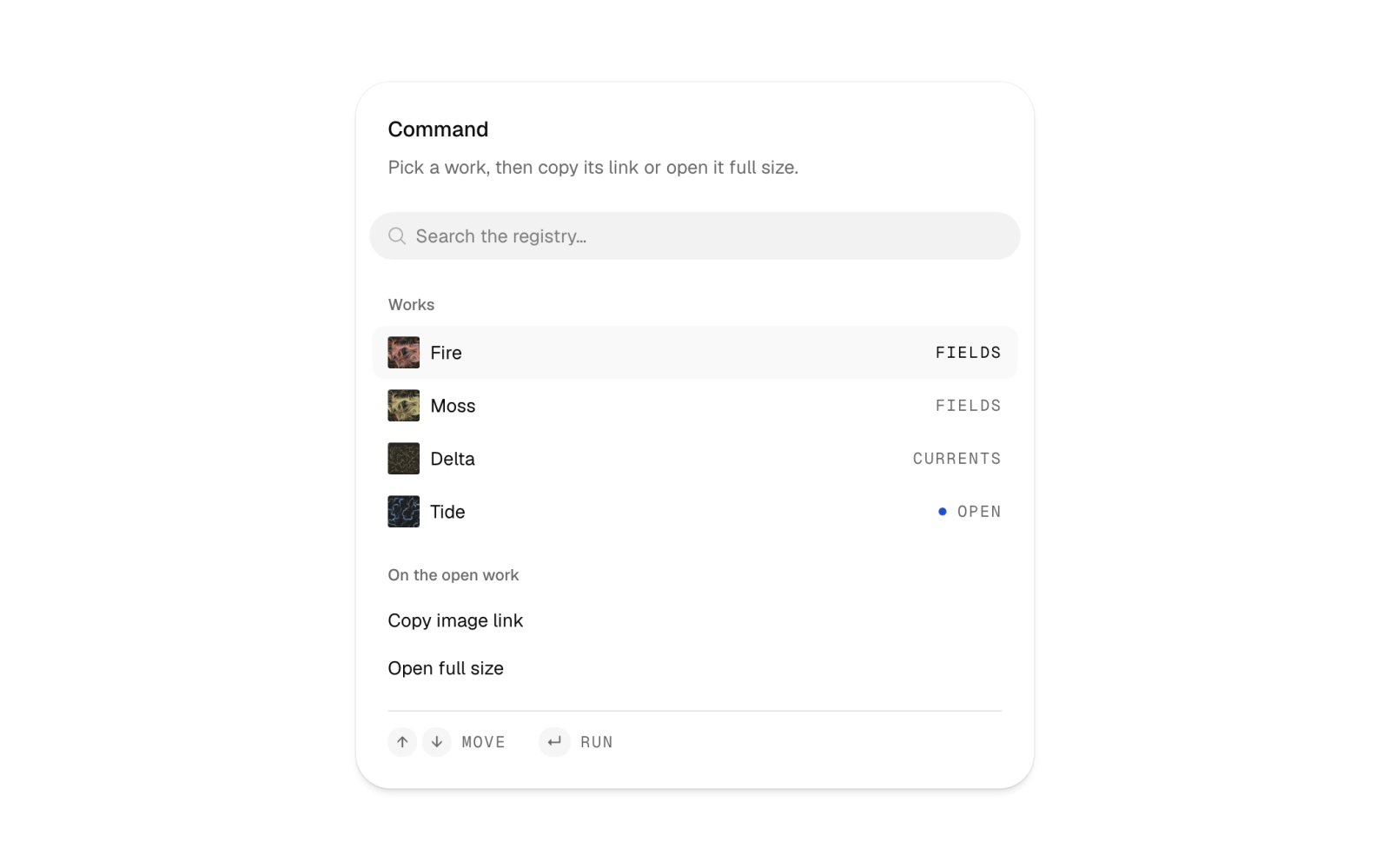
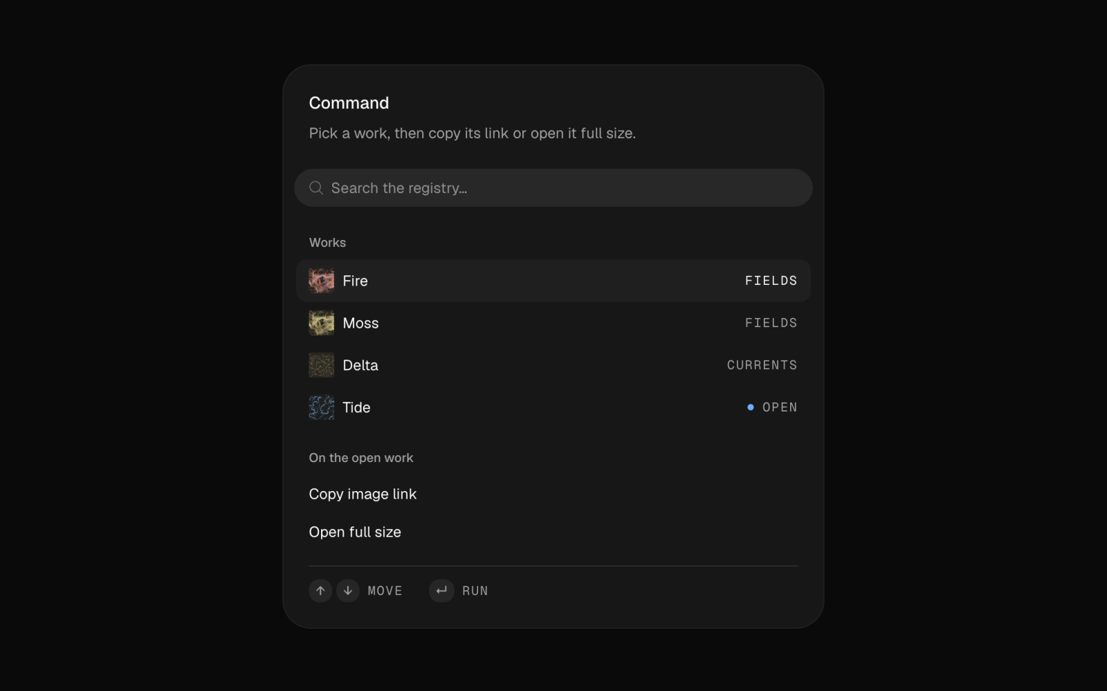 Command PaletteLicensedA command palette in a card: a searchable list of works with thumbnails and an open marker, copy-link and open-full-size actions, and a footer of key hints and a live status in Geist Mono.
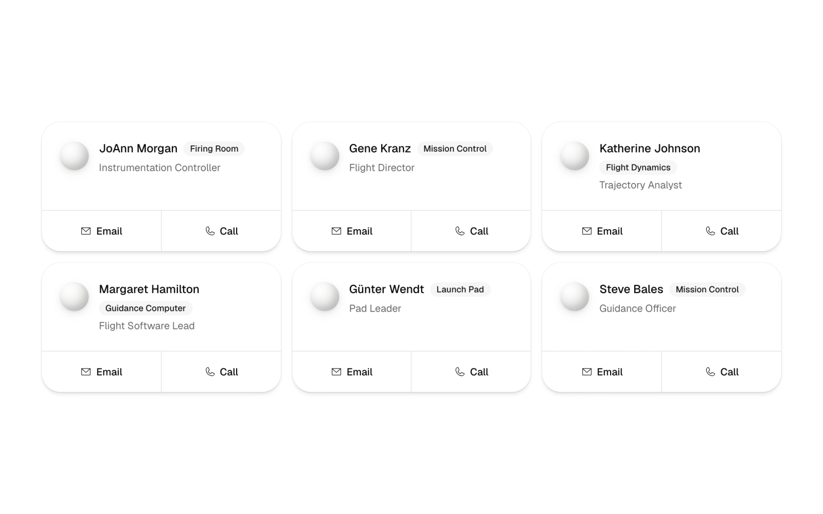
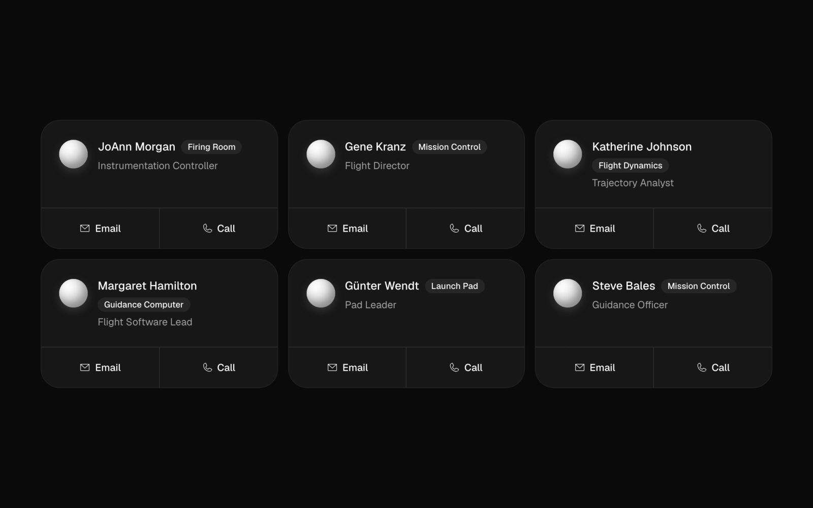 Contact ListFreeA responsive grid of six contact cards, up to three columns, each with a greyscale Cloud shape avatar, name, role badge and title, and a ruled footer split into Email and Call links.
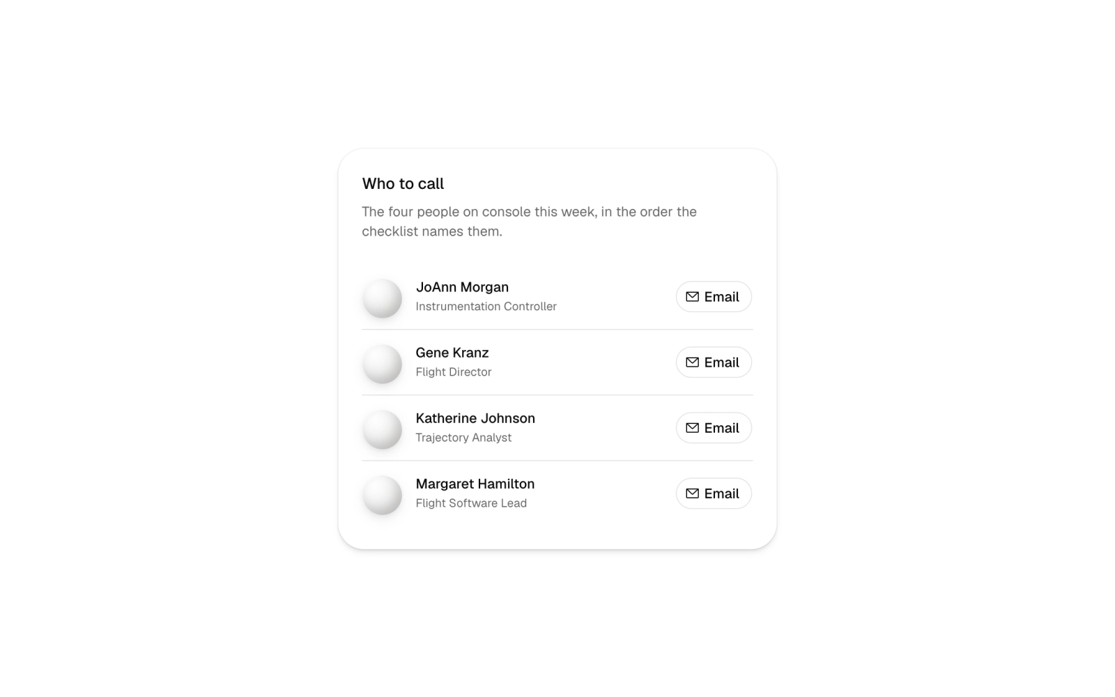
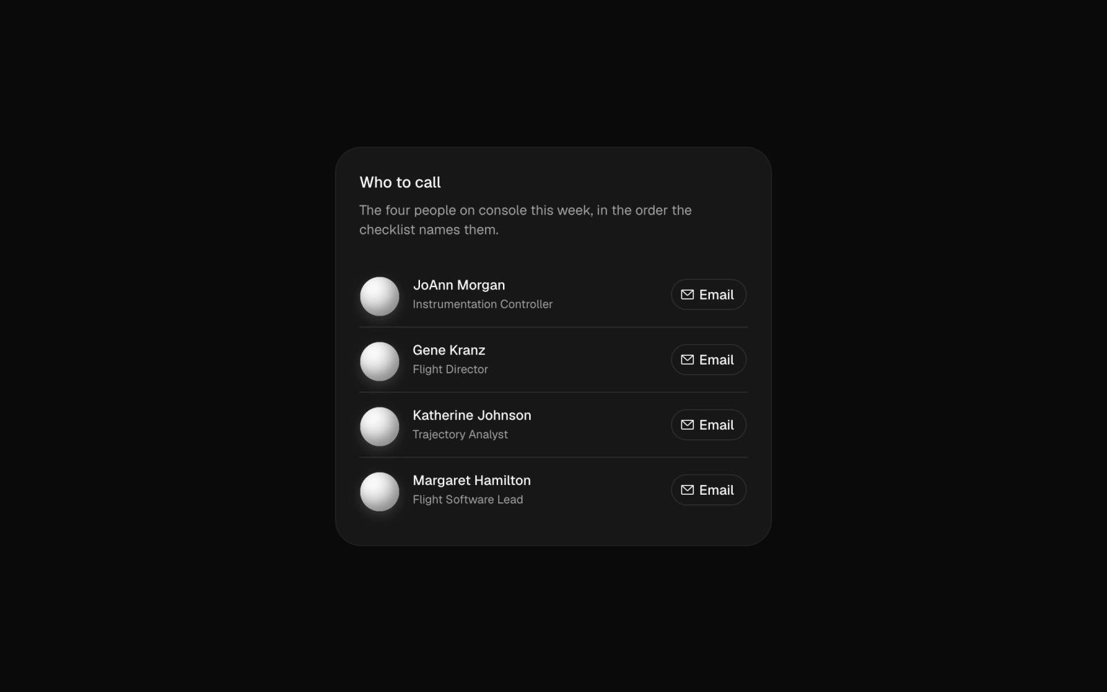 Contact List CardFreeA single card listing four on-call contacts as rows with a greyscale Cloud shape avatar, name, title and an outline Email button. Rows are divided by hairlines under a header and description.
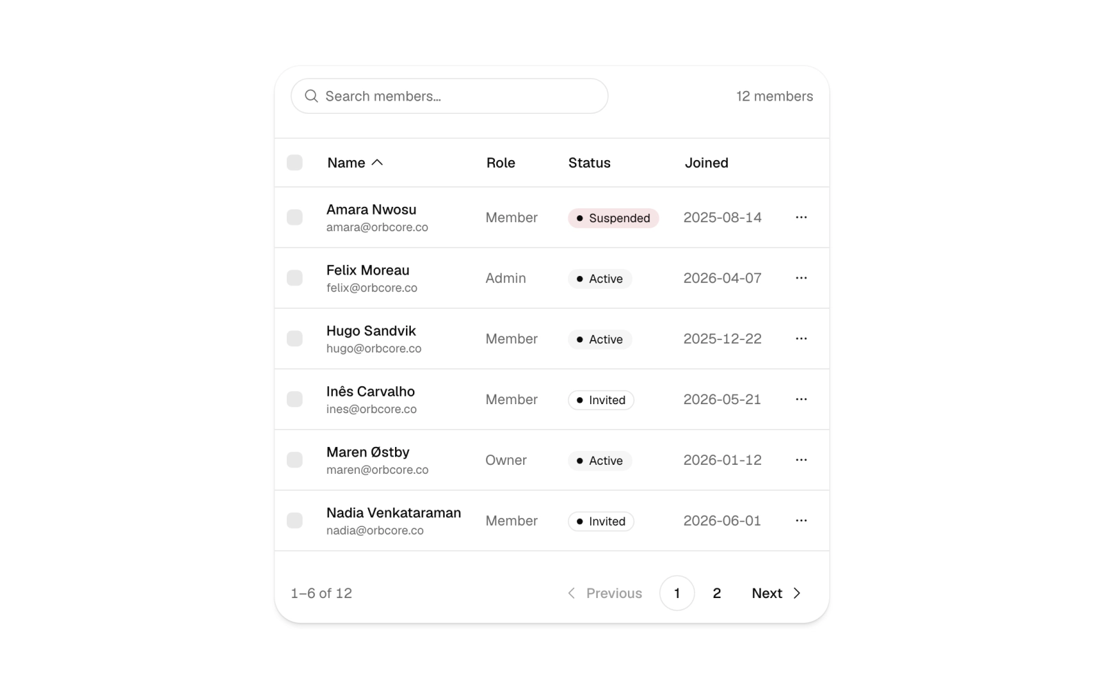
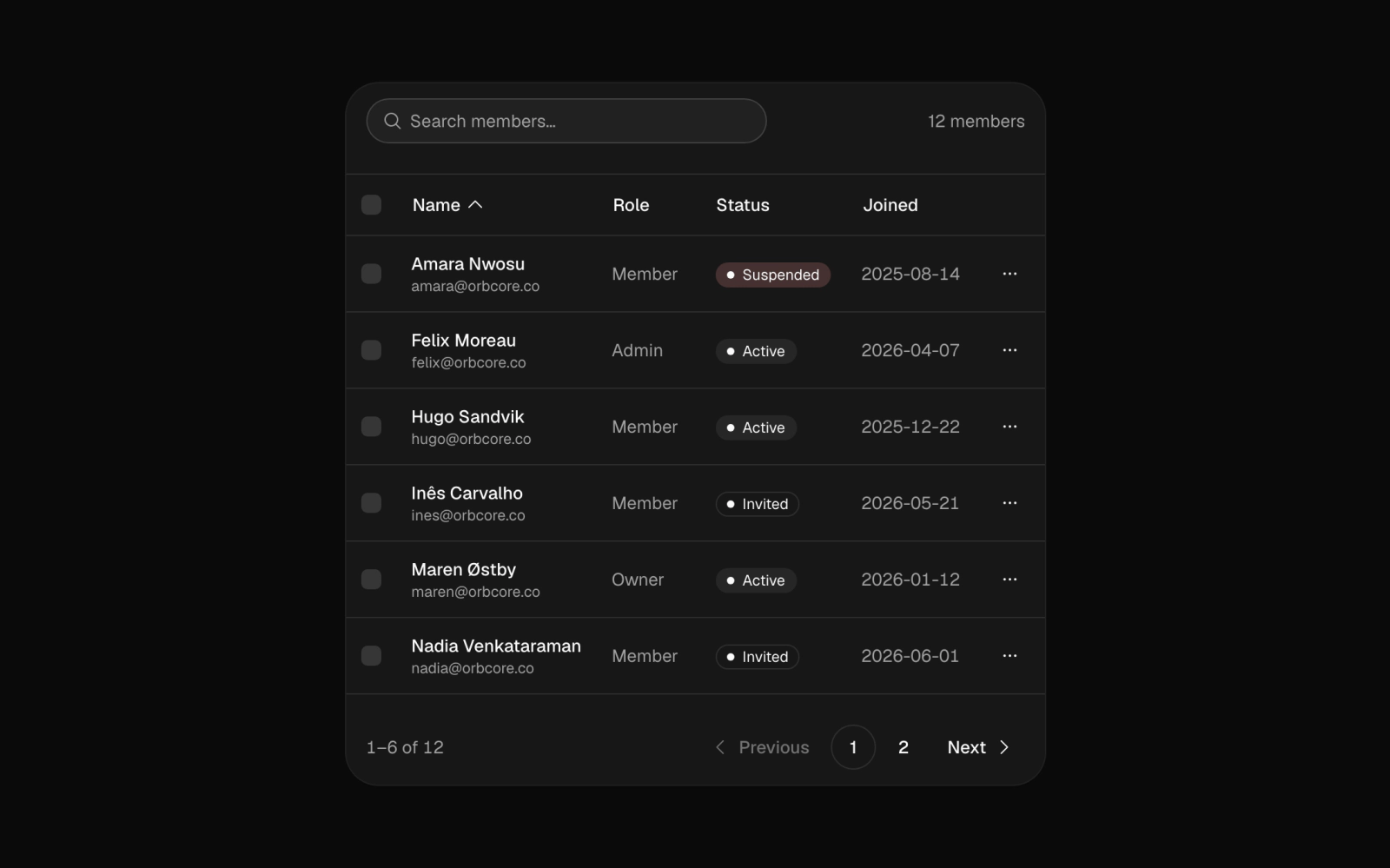 Data TableLicensedA members data table with search, sortable name, role and joined columns, row and page checkboxes, status badges, per-row action menus and pagination at six rows a page. Columns hide on narrow screens.
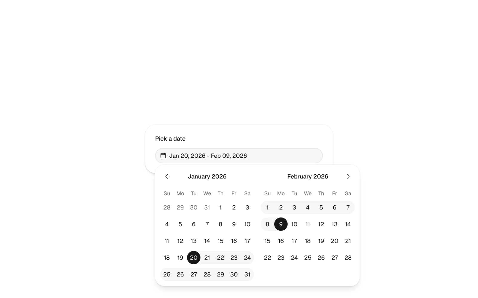
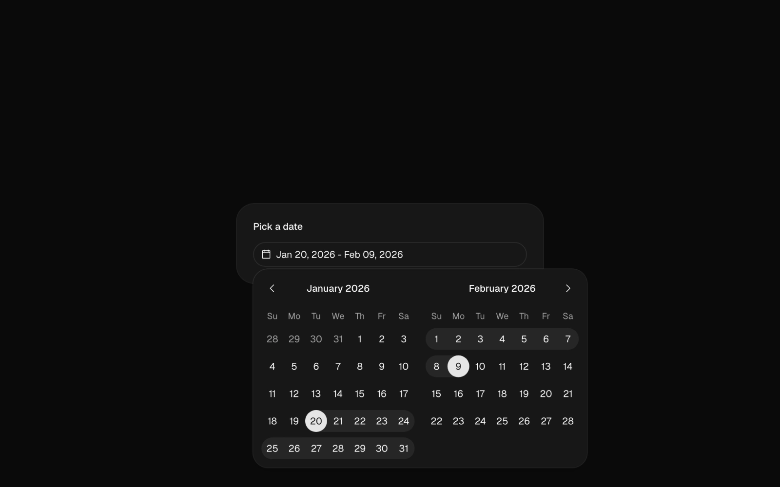 Date PickerFreeA card holding a Date Range Picker: a labelled trigger that opens a two-month range calendar in a popover, preset to a 20-day span. Uses date-fns to build the default range.
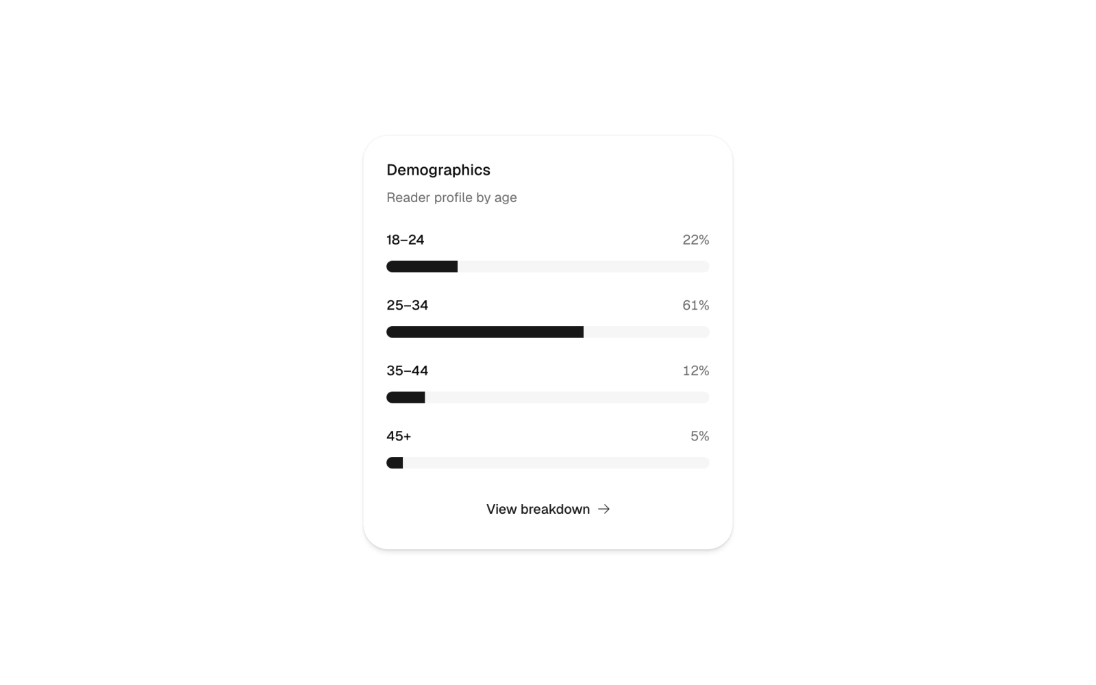
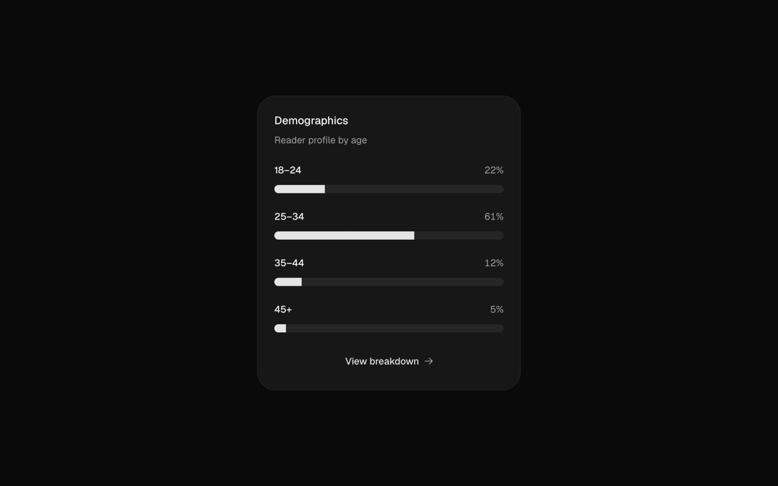 DemographicsLicensedA reader demographics card that shows age bands as progress bars with their shares, plus a dialog with the full breakdown in a table. Bands and the reader total are plain data; numbers format by locale.
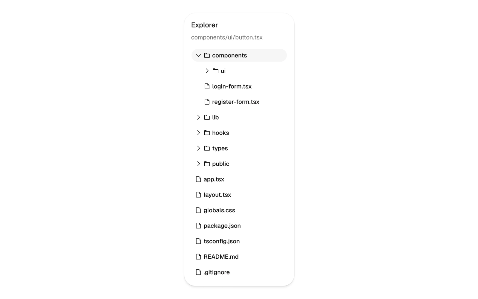
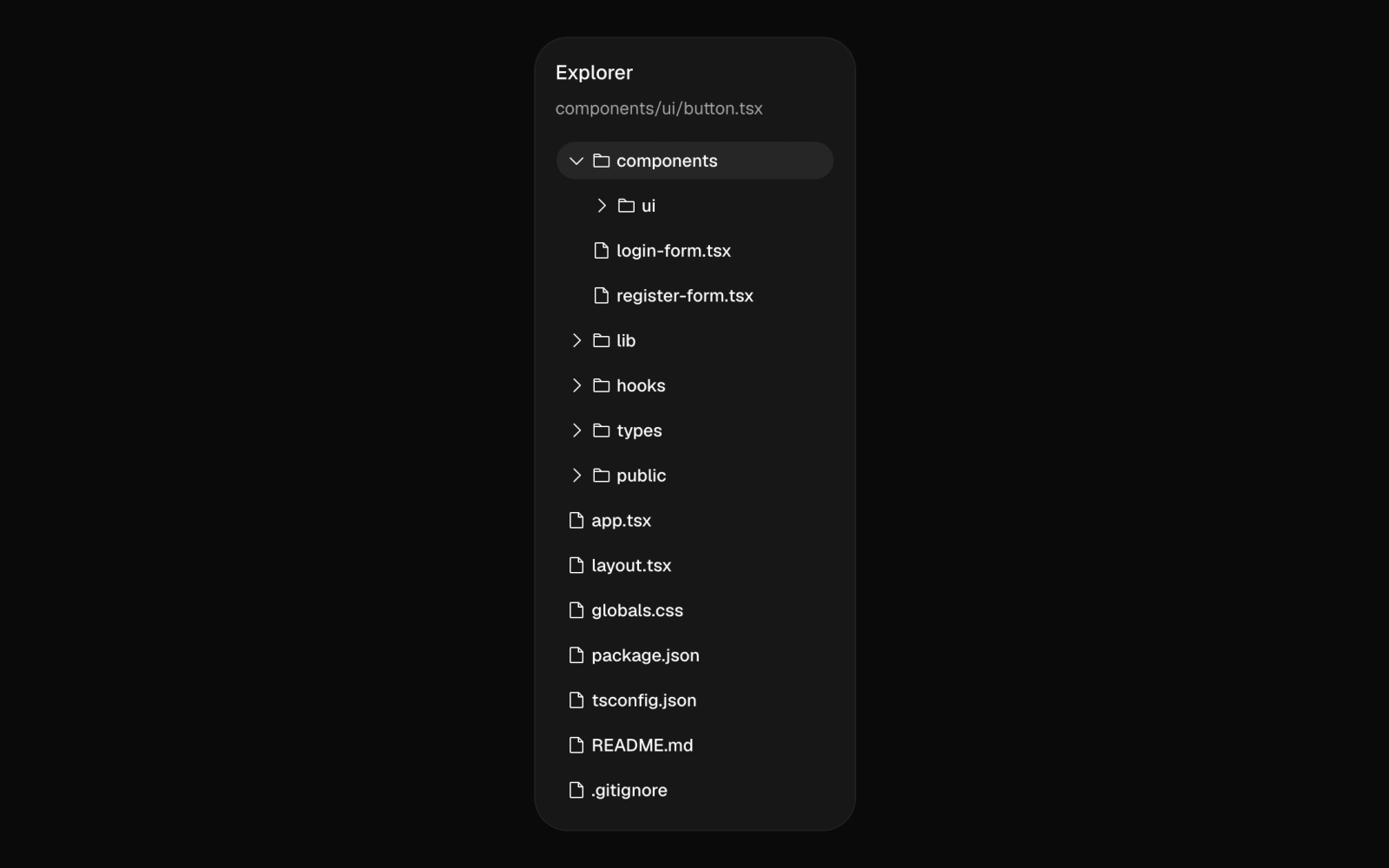 File TreeFreeAn Explorer card showing a nested project file tree with collapsible folders, rotating carets and the selected file's path in the header. Folder and file rows are ghost buttons with Phosphor icons.
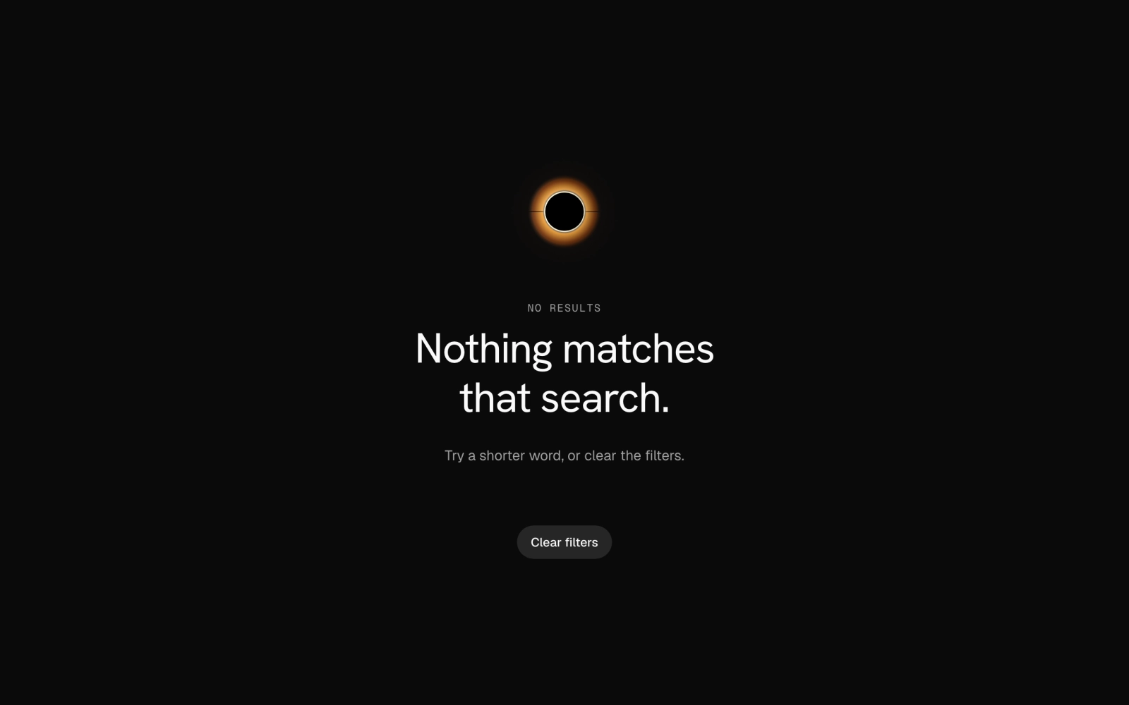
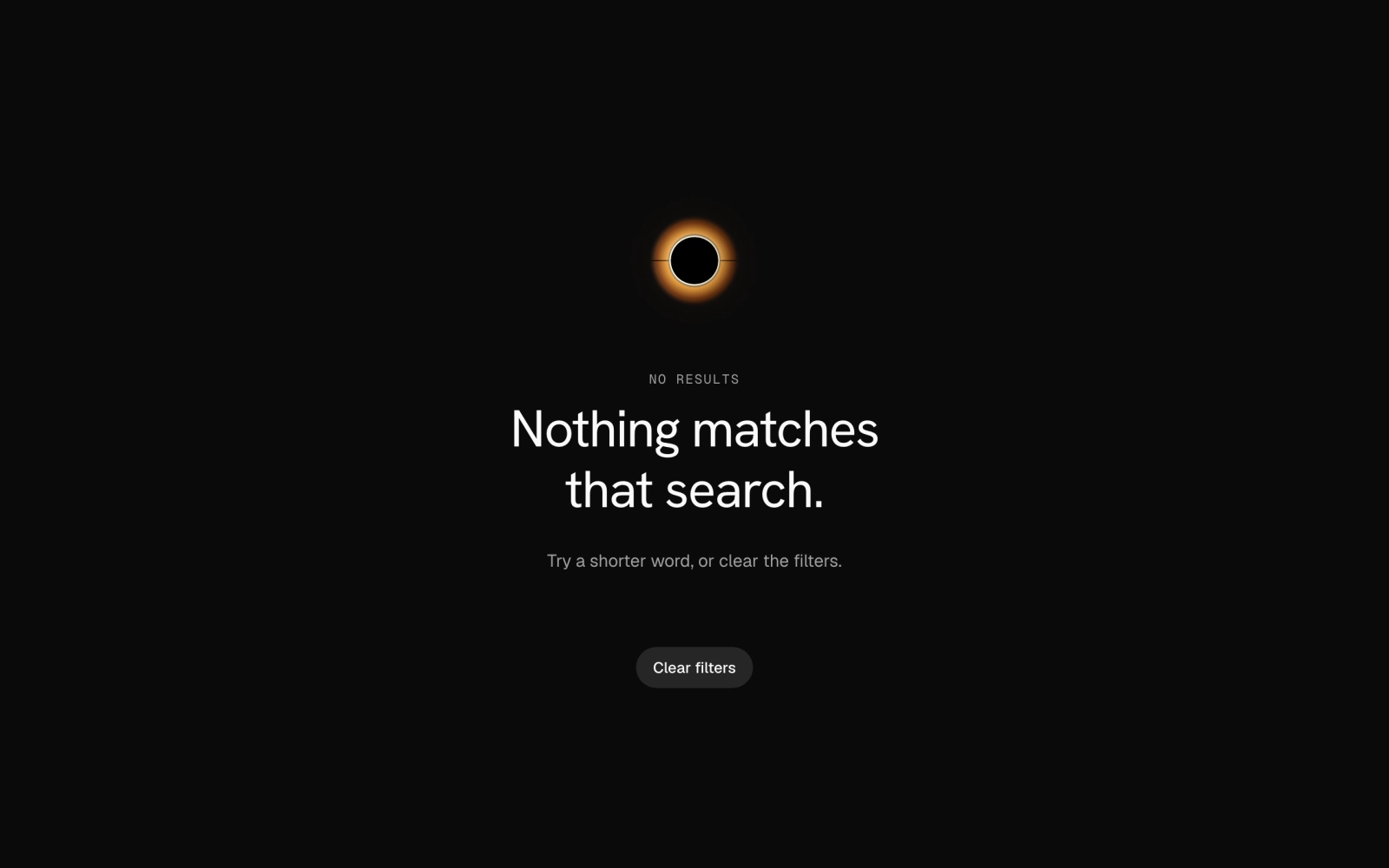 No ResultsLicensedA full-height empty search state pinned dark: a warm Black Hole orb above an eyebrow, headline, short hint and a Clear filters button, all centred in a Section.
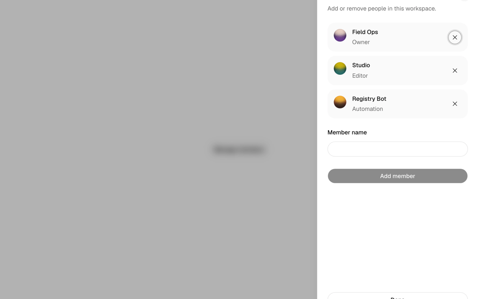
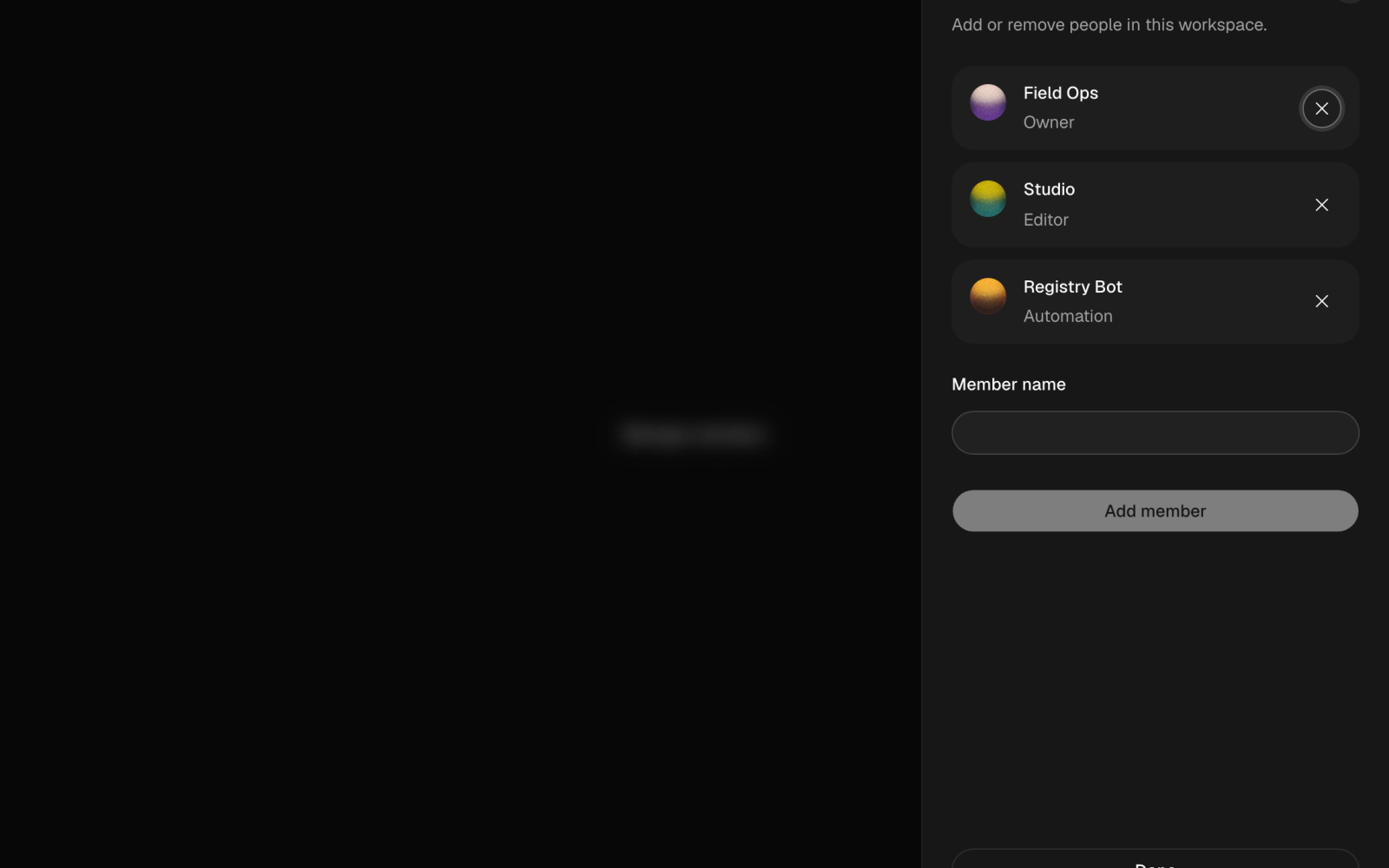 Orb DrawerLicensedA member manager in a sheet: a Manage members trigger opens a list of workspace members with small Orbital orb avatars, an add-member field and remove buttons that announce each change.
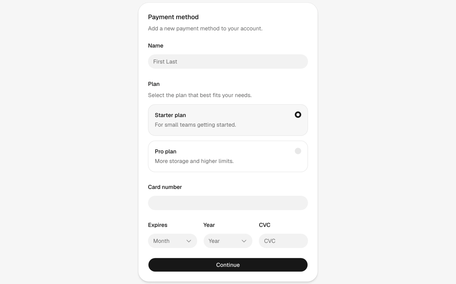
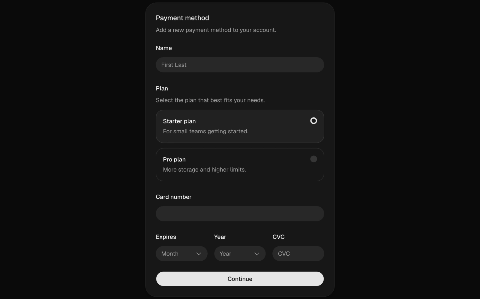 PaymentLicensedA payment method card form with name, a radio choice between two plans, card number, expiry month and year selects and CVC. Validated values go to a submit handler you supply.
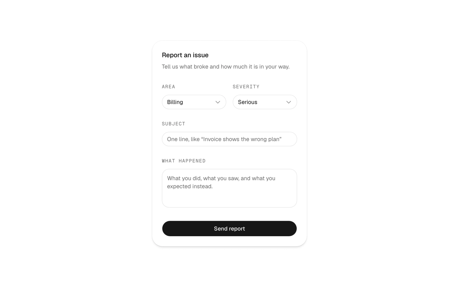
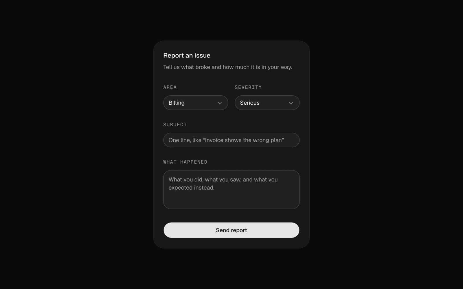 Report IssueFreeAn issue report card form with Area and Severity selects, a one-line subject and a details textarea, preset to Billing and Serious, ending in a Send report button.
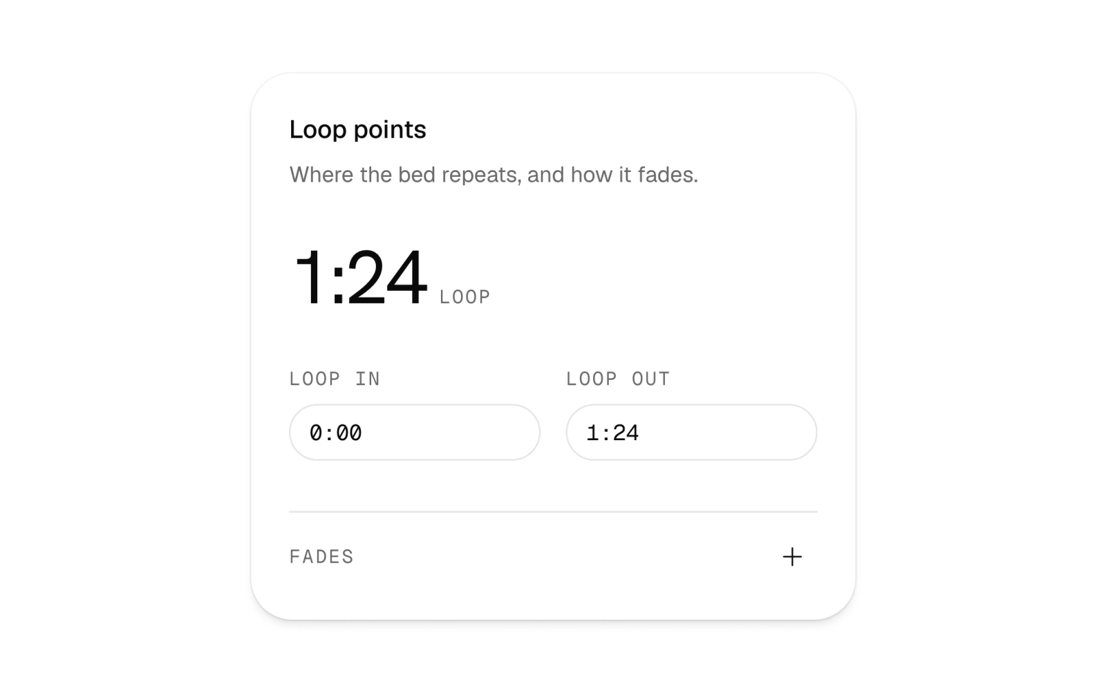
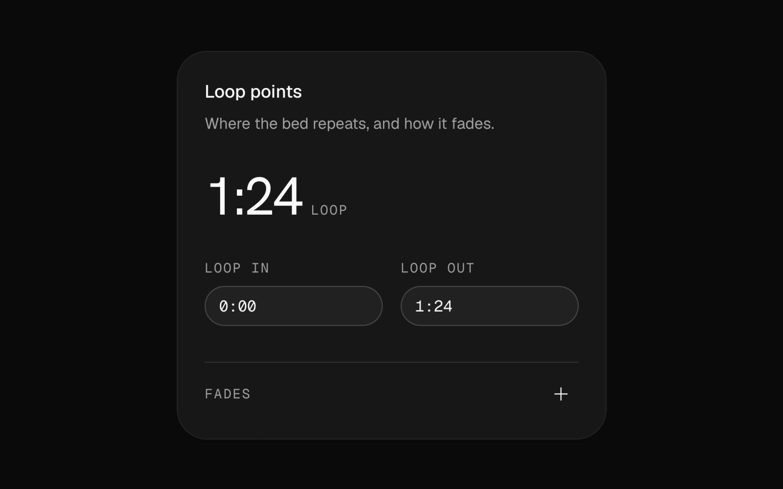 SettingsFreeAn audio loop settings card with m:ss time fields for loop in and loop out, plus fade in and fade out fields in a collapsible section behind a show and hide toggle.
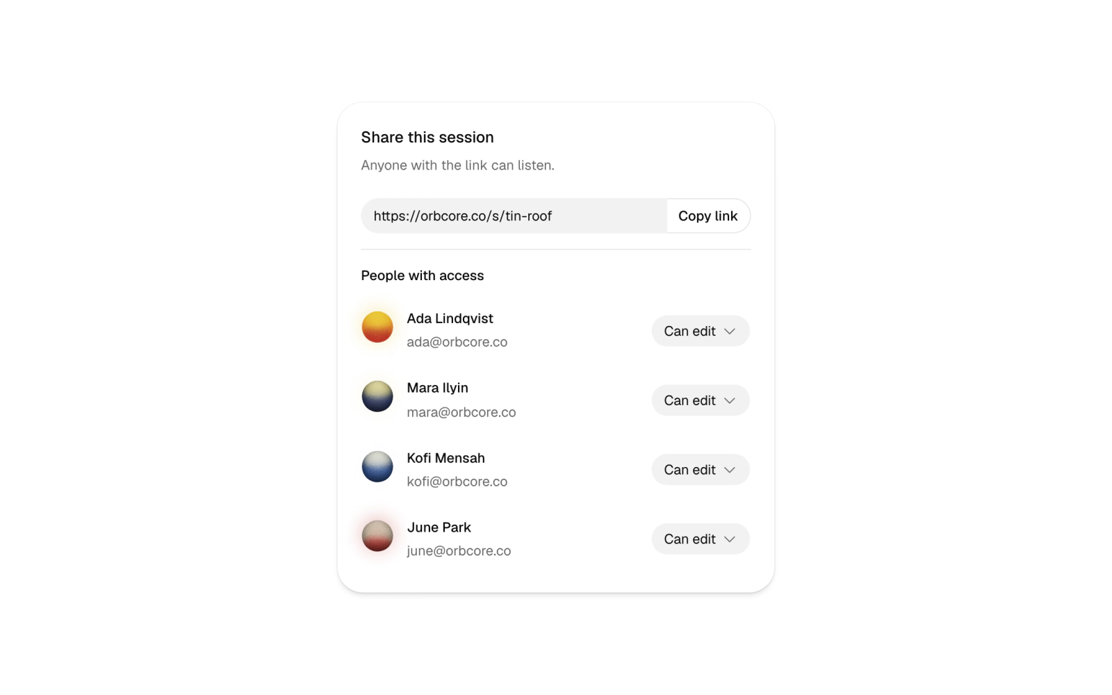
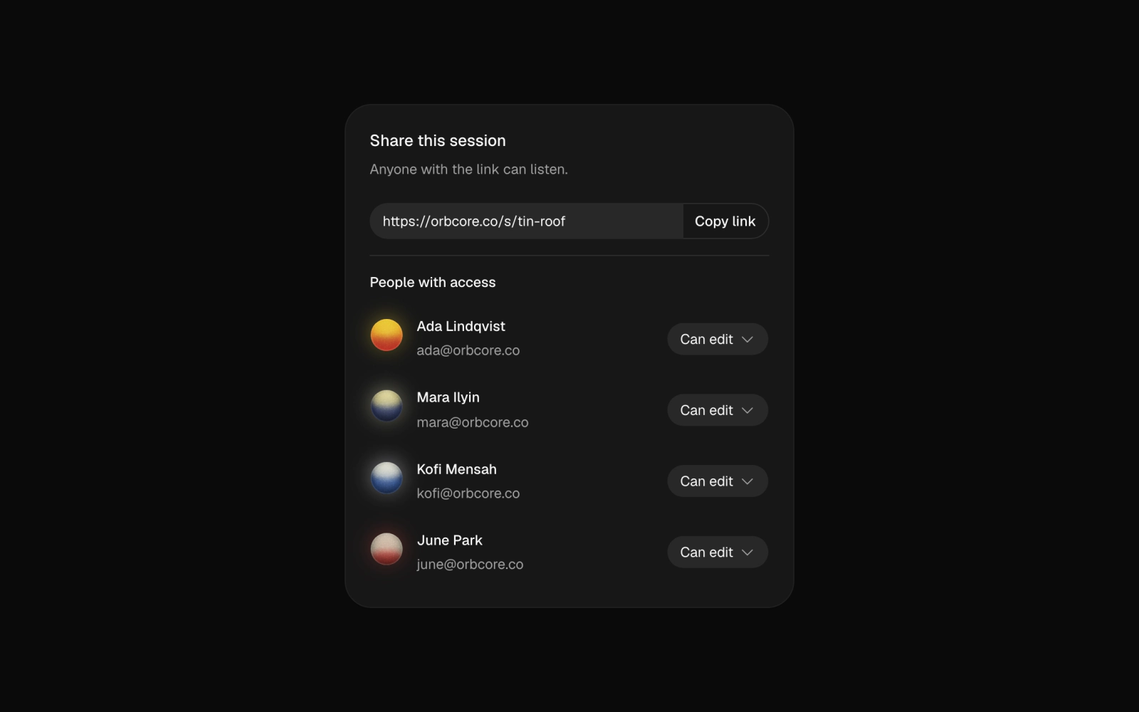 ShareLicensedA share card for a session link with a copy button and error fallback, and a people-with-access list where each person has an Orbital orb avatar and a permission select for edit or view.
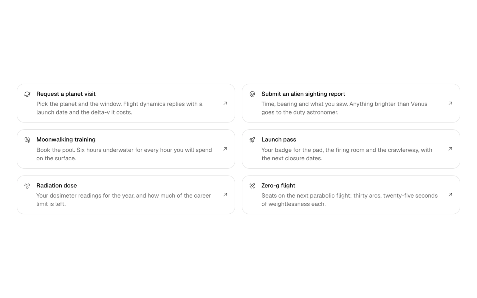
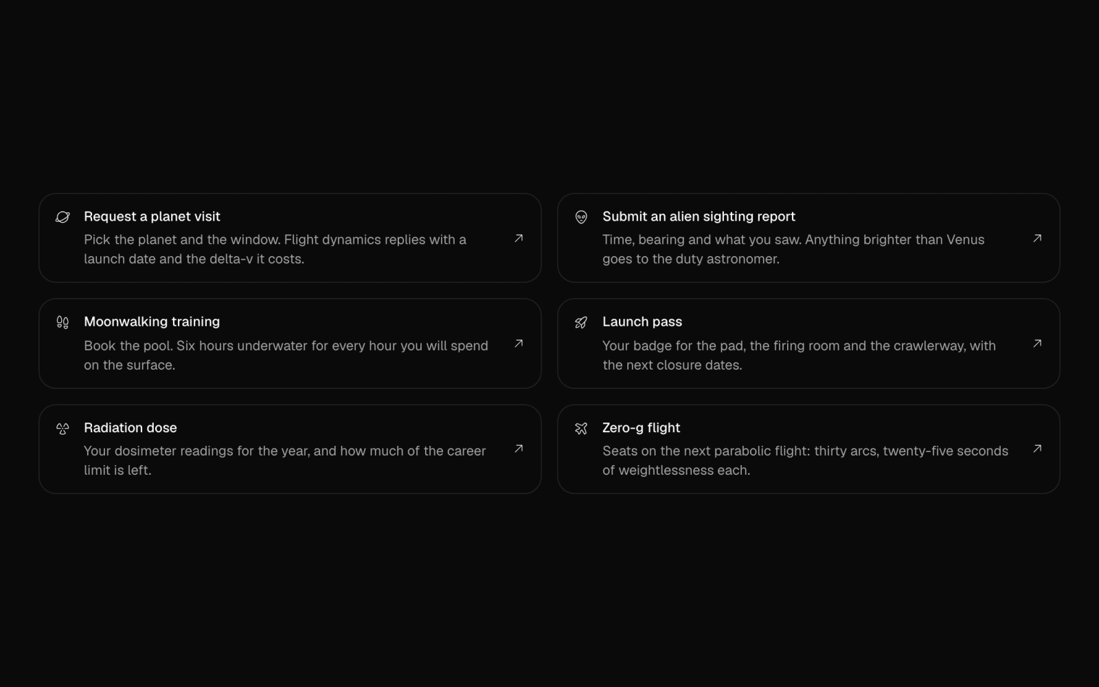 ShortcutsFreeSix outlined link items in a grid, each with a Phosphor icon, title, full description and an arrow, for quick actions such as requesting a planet visit. It steps to two columns by container width.
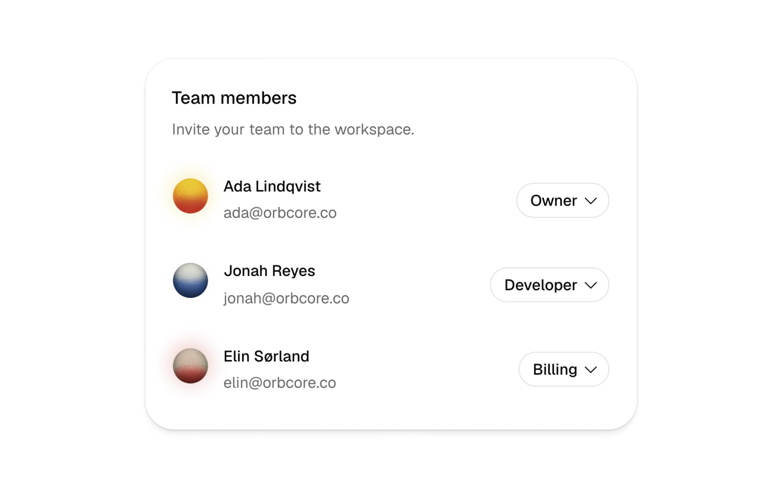
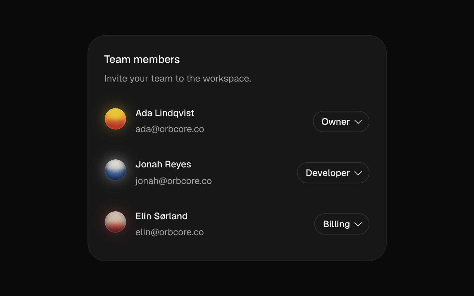 Team MembersLicensedA team member list card with Orbital orb avatars, emails and a searchable role picker per person in a popover, choosing between Viewer, Developer, Billing and Owner.
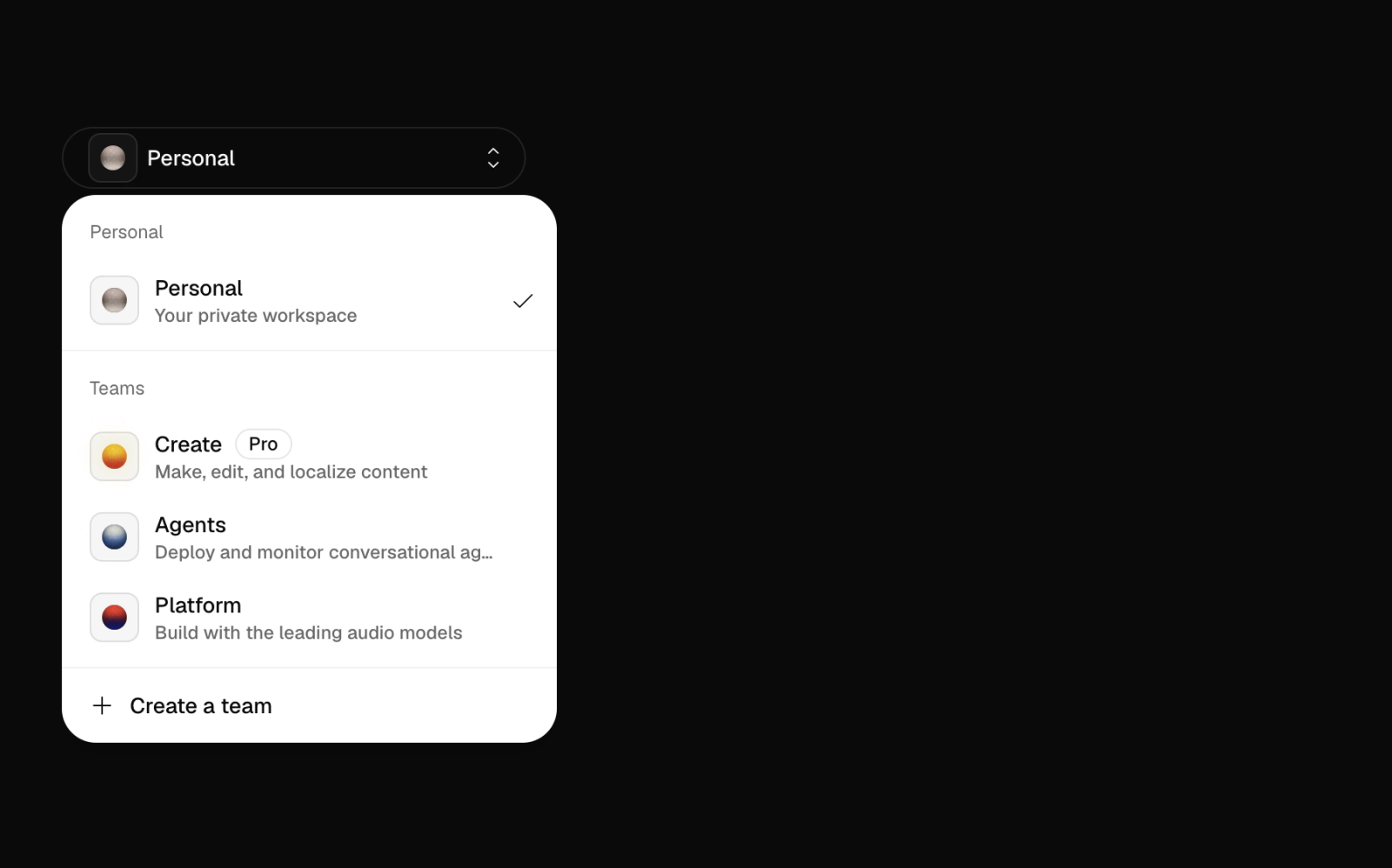
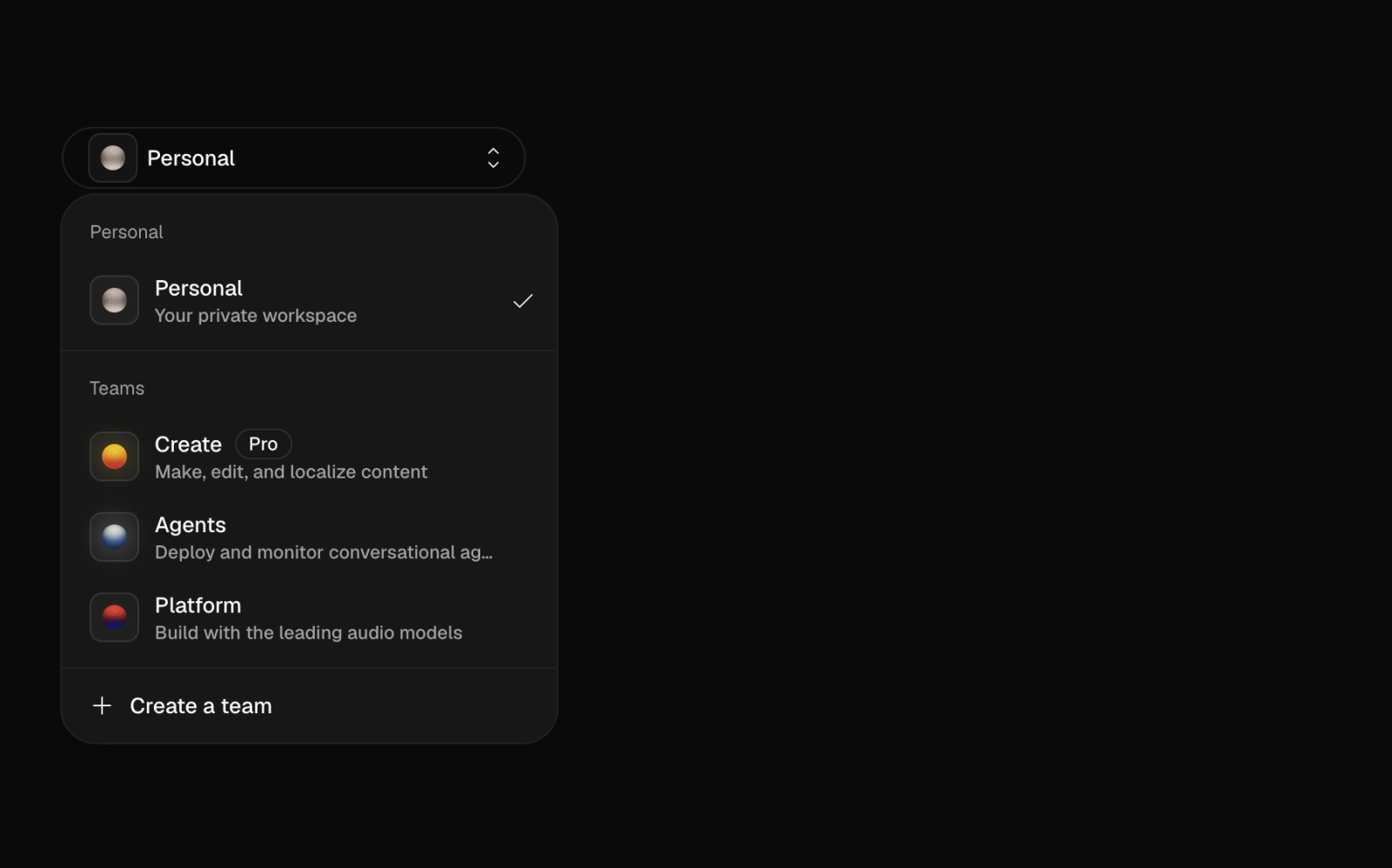 Team SelectorLicensedA team switcher on a dark full-height section: a dropdown grouping a personal workspace and teams, each with a small Orbital orb on a rounded tile, a Pro badge and a create-team action.
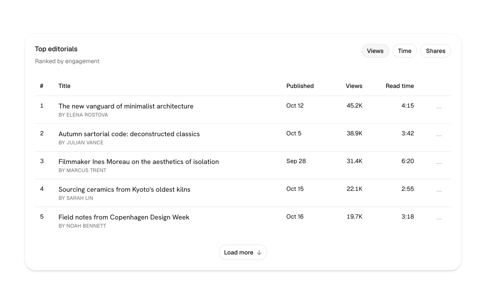
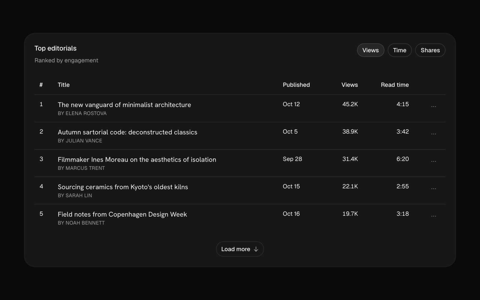 Top EditorialsLicensedA ranked editorials table card with a views, time or shares toggle, titles in the Hanken Grotesk display face, row menus to edit in a dialog, publish now or confirm delete, and load more.
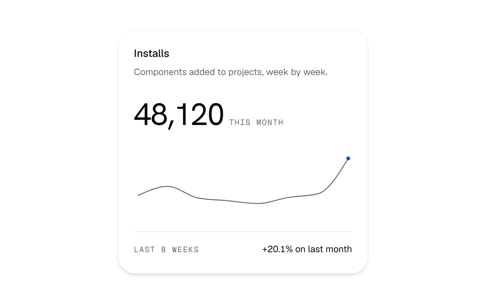
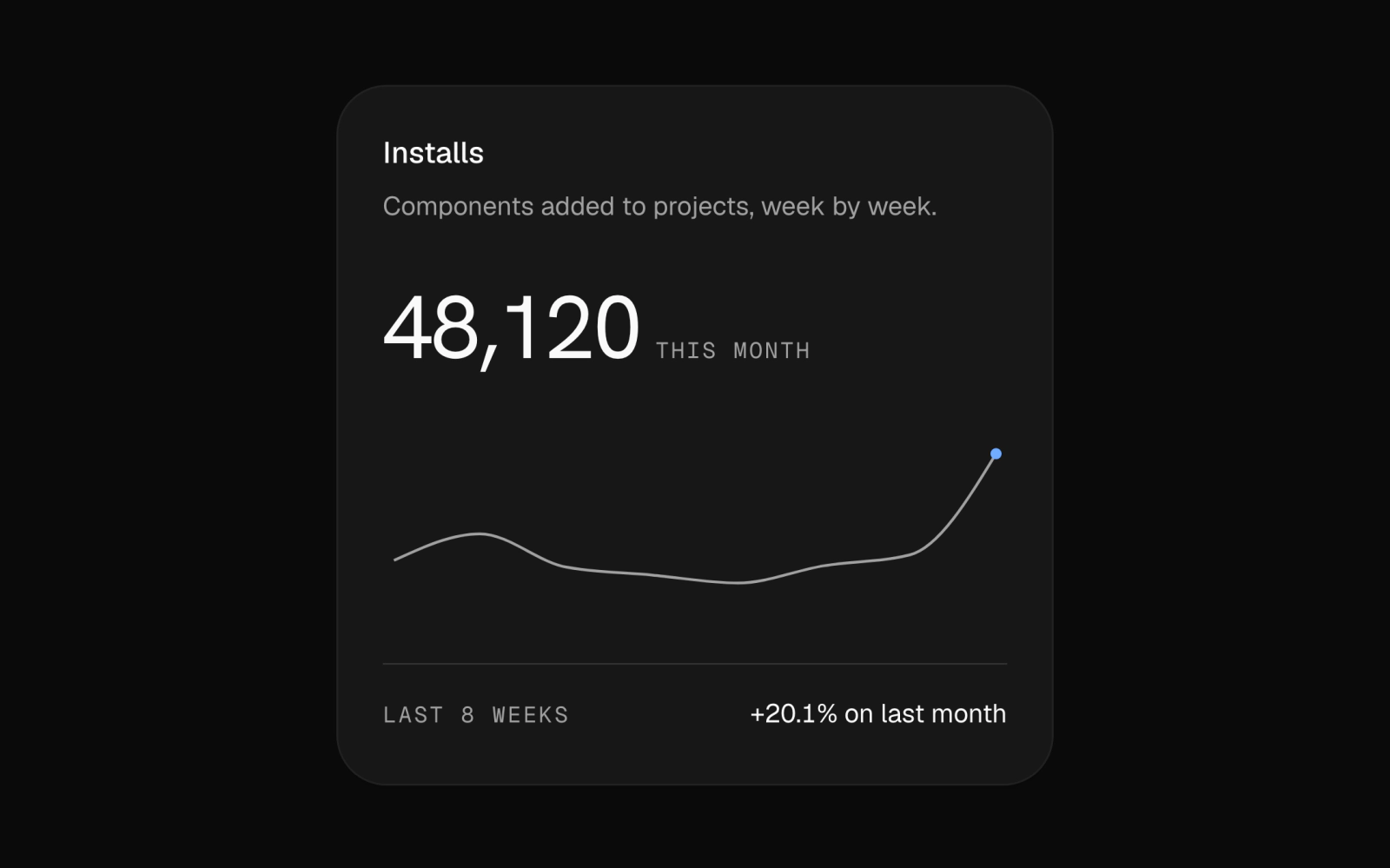 Weekly Installs CardFreeA compact stats card for weekly installs: a large total, a hairline recharts line over eight weeks with only the latest point in the accent, and a change caption. Labels use Geist Mono; recharts is pinned to 3.8.0.
Vertical Docs Topic Nav
Docs topic navigator over SoftGrain: vertical line Tabs whose active topic is lit by a StandingSeam, with that topic's heading and description beside the list. Stacks in narrow sections.
Account Menu
An app header with a left-swiping drawer of grouped navigation links and an account dropdown showing the signed-in user, plan and grouped settings. Group labels use Geist Mono; icons come from Phosphor.